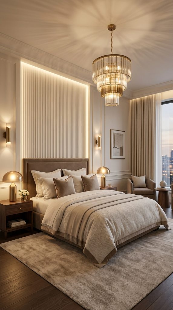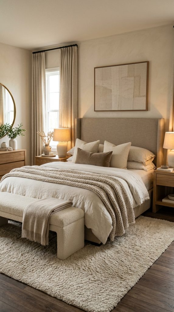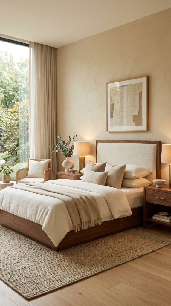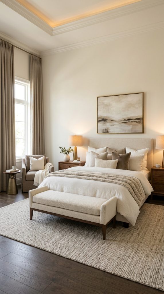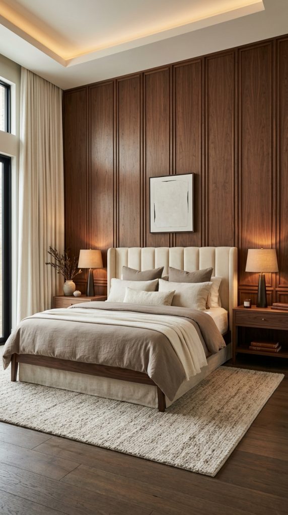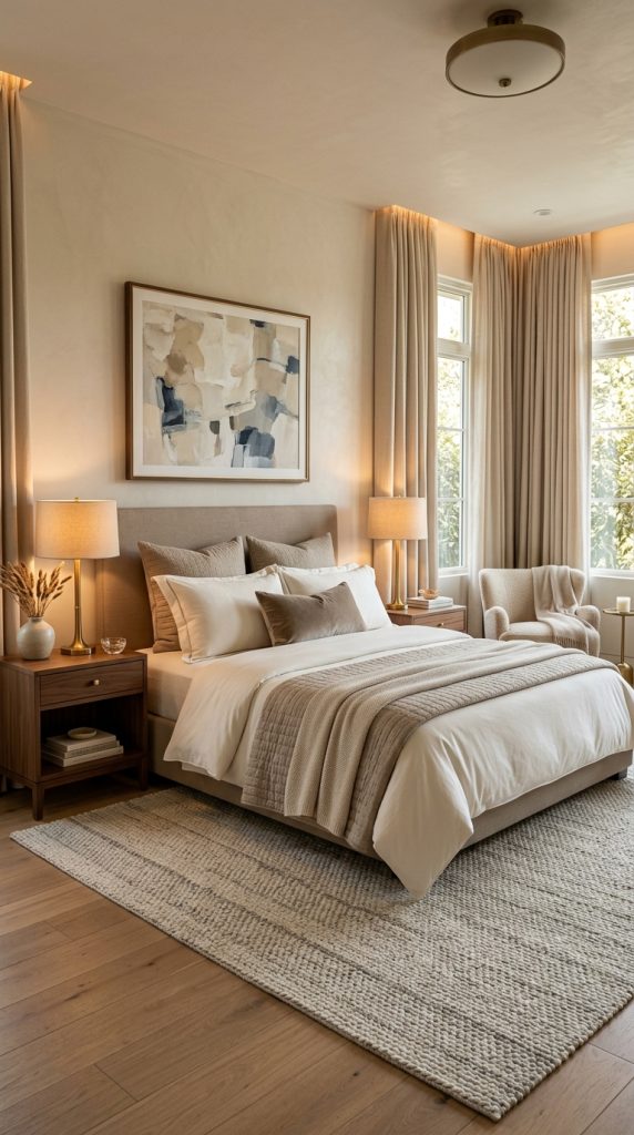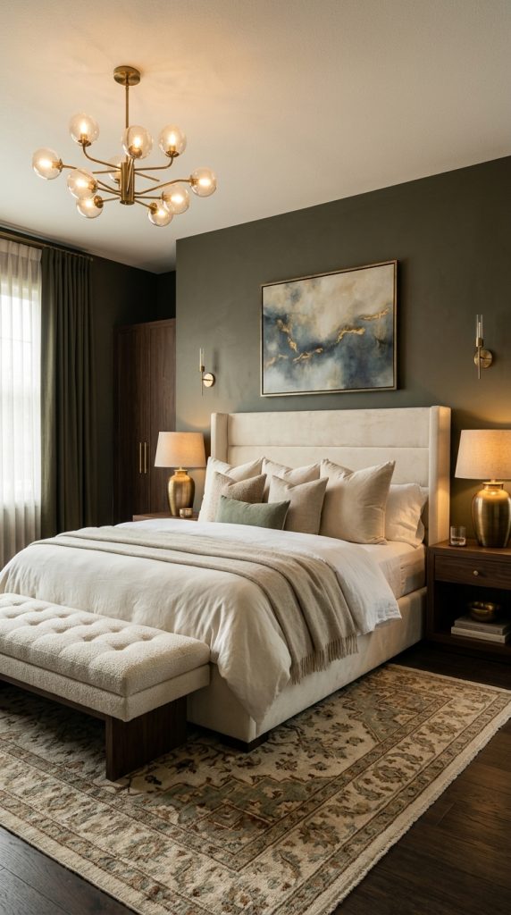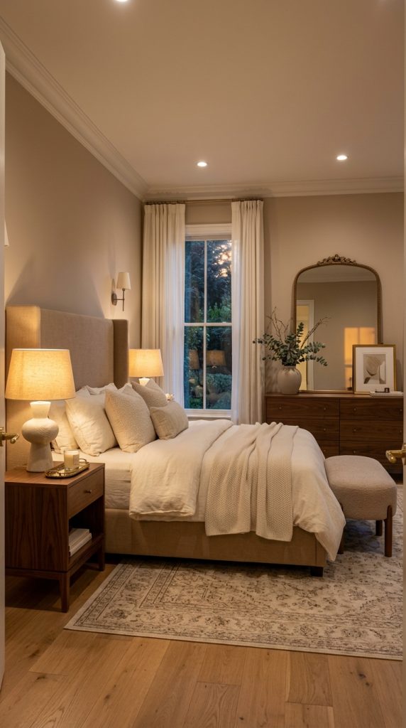
Category: Home Decor

  • Decorative Lighting Ideas for a Warm and Luxurious Home

    Decorative Lighting Ideas for a Warm and Luxurious Home

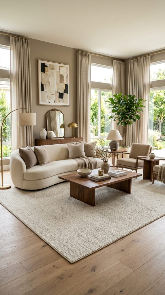
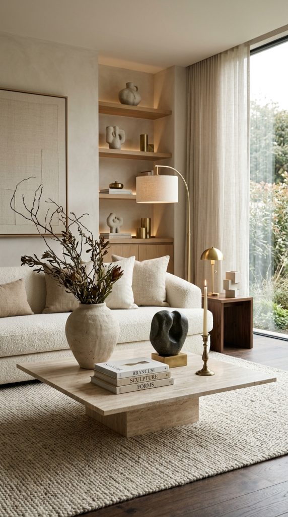
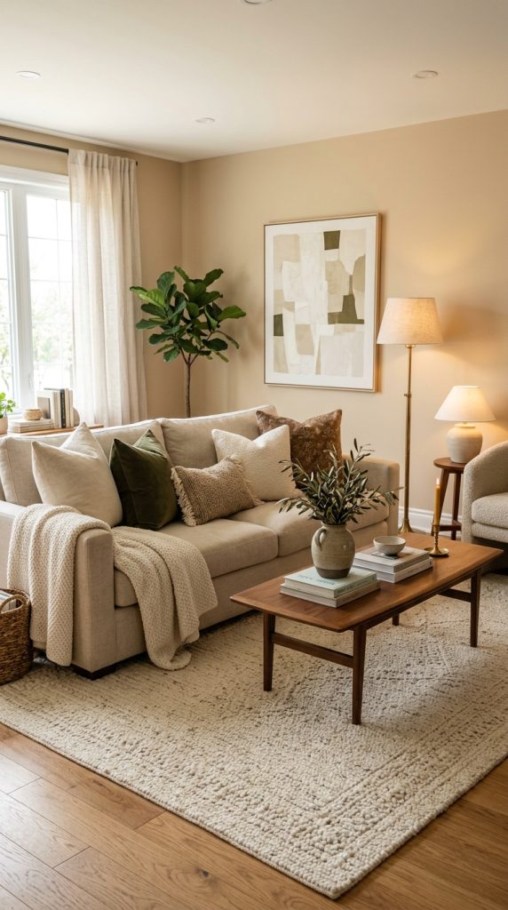
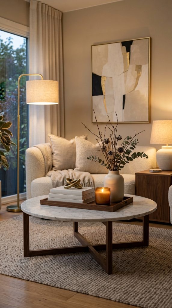
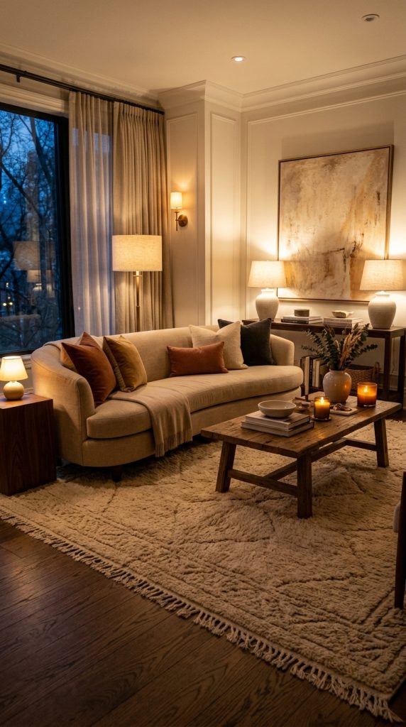
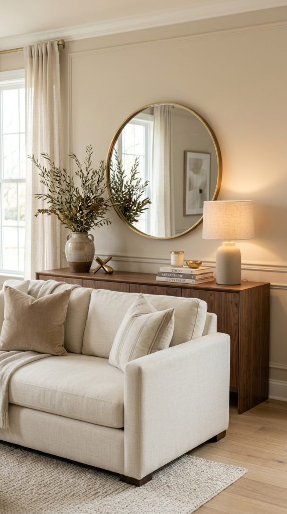
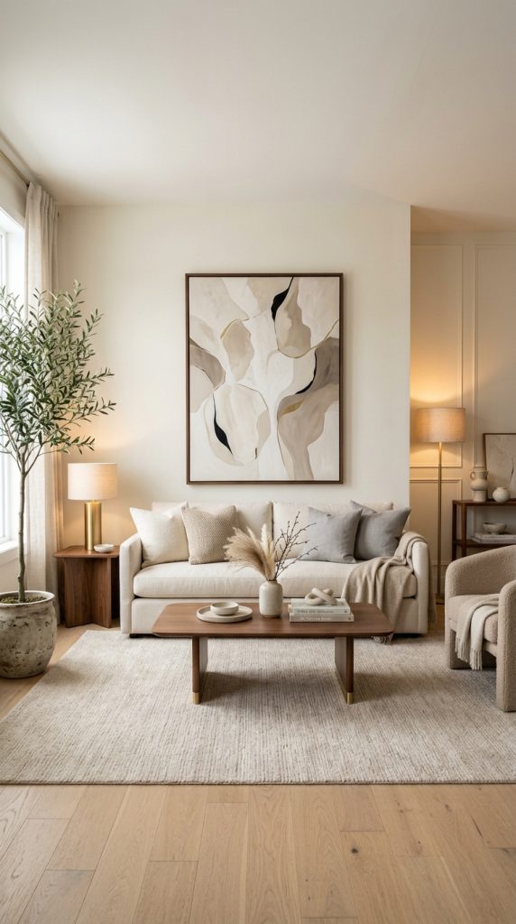
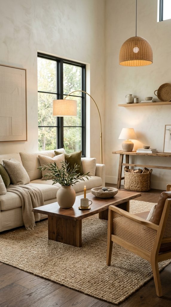
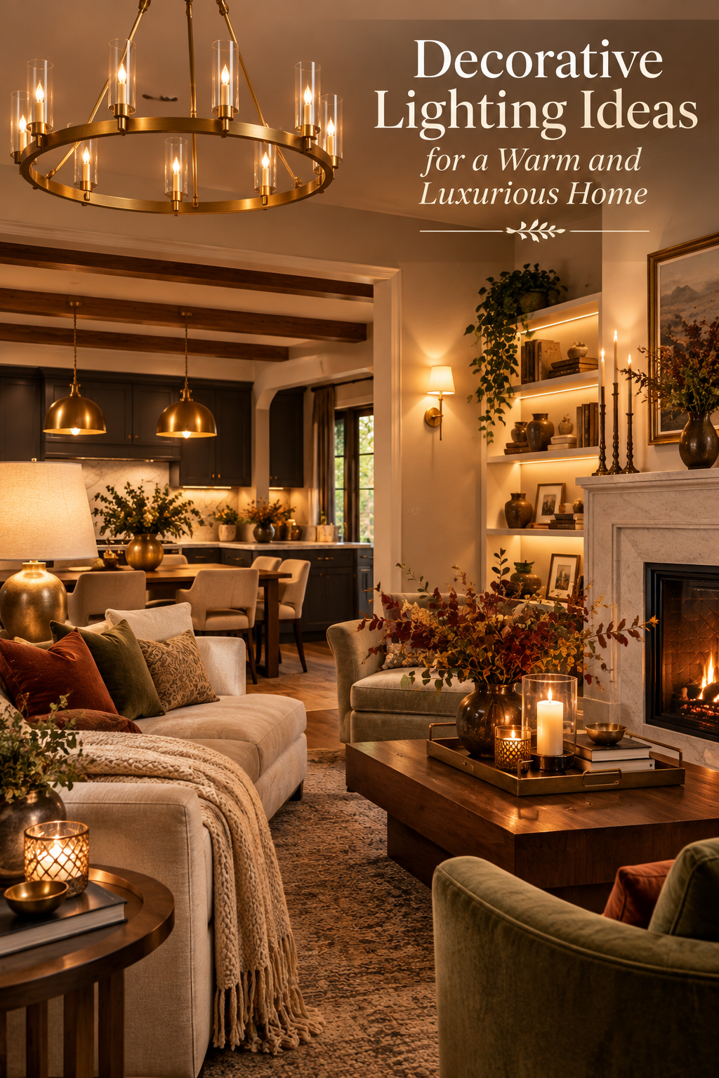
    Decorative lighting ideas for a warm and luxurious home can completely transform the way a room looks, feels, and functions. The right lighting does much more than brighten a space. It can make a living room feel intimate, turn a dining area into an elegant entertaining space, make a bedroom feel like a boutique hotel, and highlight architectural details that might otherwise disappear after sunset. In a beautifully designed home, lighting becomes part of the interior rather than something added at the end.
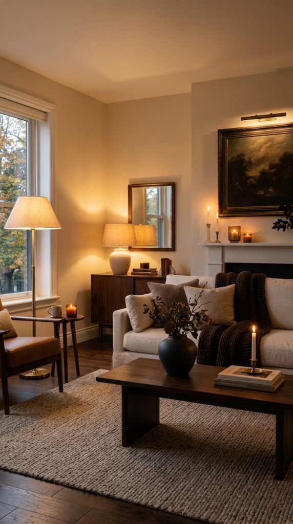
    One of the biggest shifts in contemporary interior design is the way decorative lighting is being treated as an important design feature. Rather than depending on one central ceiling fixture to illuminate an entire room, designers are increasingly combining different sources of light at different heights. Table lamps, floor lamps, wall sconces, pendants, chandeliers, picture lights, under-cabinet lighting, and concealed illumination can work together to create a room that feels layered and atmospheric. Current 2026 lighting coverage specifically highlights layered lighting, sculptural fixtures, textured surfaces, alabaster, ceramic, and warmer metal finishes.

    This approach is particularly valuable if your goal is a luxurious home. Luxury is not always about expensive furniture or oversized rooms. Often, it comes from atmosphere, proportion, material quality, and thoughtful details. A simple cream sofa can look considerably more sophisticated when illuminated by a warm sculptural floor lamp. A dining table can feel dramatically more elegant when a beautiful pendant creates a soft pool of light above it. Even a narrow hallway can become memorable when an artistic wall light washes a textured surface with a gentle glow.

    Warm lighting is also important because the color and intensity of light can change the perceived character of materials. Walnut appears richer, brass becomes softer, stone gains depth, linen looks more tactile, and velvet develops subtle dimension when illuminated correctly. Instead of making every corner equally bright, decorative lighting allows you to decide where the eye should go.

    Another advantage is flexibility. A room should not have to look exactly the same at 9 a.m. and 9 p.m. During the day, natural daylight can do most of the work. In the evening, lamps and accent fixtures can create a more intimate environment. A living room can become a reading space, a conversation area, or a relaxed entertaining room simply by changing which lights are switched on.

    The most successful luxury lighting schemes also avoid visual clutter. You do not need a lamp on every surface or a statement fixture in every room. Instead, each light should have a purpose. Some fixtures provide general illumination, some support activities, some highlight artwork or architecture, and others simply create beauty.

    For a timeless look, warm ivory shades, natural stone, alabaster, ceramic, linen, walnut, brushed brass, aged bronze, smoked glass, and soft neutral colors work especially well. Current 2026 lighting trends are also embracing handcrafted surfaces, sculptural silhouettes, imperfect materials, warmer metals, and fixtures that function almost like artwork.

    The following decorative lighting ideas will help you create a home that feels warm, elegant, comfortable, and luxurious without making the lighting scheme feel overly complicated.

    1. Layer Table Lamps for a Soft Luxury Glow
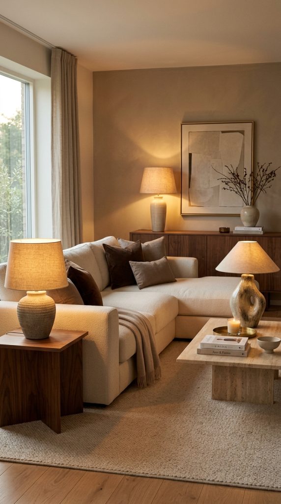
    Table lamps are among the easiest ways to make a home feel warmer and more sophisticated because they introduce light at eye level rather than flooding the entire room from above.

    A single overhead fixture often creates strong illumination from one direction. While that may be practical, it can make a room feel flat. Table lamps introduce smaller, softer pools of light that create depth across the room.

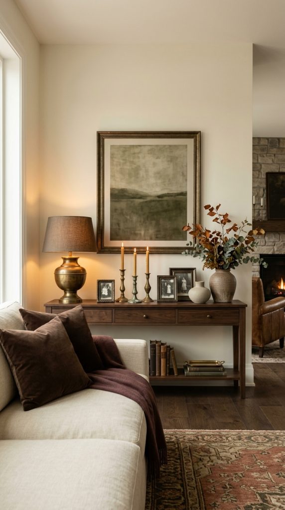
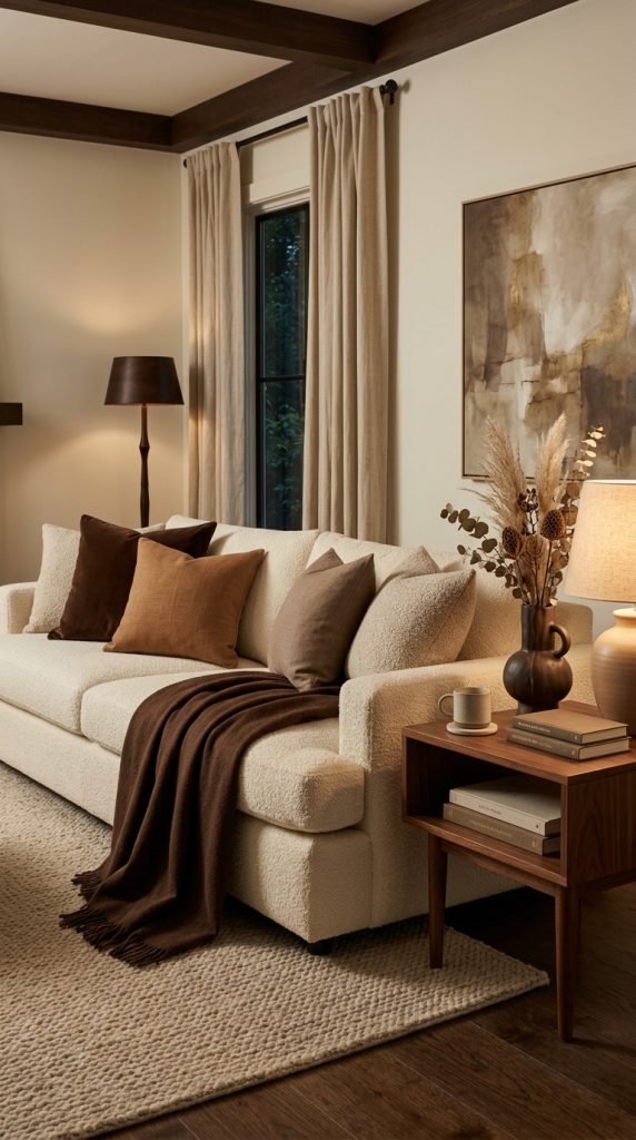
    In a living room, consider placing one lamp on a side table beside the sofa and another on a console positioned farther away. The two lamps do not need to be identical. In fact, slightly different shapes can make the arrangement feel more collected and personal.

    For a classic luxury look, choose lamps with ceramic, stone, wood, glass, or metal bases and pair them with fabric shades. Linen shades are particularly useful because they soften the light while adding subtle texture.

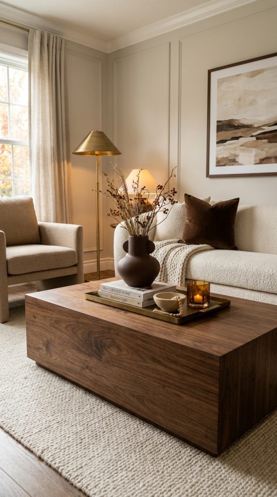
    A cream ceramic lamp with a warm linen shade can look beautiful on a walnut side table. If the room contains brass details, an aged-brass lamp can repeat that finish without making the space feel overly metallic.

    Scale matters.

    A tiny lamp on a large side table can look lost, while an oversized lamp on a narrow table may feel unbalanced. Choose a lamp that has enough visual presence to relate to the surrounding furniture.

    You can also use lamps to balance architectural features.

    For example, if one side of your living room has a tall bookshelf, a substantial table lamp on the opposite side can help distribute visual weight.

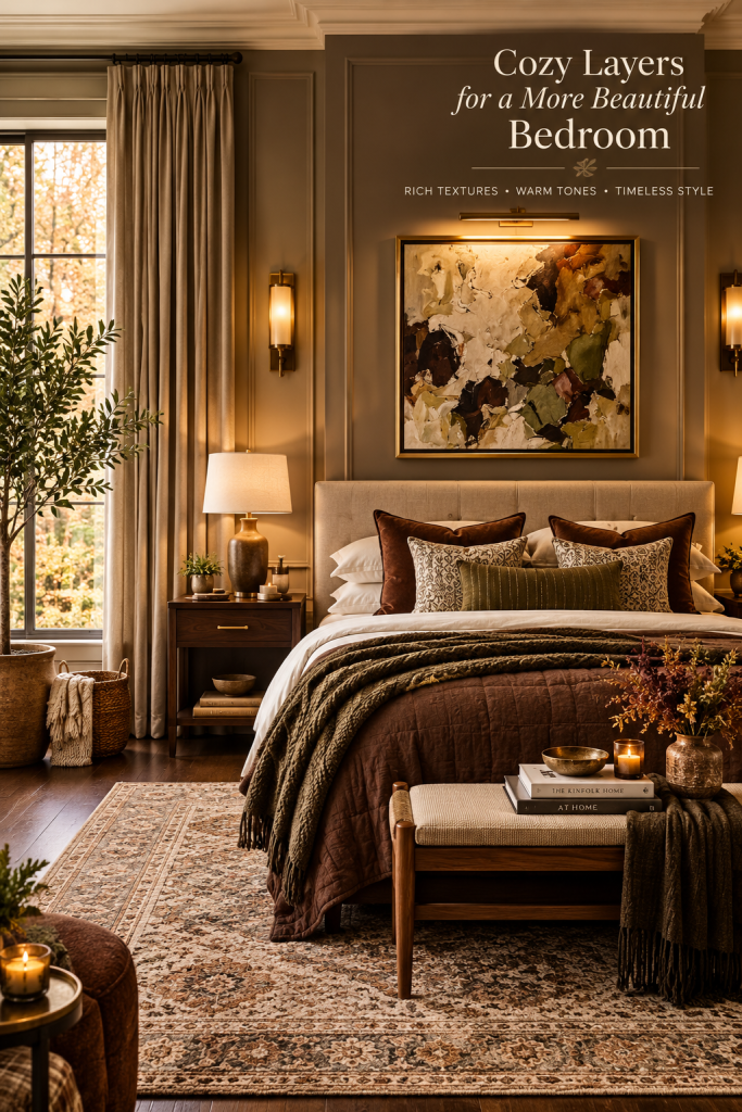
    In a bedroom, bedside lamps provide both atmosphere and practical illumination. Rather than relying entirely on ceiling lighting, use warm bedside lamps to create a relaxing environment in the evening.

    A pair of lamps can create symmetry around the bed, while a single lamp can work beautifully in a more asymmetrical arrangement.

    For a sophisticated contemporary home, do not feel obligated to match every lamp. Repeating the same material or color is often enough to create cohesion.

    For example, one lamp might have a stone base while another uses aged brass, but both could have warm cream shades.

    The result is more relaxed and sophisticated than purchasing an identical set for every room.

    Current lighting trends also emphasize personality and individuality, with designers increasingly treating lamps as decorative objects rather than purely functional products.

    When selecting table lamps, consider the quality of the light as carefully as the appearance. Warm, diffused illumination generally creates a more inviting evening atmosphere than harsh, cool light.

    Use table lamps to illuminate areas where people actually spend time: beside sofas, chairs, beds, desks, consoles, and reading areas.

    The goal is to create multiple gentle points of illumination that make the room feel naturally welcoming.

    2. Make a Sculptural Chandelier the Roomโ€™s Focal Point

    A chandelier can completely change the personality of a room.

    Instead of viewing a chandelier simply as a source of overhead illumination, treat it as a major architectural and decorative element.

    Current 2026 lighting trends are strongly emphasizing sculptural lighting, with statement fixtures increasingly being used as functional art and focal points.

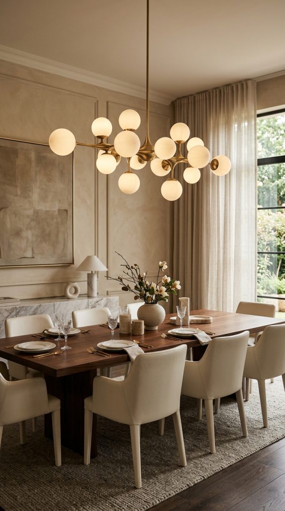
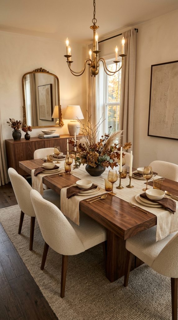
    For a luxurious dining room, a sculptural chandelier positioned above the table can establish the entire design direction.

    Choose a fixture with a silhouette that complements the room.

    Soft curved shapes work beautifully in rooms containing rounded furniture, while linear or geometric fixtures can complement contemporary architecture.

    Materials also influence the mood.

    Brushed brass creates warmth.

    Aged bronze feels historic and sophisticated.

    Opal glass creates softness.

    Smoked glass produces a moodier atmosphere.

    Natural materials can create a more organic feeling.

    If the dining table is made from dark walnut, a warm brass or soft-glass chandelier can provide beautiful contrast.

    If the room already contains many metallic elements, consider a plaster, ceramic, or fabric fixture instead.

    The chandelier should not compete with every other feature in the room.

    If you choose a dramatic chandelier, simplify some of the surrounding decor.

    This creates visual hierarchy.

    The dining table can then remain relatively understated, allowing the chandelier to become the focal point.

    A sculptural chandelier also works beautifully in an entryway.

    A double-height foyer can accommodate a larger installation, while a standard-height hallway may benefit from a smaller but visually distinctive pendant.

    In a bedroom, a sculptural ceiling fixture can replace a traditional central light and create a more intimate boutique-hotel feeling.

    However, proportion is extremely important.

    An oversized fixture can look spectacular in a large room but overwhelming in a small one. Before purchasing, consider the width of the room, ceiling height, furniture scale, and the amount of visual space around the fixture.

    The chandelier should feel substantial without making the ceiling appear crowded.

    For an especially luxurious effect, use a dimmable fixture. A chandelier that can become softer in the evening offers much more flexibility than one that always produces the same intensity.

    You can then combine it with lamps and accent lighting rather than expecting the chandelier to illuminate the entire room.

    This creates a more layered and atmospheric result.

    3. Use Alabaster Lighting for an Elegant Diffused Glow
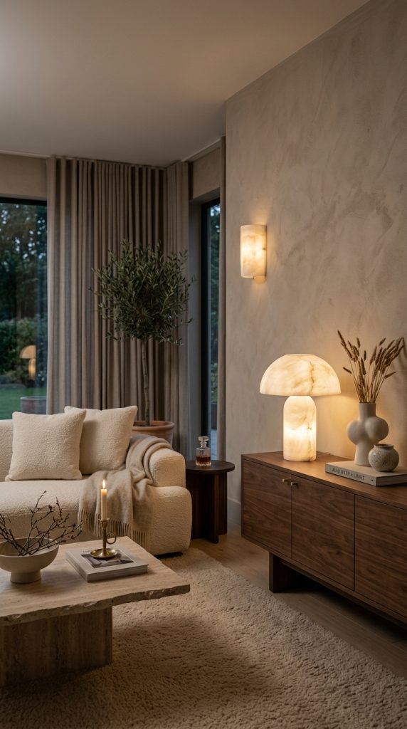
    Alabaster lighting is an excellent choice when you want your home to feel luxurious without appearing overly flashy.

    Alabaster is a natural stone with a translucent quality that allows light to pass through softly. Current 2026 lighting coverage identifies alabaster as an important material because it produces a gentle, diffused glow while adding natural texture and individuality.

    Every piece can have subtle variations in veining, cloudiness, and coloration.

    That natural variation makes alabaster particularly attractive in refined interiors.

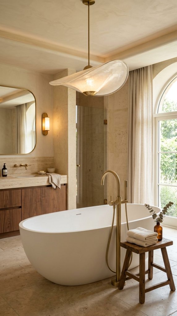
    An alabaster wall sconce can look beautiful beside a bathroom mirror.

    A pair of alabaster lamps can create a sophisticated bedroom arrangement.

    A sculptural alabaster pendant can become the focal point of a dining area.

    Because the stone naturally diffuses light, it can soften the atmosphere of a room without requiring elaborate shades or decorative accessories.

    Pair alabaster with warm wood for an organic luxury aesthetic.

    Walnut furniture, cream upholstery, natural stone, and alabaster lighting can create a calm palette that feels expensive without being showy.

    You can also combine alabaster with brass.

    A warm brass frame around a glowing alabaster shade creates a timeless combination that works in traditional, transitional, and contemporary interiors.

    In a bathroom, alabaster sconces can create a spa-like atmosphere.

    In a hallway, a small alabaster wall light can transform an otherwise overlooked passage.

    In a living room, an alabaster table lamp can add a soft glow to a dark console.

    The important thing is not to use alabaster everywhere.

    One or two carefully chosen fixtures can have greater impact than filling every room with the same material.

    Because alabaster has natural variation, it also works beautifully with other imperfect materials.

    Pair it with handmade ceramics, aged wood, linen, and brushed metals.

    The combination feels collected rather than mass-produced.

    For a warm luxury home, this is one of the easiest ways to introduce natural material and soft illumination at the same time.

    4. Create a Cozy Reading Corner With a Statement Floor Lamp
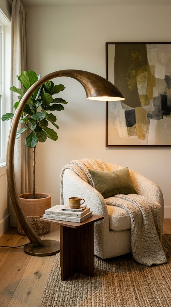
    A floor lamp can turn an unused corner into one of the most inviting areas of your home.

    Rather than choosing a floor lamp only for its practical function, look for one with an interesting silhouette.

    A curved floor lamp can extend elegantly over a lounge chair.

    A sculptural tripod lamp can add architectural interest.

    A tall ceramic lamp can bring an artistic quality to a reading nook.

    A simple linen-shaded floor lamp can create a softer traditional look.

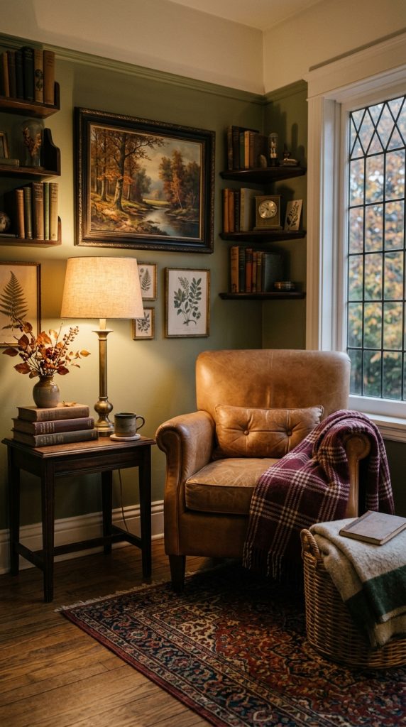
    For a sophisticated reading corner, start with a comfortable chair.

    Bouclรฉ, linen, velvet, leather, or textured upholstery can work beautifully.

    Place a small side table beside it.

    Then add a floor lamp positioned so the light reaches the reading area without shining directly into the eyes.

    A small stack of books and a folded throw can complete the space.

    You do not need many decorative objects.

    The light itself should create much of the visual interest.

    A reading corner is also an excellent place to introduce a slightly unexpected lighting design.

    For example, an oversized curved lamp can contrast with a traditional chair.

    A vintage-style lamp can add personality to a contemporary room.

    A ceramic lamp can soften a room filled with straight architectural lines.

    Current 2026 lighting design is moving toward more expressive silhouettes and lighting fixtures that behave like sculpture rather than disappearing into the background.

    This makes a statement floor lamp particularly useful for creating a luxury editorial look.

    Consider the lamp’s proportions carefully.

    If your chair is small, an enormous floor lamp may dominate the corner.

    If the room has tall ceilings and large furniture, a tiny lamp may disappear.

    The ideal fixture should feel visually connected to the chair, table, artwork, and surrounding architecture.

    Warm illumination is especially important here.

    A reading corner should feel inviting, not clinical.

    Choose a warm light source and, when possible, use a dimmer so the brightness can be adjusted depending on the time of day.

    During the evening, the reading corner can become a quiet glowing zone within the larger room.

    This creates the type of layered atmosphere associated with high-end interiors.

    5. Add Decorative Wall Sconces for Sophisticated Ambience
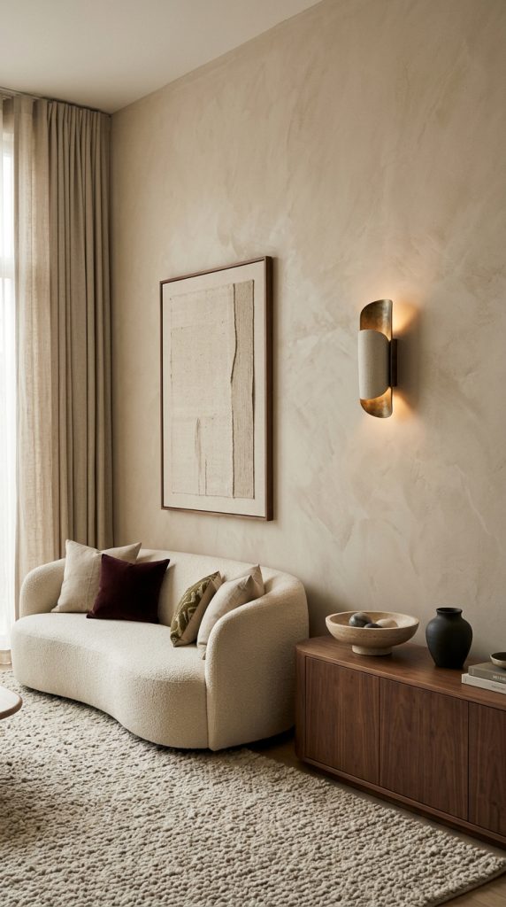
    Wall sconces are one of the most effective ways to introduce lighting without taking up valuable floor or table space.

    They are particularly useful in bedrooms, hallways, bathrooms, living rooms, dining rooms, and entryways.

    A pair of sconces placed beside a mirror can create symmetry and provide functional illumination.

    But you do not always need to use them symmetrically.

    Current 2026 lighting coverage is also highlighting asymmetrical arrangements, including fixtures intentionally positioned off-center for a more unexpected appearance.

    This can be particularly effective in contemporary homes.

    For example, instead of placing two sconces on either side of a piece of artwork, you could use one sculptural sconce beside it and allow the artwork to occupy the remaining visual space.

    The result feels less predictable.

    For traditional interiors, choose sconces with linen shades, aged brass, bronze, or classic silhouettes.

    For modern interiors, consider plaster, ceramic, smoked glass, or minimalist metal.

    For organic modern spaces, natural stone and textured ceramic can create a beautiful connection with wood furniture.

    Sconces can also help create vertical rhythm.

    A long hallway with several carefully spaced wall lights can become a design feature rather than simply a route between rooms.

    The light can wash across textured walls, artwork, or architectural details.

    In a living room, sconces can frame a fireplace.

    In a bedroom, they can replace bulky bedside lamps.

    In a dining room, they can provide soft side illumination while a chandelier handles the central focal point.

    The placement should always consider both function and visual balance.

    Install fixtures at appropriate heights for their intended use and follow electrical and building requirements.

    If hardwiring is not practical, plug-in sconces can sometimes provide a similar decorative effect without major renovation.

    For a luxury look, conceal visible cords whenever possible and select fixtures that complement the home’s architecture.

    Wall sconces are especially effective when paired with warm paint colors, natural wood, textured plaster, or stone.

    Their light can reveal subtle variations in the surface that disappear under flat overhead lighting.

    6. Use Warm Brass and Aged Bronze Lighting for Timeless Luxury
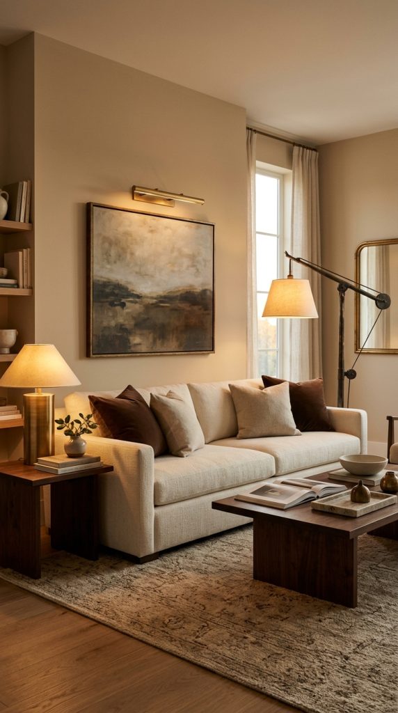
    Metal finishes have a major influence on the perceived warmth of lighting.

    If your goal is a luxurious home, brushed brass and aged bronze are especially versatile.

    Unlike highly polished chrome, warmer metals tend to complement cream, beige, brown, walnut, olive, burgundy, and natural stone.

    Current 2026 lighting coverage points toward warmer muted metals such as brushed brass and aged bronze, often paired with glass, stone, ceramic, leather, or plaster.

    Brass does not have to mean shiny or glamorous.

    A brushed finish can feel understated and sophisticated.

    Aged brass introduces more character.

    Bronze can create a deeper, moodier appearance.

    Use these finishes through pendants, sconces, table lamps, chandeliers, picture lights, and floor lamps.

    The best result usually comes from repetition rather than complete matching.

    For example, a brass chandelier in the dining room can be echoed by a small brass table lamp in the adjacent living room.

    An aged-bronze floor lamp can connect with bronze hardware elsewhere in the room.

    You can also mix metals.

    A home does not need every metal finish to be identical.

    In fact, current design coverage notes growing interest in mixed metals such as aged brass, pewter, iron, and nickel because variation can add character.

    The key is to make the combination look deliberate.

    If the room contains warm brass lighting, avoid introducing five completely unrelated metal finishes without any visual connection.

    Instead, choose one dominant finish and one supporting finish.

    For example, use aged brass as the main warm metal and matte black as a secondary accent.

    Or use bronze lighting alongside subtle pewter accessories.

    Metal also works differently depending on the room.

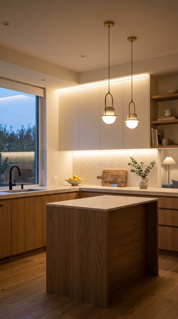
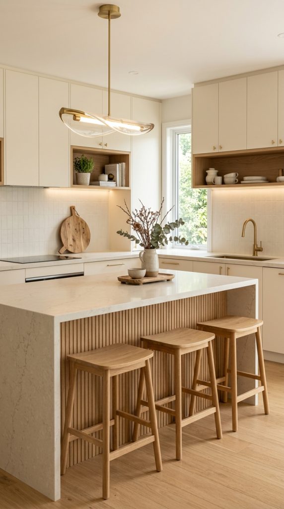
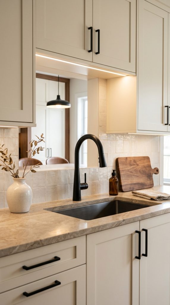
    In a kitchen, brass pendant lights can warm white or cream cabinetry.

    In a bedroom, aged bronze lamps can create a moody atmosphere.

    In a living room, brass sconces can highlight artwork.

    In a bathroom, warm metal lighting can soften cool stone surfaces.

    The result is a home that feels layered and intentional.

    7. Use Pendant Lights to Create an Intimate Dining Atmosphere
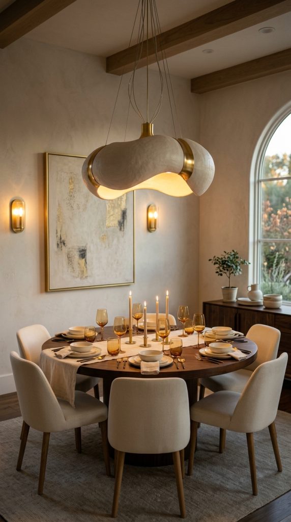
    Pendant lighting is particularly powerful above a dining table because it defines the eating area visually.

    In an open-plan home, a pendant can help separate the dining zone from the kitchen or living room without requiring walls.

    The fixture should relate to the shape of the table.

    A long rectangular table can work well with a linear pendant.

    A round table may look better beneath a centered circular or sculptural fixture.

    For a more dramatic appearance, use several pendants together.

    However, they should be treated as one composition rather than several unrelated objects.

    Glass pendants can create an airy effect.

    Opal glass produces softer illumination.

    Smoked glass adds mood.

    Ceramic pendants introduce handmade texture.

    Fabric shades create a softer, more traditional atmosphere.

    A sculptural metal fixture can create a contemporary focal point.

    Current 2026 lighting trends emphasize statement-making silhouettes and decorative fixtures that function as focal points rather than simply providing utility.

    For a luxurious dining room, combine the pendant with a beautiful table setting.

    Natural linen, stoneware, glassware, candles, and warm wood can reinforce the lighting’s atmosphere.

    Avoid making the pendant compete with an elaborate centerpiece.

    If the fixture is visually strong, keep the table arrangement relatively restrained.

    This creates a more sophisticated composition.

    Dimmers are especially useful above dining tables.

    Bright lighting may be useful when cleaning or preparing food, but a lower setting creates a much more intimate atmosphere during dinner.

    Pendant lighting can also be used beyond dining rooms.

    A sculptural pendant beside a bathtub can create an architectural focal point where electrical safety and local codes permit.

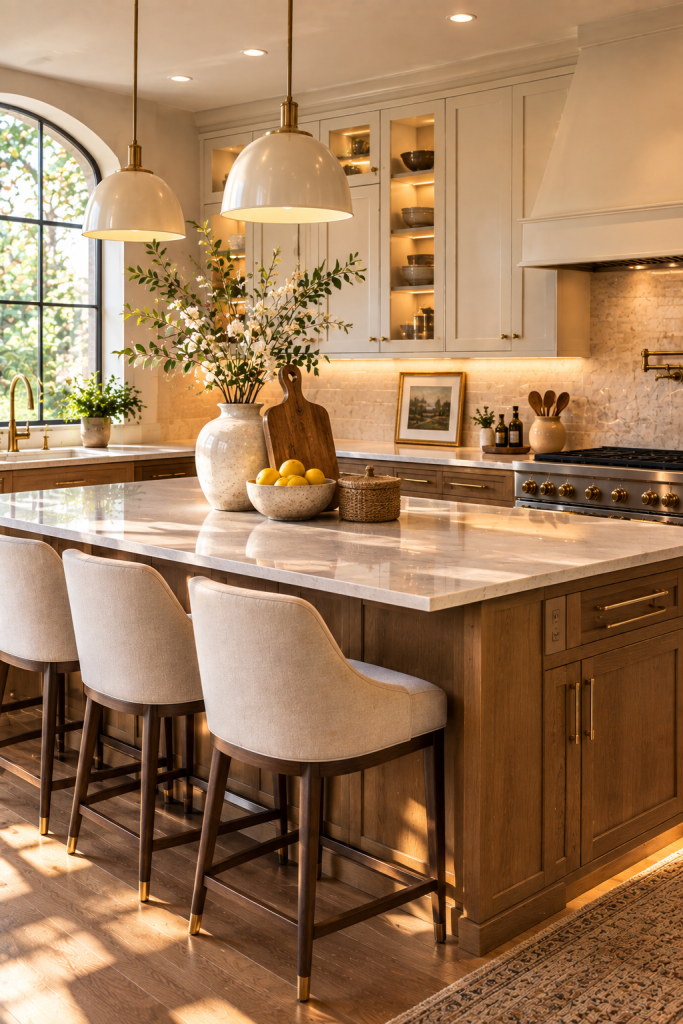
    A pendant above a kitchen island can add personality.

    A small pendant in a bedroom can replace a traditional bedside lamp.

    A pair of pendants in a hallway can create rhythm.

    The important principle is to use the fixture to define the space.

    8. Create a Luxury Bedroom With Beautiful Bedside Lamps

    Bedroom lighting should be calming, comfortable, and functional.

    It is one of the rooms where harsh overhead lighting is least desirable because the atmosphere should encourage relaxation.

    Begin with bedside lamps.

    Choose lamps that are large enough to balance the bed but not so large that they dominate the nightstands.

    Ceramic, alabaster, glass, wood, or brushed brass bases can all create a luxury appearance.

    Fabric shades are especially effective because they soften the light.

    A cream linen shade can create a warm glow against neutral bedding.

    For a richer look, consider a muted taupe, warm beige, or soft brown shade.

    If the bedroom has a dark wood bed, brass or alabaster lamps can provide contrast.

    If the bed is upholstered in cream, darker bronze or walnut lamps can create visual depth.

    Symmetry is particularly effective in bedrooms.

    Two matching bedside lamps can frame the bed and create a hotel-inspired feeling.

    However, a more collected room can use slightly different lamps with similar proportions or materials.

    The surrounding nightstand should not become crowded.

    Leave enough space for practical items.

    One small decorative object, a book, or a ceramic tray may be enough.

    Additional lighting can come from a floor lamp in a seating area or a small wall light near artwork.

    If you have a dressing area, use separate task lighting so the entire room does not need to be brightly illuminated.

    A layered bedroom lighting scheme might therefore include:

    A soft central ceiling fixture for general illumination.

    Bedside lamps for reading and evening atmosphere.

    A floor lamp for a chair.

    Accent lighting for artwork.

    Closet or dressing lighting for practical tasks.

    This creates flexibility.

    You can use only the bedside lamps when relaxing, add the floor lamp while reading, or turn on the full lighting scheme when getting ready.

    The bedroom then becomes a calm environment rather than a room dominated by a single bright fixture.

    9. Use Picture Lights to Highlight Artwork and Architectural Details

    Picture lights are a sophisticated way to draw attention to art.

    They are particularly useful in homes where artwork, photography, architectural details, or decorative wall treatments play an important role.

    Instead of illuminating the entire room, a picture light focuses attention on one specific feature.

    This creates visual hierarchy.

    For example, a large abstract painting above a console can become a focal point when illuminated from above.

    A vintage landscape can receive a warmer glow from a small brass picture light.

    A gallery wall can use carefully positioned accent lighting to create depth.

    Picture lights can also be used to highlight architectural features.

    A textured plaster wall, stone fireplace, built-in shelving unit, or decorative niche can become more noticeable when softly illuminated.

    This technique is particularly effective in the evening because it creates contrast between illuminated areas and darker surrounding surfaces.

    The room feels more layered.

    For a traditional interior, choose brass or bronze picture lights.

    For a modern home, slim black or minimalist metal fixtures may work better.

    For an organic modern room, aged brass or natural-toned finishes can connect with wood and stone.

    Do not illuminate every piece of artwork.

    Choose the pieces you want to emphasize.

    This is an important principle in luxury interiors: not everything needs equal visual importance.

    If every object is highlighted, nothing feels special.

    Instead, create a hierarchy.

    Perhaps the large painting above the fireplace receives the strongest accent lighting while smaller artworks remain softly visible.

    Picture lights can also create a beautiful effect in hallways.

    A long corridor with selected artwork and subtle lighting can feel like a private gallery.

    This makes transitional spaces part of the design rather than leaving them visually neglected.

    When installing picture lights, consider the artwork’s size, frame, surface, and recommended lighting conditions. Some artwork materials are sensitive to light exposure, so appropriate fixture selection and intensity matter.

    10. Combine Decorative, Ambient, and Accent Lighting for a Complete Luxury Home
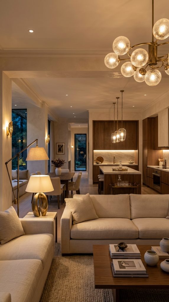
    The final idea is to combine everything into a complete lighting strategy.

    The most sophisticated lighting scheme is rarely based on one type of fixture.

    Instead, different forms of illumination perform different roles.

    Ambient lighting provides overall visibility.

    Task lighting supports activities such as reading, cooking, working, or applying makeup.

    Accent lighting highlights artwork, architecture, shelving, plants, or decorative objects.

    Decorative lighting adds visual personality.

    When these layers work together, the room becomes flexible and atmospheric.

    Consider a living room.

    The ambient layer might be a subtle ceiling fixture.

    The task layer could include a floor lamp beside an armchair.

    The accent layer might illuminate artwork or shelving.

    The decorative layer could consist of sculptural table lamps and a statement chandelier or pendant.

    At night, you may not need all of them switched on.

    Perhaps the ceiling light stays off while the table lamps, floor lamp, and artwork lighting create a softer atmosphere.

    This is what makes a room feel luxurious.

    It is not simply brighter.

    It has more control and depth.

    The same principle works in a kitchen.

    Ambient ceiling lighting provides general visibility.

    Under-cabinet lighting illuminates work surfaces.

    Pendant fixtures define the island.

    Decorative sconces can add character to an adjacent wall.

    In a bathroom, ambient lighting can combine with vanity sconces, backlit mirrors, and accent lighting.

    In a dining room, a chandelier provides the central decorative feature while candles and subtle wall lighting add intimacy.

    In a bedroom, bedside lamps and accent lights can create a calm atmosphere without requiring bright overhead illumination.

    Current 2026 design coverage continues to emphasize layered lighting because combining ambient, task, and accent sources provides greater mood and flexibility than relying on one strong fixture.

    The key is to think about the room at different times of day.

    Ask yourself what the space needs in the morning.

    What does it need in the afternoon?

    What should it feel like after sunset?

    Where should the eye go?

    Where do people read?

    Where do they gather?

    Which architectural features deserve attention?

    Which areas can remain slightly darker?

    These questions will produce a more sophisticated result than simply choosing fixtures based on appearance.

    How to Choose the Right Color Temperature for a Warm Home

    The appearance of a lighting fixture is only part of the equation.

    The color temperature of the light source also affects the atmosphere.

    For living rooms, bedrooms, dining rooms, and other relaxing spaces, warmer light is generally more comfortable.

    A very cool light can make warm wood, cream upholstery, and natural stone appear less inviting.

    For areas that require more visual clarity, such as kitchens or workspaces, the lighting needs may be different.

    The best choice depends on the room, activities, fixture type, and personal preference.

    If you want a consistently warm home, avoid mixing dramatically different light colors within the same visual zone.

    For example, a very cool ceiling fixture combined with extremely warm table lamps can create an uncomfortable mismatch.

    A more coordinated approach allows the room to feel visually connected.

    Dimmability is also extremely valuable.

    A light fixture that can be adjusted provides more flexibility than one fixed at a single intensity.

    Use brighter settings when performing tasks.

    Lower settings can create a relaxing atmosphere in the evening.

    How to Make Decorative Lighting Look More Expensive

    Luxury lighting does not necessarily require the most expensive fixture.

    Proportion is one of the biggest factors.

    A correctly sized lamp can look more sophisticated than a costly lamp that is too small for the furniture.

    Materials also matter.

    Natural stone, ceramic, glass, linen, wood, and aged metals tend to create depth and texture.

    Avoid using too many decorative fixtures in one room.

    Choose one statement piece and allow the surrounding lighting to support it.

    For example, if your chandelier is dramatic, use simpler table lamps.

    If your table lamps are sculptural, keep the ceiling fixture relatively quiet.

    This creates hierarchy.

    Another way to create an expensive-looking result is to hide visual clutter.

    Visible cords can make even beautiful lamps look unfinished.

    Where possible, manage cords carefully and keep surfaces organized.

    The surrounding decor should also support the lighting.

    A beautiful lamp on a crowded table loses some of its impact.

    Give the fixture breathing room.

    Decorative Lighting Ideas for a Small Home

    Small rooms benefit from lighting that adds atmosphere without taking up excessive floor space.

    Wall sconces are particularly useful because they free tables and floors.

    Pendant lights can provide overhead illumination while becoming decorative focal points.

    Small table lamps can add warmth to consoles and shelves.

    Under-cabinet lighting can make a compact kitchen feel more functional.

    Mirrors can also work with lighting.

    A carefully positioned lamp near a mirror can bounce illumination through the room and increase the sense of depth.

    Avoid choosing fixtures solely because they are tiny.

    One well-proportioned statement light can sometimes make a small room feel more designed.

    The key is scale.

    An oversized fixture can become dramatic if the surrounding room is kept simple, while too many small fixtures can make the space feel busy.

    How to Avoid Common Decorative Lighting Mistakes

    One of the most common mistakes is using only overhead lighting.

    This can make a room feel flat and overly bright.

    Another mistake is choosing fixtures that are too small.

    A tiny pendant above a large dining table may disappear visually.

    A small lamp on a large console may look unbalanced.

    Another problem is using too many statement pieces.

    If every light fixture demands attention, the room becomes visually noisy.

    Choose one or two focal fixtures and let the remaining lights support them.

    Avoid placing lights without considering what they illuminate.

    A beautiful fixture that casts an uncomfortable glare is not successful lighting.

    Finally, do not ignore dimming and control options.

    Flexible lighting gives you more ways to use the same room.

    How to Create a Pinterest-Worthy Luxury Lighting Interior

    For Pinterest, lighting needs to be visible in the photograph without making the image too dark.

    A warm room should still have enough exposure to show furniture, textures, and architectural details.

    Choose one strong focal point.

    This might be a sculptural chandelier above a dining table, a glowing alabaster lamp on a console, or a dramatic floor lamp beside a cream chair.

    Use warm ambient lighting throughout the image.

    Avoid excessive decorative objects that distract from the lighting.

    Natural materials photograph beautifully, especially wood, stone, ceramic, linen, glass, and brushed metals.

    For a Pinterest cover, a vertical 2:3 composition works particularly well.

    Keep the image elegant and uncluttered.

    If text is added, use very little.

    A short title such as โ€œLUXURY LIGHTING IDEASโ€ is more visually appealing than covering the photograph with a long paragraph.

    The lighting itself should sell the idea.

    How to Build a Luxury Lighting Plan Room by Room

    A practical way to approach your home is to give each room a lighting hierarchy.

    Living Room

    Use a central decorative fixture, table lamps, a floor lamp, and accent lighting.

    Bedroom

    Use bedside lamps, a soft ceiling fixture, and optional reading or artwork lighting.

    Dining Room

    Use one strong pendant or chandelier and supplement it with candles or subtle wall lighting.

    Kitchen

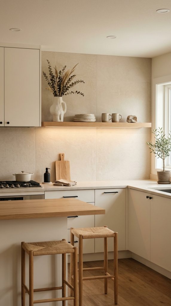
    Combine ceiling illumination, under-cabinet lights, island pendants, and decorative accents.

    Bathroom

    Use vanity lighting, ambient illumination, and carefully selected decorative fixtures suitable for wet environments.

    Entryway

    Use a statement pendant, console lamp, or wall sconces.

    Home Office

    Combine comfortable task lighting with ambient illumination so the room remains pleasant after work hours.

    This approach prevents every room from receiving the exact same lighting treatment.

    Final Thoughts

    Decorative lighting ideas for a warm and luxurious home are ultimately about creating atmosphere, not simply adding more fixtures.

    The most beautiful interiors use light strategically.

    A sculptural chandelier can define a dining room.

    An alabaster lamp can create a soft glow on a console.

    A floor lamp can transform an empty corner into a reading retreat.

    A wall sconce can make artwork feel important.

    A warm brass pendant can bring personality to a kitchen.

    A pair of bedside lamps can make a bedroom feel like a boutique hotel.

    When these elements are combined thoughtfully, lighting becomes part of the architecture and personality of the home.

    The strongest 2026 lighting direction is particularly useful for this approach. Designers are treating lighting increasingly as sculpture, embracing handcrafted and tactile materials, natural stone such as alabaster, ceramic surfaces, warmer metals, and more individual arrangements.

    You do not need to completely renovate your home to achieve the effect.

    Start with one room.

    Identify where the current lighting feels too harsh, too dark, or visually flat.

    Add one beautiful lamp.

    Then consider a second layer.

    Perhaps a floor lamp beside the sofa or a picture light above artwork.

    Over time, these smaller changes can completely transform the atmosphere.

    Remember that luxury does not mean making every corner bright.

    In fact, some of the most inviting rooms contain areas of gentle shadow.

    The objective is balance.

    You want enough illumination to see the room comfortably while allowing certain areas to remain softly subdued.

    Use warm materials, thoughtful proportions, beautiful silhouettes, and varied heights.

    Choose fixtures that complement the architecture rather than competing with it.

    And most importantly, select lighting that makes the home feel good when you are actually living in it.

    A luxurious room should not only photograph beautifully.

    It should feel beautiful at the end of a long day, during a quiet dinner, while reading a book, entertaining guests, or simply relaxing at home.

    That is the real power of decorative lighting.

    It does not merely illuminate your home.

    It creates the atmosphere in which your home is experienced.
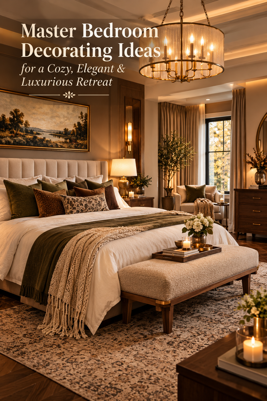

  • Master Bedroom Decorating Ideas for a Cozy, Elegant & Luxurious Retreat

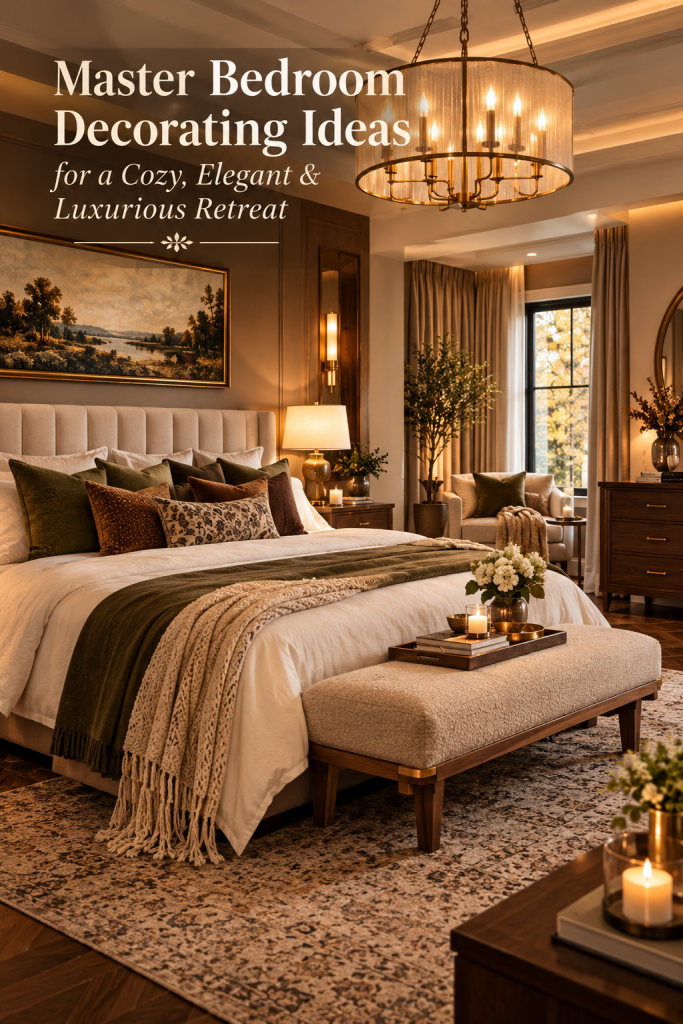
    Master Bedroom Decorating Ideas for a Cozy, Elegant & Luxurious Retreat

    Your master bedroom should feel like more than a place to sleep. It should be a private retreat where you can slow down, relax, recharge, and enjoy a sense of comfort at the end of the day. The most beautiful bedrooms are not necessarily the largest or the most expensive. They are the spaces where furniture, lighting, colors, fabrics, and personal details work together to create an atmosphere that feels welcoming and intentional.

    If you are searching for master bedroom decorating ideas for a cozy, elegant and luxurious retreat, the key is to balance softness with sophistication. A room can look luxurious without feeling formal, and it can feel cozy without becoming cluttered. The goal is to create layers of comfort while keeping the overall design polished.

    Current 2026 bedroom trends are moving toward warmer, more personal interiors rather than overly stark spaces. Designers are highlighting earthy colors, richer textures, layered lighting, natural materials, statement headboards, cocooning layouts, and bedrooms that feel genuinely restorative. (Homes and Gardens)

    This shift is particularly useful when decorating a master bedroom because it allows you to create luxury through atmosphere rather than simply buying expensive furniture. A beautifully layered bed, warm bedside lighting, substantial curtains, natural wood, tactile fabrics, and carefully selected accessories can completely transform an ordinary room.

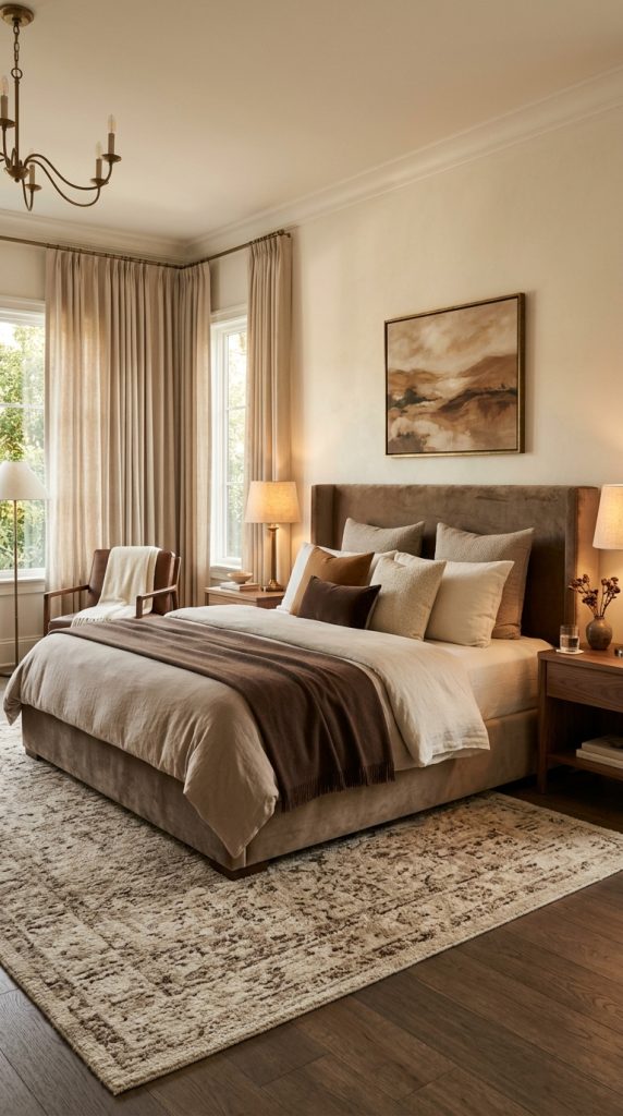
    Color also plays an important role. Cream, taupe, warm beige, chocolate brown, muted olive, soft clay, dusty blue, charcoal, and warm gray can all create an elegant foundation. Deeper colors can make a bedroom feel intimate and cocooning, while lighter neutrals can make it feel airy and spacious. The important part is choosing a palette that feels harmonious rather than filling the room with too many unrelated shades.

    Texture is equally important. A bedroom decorated entirely with smooth surfaces can look flat even when the furniture is expensive. Introducing linen, velvet, boucle, wool, cotton, wood, woven materials, stone, ceramic, and softly finished metals gives the eye different surfaces to discover. Architectural Digest’s 2026 bedroom guidance similarly emphasizes materiality, proportion, layered lighting, tactile textiles, and intentional editing when creating a refined bedroom. (Architectural Digest)

    Lighting can then bring everything together. Instead of depending entirely on one ceiling fixture, use several sources at different heights. Bedside lamps, sconces, floor lamps, concealed lighting, and a decorative pendant can create a much softer atmosphere. Layered lighting is also repeatedly highlighted in current bedroom design guidance because it allows the room to shift from bright and functional during the day to warm and relaxing at night. (HomeLane)

    The following ten master bedroom decorating ideas are designed to help you create that balance. Some ideas focus on major elements such as the bed and walls, while others show how smaller details can create a luxurious finished look. You do not need to use every idea. Instead, choose the elements that fit your room, lifestyle, budget, and personal style.

    1. Create a Statement Bed With an Oversized Upholstered Headboard

    The bed should be the visual anchor of your master bedroom, and one of the easiest ways to make it feel luxurious is to give it a substantial upholstered headboard.

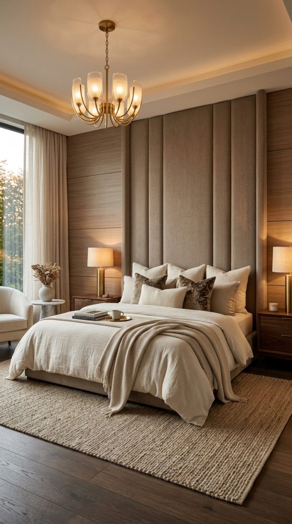
    An oversized headboard instantly adds presence to the room. Instead of allowing the bed to look like an isolated piece of furniture, the headboard creates a strong visual center and gives the wall behind it architectural importance.

    For a cozy elegant bedroom, consider a tall headboard covered in linen, boucle, velvet, cotton, or another tactile fabric. Warm ivory, oatmeal, taupe, mushroom, caramel, soft gray, and muted brown work beautifully when you want a timeless appearance.

    If you prefer a more dramatic bedroom, choose charcoal, deep olive, chocolate brown, navy, or muted burgundy.

    The shape of the headboard matters as well. A simple rectangular design feels contemporary, while curved edges create a softer and more romantic appearance. Vertical channel tufting can introduce subtle architectural detail without requiring complicated wall construction.

    One of the most effective approaches is to make the headboard slightly wider than the mattress. This creates a more substantial visual frame and gives the bed a custom-designed appearance.

    Build a layered luxury bed

    The headboard is only the foundation. The bedding should continue the same sense of softness.

    Start with high-quality-looking neutral sheets. Layer a duvet or quilt over them and add a textured coverlet or folded blanket near the foot of the bed. Finish with a carefully edited collection of pillows.

    Avoid filling the bed with an excessive number of decorative pillows. Instead, use different shapes and textures. Two large sleeping pillows can form the base, followed by two decorative pillows and one long lumbar cushion.

    For example, you could combine:

    • Cream linen bedding
    • A taupe textured coverlet
    • Two oversized ivory pillows
    • One caramel velvet cushion
    • One long boucle lumbar pillow
    • A soft wool throw at the foot

    The result feels luxurious because of the layering rather than because of excessive decoration.

    Make the wall behind the bed part of the design

    If you want the room to feel more custom, extend the headboard concept into the surrounding wall.

    You could use:

    • Upholstered wall panels
    • Vertical wood slats
    • Warm-toned molding
    • Soft textured wallpaper
    • Limewash-style paint
    • Simple panel molding
    • A full-height fabric headboard

    Current bedroom design trends are increasingly embracing padded and enveloping surfaces to create cocoon-like spaces. (ELLE Decor)

    For a sophisticated result, keep the wall treatment and headboard within the same color family. A beige headboard against a slightly deeper taupe wall, for example, creates depth without harsh contrast.

    Add proportionate nightstands

    Large beds require furniture with appropriate scale. Tiny nightstands beside an oversized bed can make the entire arrangement feel unbalanced.
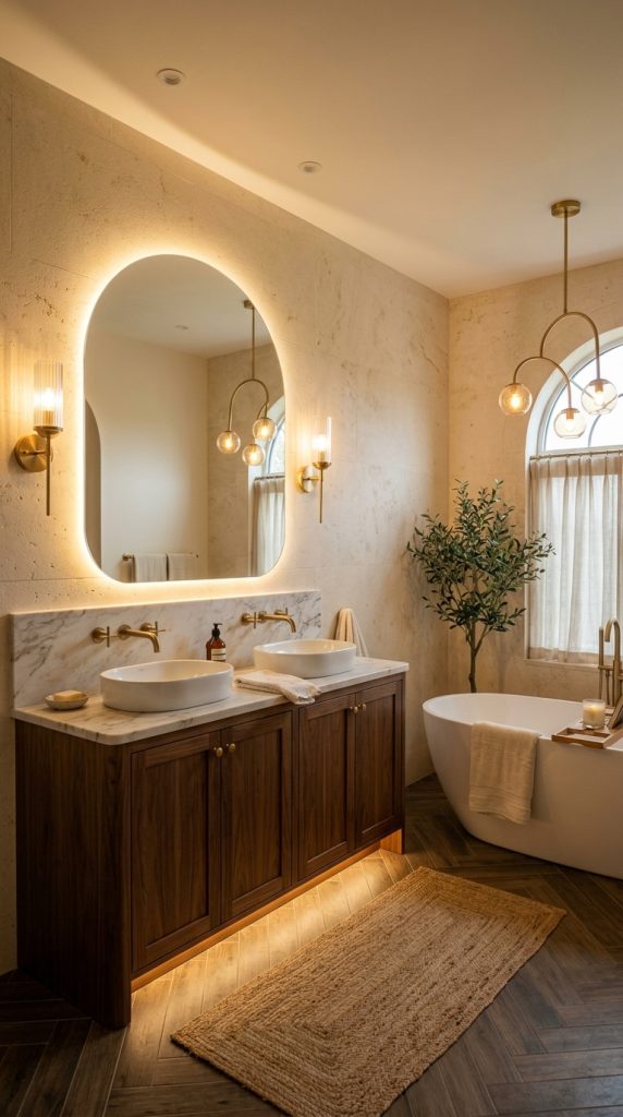
    Choose nightstands that are approximately level with the mattress or slightly below it. Look for substantial materials such as walnut, oak, dark wood, stone, or painted wood.

    Add one beautiful lamp, a small decorative object, and perhaps a book. Avoid turning the nightstand into a storage pile.

    The finished composition should feel intentional from across the room.

    2. Use a Warm, Sophisticated Color Palette

    Color is one of the fastest ways to change the emotional atmosphere of a bedroom.

    For a cozy and luxurious master bedroom, consider moving away from extremely cool whites and building your palette around warmer neutrals and sophisticated earth tones.

    A warm palette can include:

    • Cream
    • Oatmeal
    • Beige
    • Taupe
    • Mushroom
    • Caramel
    • Walnut brown
    • Chocolate
    • Muted olive
    • Clay
    • Dusty rose
    • Warm charcoal

    These colors work especially well because they can be layered without making the bedroom visually chaotic.

    Try tonal decorating

    Tonal decorating means using several shades from the same color family instead of creating strong contrast everywhere.

    Imagine a bedroom using:

    • Warm ivory walls
    • Beige curtains
    • Oatmeal bedding
    • Taupe upholstered bed
    • Walnut nightstands
    • Caramel throw
    • Soft brown rug

    Nothing screams for attention, but the room can still feel rich because every layer contributes to the overall atmosphere.

    This approach is particularly useful for luxury bedrooms because it creates visual continuity.

    Consider a deeper color for a cocoon effect

    If your master bedroom is large enough or receives plenty of natural light, consider using a deeper shade across the walls.

    Chocolate brown, smoky olive, deep blue-gray, charcoal, or warm cocoa can create an intimate atmosphere.

    ELLE Decor’s 2026 bedroom coverage notes the growing use of color-drenched bedrooms, where walls, trim, and sometimes ceilings are unified in a rich color to create an immersive retreat. (ELLE Decor)

    You do not necessarily have to paint every surface. A single deeply colored wall behind the bed can provide a similar effect.

    For a softer appearance, combine the dark wall with cream bedding and warm wood furniture.

    Keep the ceiling in mind

    A common decorating mistake is treating the ceiling as an afterthought.

    In a traditional neutral bedroom, a soft warm-white ceiling can keep the room feeling open. In a more dramatic design, painting the ceiling a related color can create an enveloping effect.

    If your bedroom has beautiful architectural details, a subtle ceiling treatment can make those features feel intentional rather than accidental.

    Use accent colors carefully

    Luxury does not mean avoiding color. It means using color with control.

    Instead of introducing five bright accent colors, choose one or two supporting shades.

    For example:

    Warm neutral bedroom: cream + taupe + walnut + muted brass

    Earthy bedroom: beige + olive + clay + dark wood

    Moody bedroom: chocolate + ivory + burgundy + antique brass

    Soft elegant bedroom: warm white + dusty rose + caramel + walnut

    The fewer competing colors you use, the easier it becomes to create a sophisticated appearance.

    3. Layer Soft Lighting for a Boutique-Hotel Atmosphere

    Lighting can completely change how a master bedroom looks after sunset.

    A beautiful room with harsh overhead lighting can feel ordinary, while a relatively simple room with carefully layered lighting can feel intimate and luxurious.

    Instead of using a single ceiling fixture as your primary light source, create several levels of illumination.

    Start with bedside lighting

    Bedside lamps are one of the most important lighting elements in a master bedroom.

    Choose lamps with warm-toned shades and soft diffusion. Ceramic, alabaster-style, linen, ribbed glass, aged brass, bronze, and wood can all complement an elegant bedroom.

    Place matching lamps on both nightstands if you want symmetry.

    For a more collected appearance, you can use two different lamps that share similar proportions and finishes.

    Add wall sconces

    Wall sconces are especially useful when you want the nightstands to remain uncluttered.

    Mount them on both sides of the bed at a comfortable reading height. Choose fixtures that complement your room rather than overpowering it.

    Brushed brass, aged bronze, matte black, ceramic, and soft glass can work beautifully with warm neutral bedrooms.

    Use a decorative ceiling fixture

    A ceiling fixture can become a sculptural centerpiece.

    Instead of a generic flush-mount light, consider:

    • A soft-glass pendant
    • A sculptural chandelier
    • A woven pendant
    • A linen-shaded fixture
    • A simple brass chandelier
    • A modern organic fixture

    The fixture should be proportional to the room. A huge chandelier in a small bedroom can make the ceiling feel visually heavy.

    Add low-level lighting

    Luxury bedrooms benefit from illumination at different heights.

    A floor lamp beside a reading chair can create a separate pool of light. Concealed LED lighting behind architectural elements can provide a gentle glow. Small accent lights can illuminate artwork or architectural details.

    This creates visual depth because the room is not illuminated uniformly.

    Current bedroom guidance strongly favors layered lighting rather than relying on harsh overhead illumination. (HomeLane)

    Choose warm light

    For a relaxing bedroom atmosphere, warm lighting generally works better than very cool white light.

    Use warm bulbs in bedside lamps and decorative fixtures, and consider dimmable lighting wherever possible.

    The goal is to make the bedroom transition naturally from daytime functionality to evening relaxation.

    4. Add Rich Textures Through Bedding, Curtains, and Rugs

    If you want your master bedroom to feel cozy, texture is essential.

    A room can have beautiful furniture and still feel cold if every surface is smooth and visually flat.

    Texture adds dimension without requiring bold colors.

    Mix bedding materials

    Rather than buying an entire matching bedding set, layer different materials.

    Try:

    • Crisp cotton sheets
    • Washed linen duvet
    • Quilted coverlet
    • Velvet accent pillow
    • Boucle lumbar cushion
    • Knitted throw

    The different textures create depth even when the colors remain neutral.

    The key is to keep the palette controlled.

    Use curtains to soften the room

    Floor-to-ceiling curtains can make a master bedroom feel taller, softer, and more finished.

    Choose fabrics such as linen blends, cotton, velvet, or textured woven materials.

    Hang curtains as close to the ceiling as practical and allow them to fall generously toward the floor.

    For a sophisticated look, select curtains that are slightly deeper or lighter than the wall color rather than introducing a completely unrelated shade.

    Curtain-wrapped bedrooms are also appearing in current design discussions because drapery can soften architectural lines and create a more intimate atmosphere. (Martha Stewart)

    Place a substantial rug underneath the bed

    A rug anchors the bed and makes the room feel more comfortable.

    For a king or queen bed, choose a rug large enough to extend well beyond the sides and foot of the bed.

    If you cannot fit a large rug, consider placing two runners on either side of the bed or using a smaller rug positioned at the lower portion of the bed.

    Choose soft wool, cotton, jute, viscose, or another material appropriate for your lifestyle.

    Do not use only one texture

    A luxurious bedroom should have visual variety.

    Pair:

    • Smooth wood with soft bedding
    • Linen with velvet
    • Woven baskets with polished metal
    • Matte ceramics with glass
    • Plush rugs with crisp curtains

    This contrast makes the room feel layered and sophisticated without needing excessive decoration.

    5. Bring in Warm Wood and Natural Materials

    Natural materials are an excellent way to make a luxury bedroom feel grounded.

    Dark and medium wood tones are especially useful when you want to create warmth.

    Current 2026 bedroom trends are highlighting natural materials, brown furniture, earthy palettes, and more collected interiors. (HomeLane)

    Choose one dominant wood tone

    You do not need every piece of furniture to match perfectly.

    A walnut bed can work with oak accessories. A dark wood dresser can work beside a lighter wood bench.

    However, choose one dominant wood tone so the room still feels cohesive.

    For a luxurious appearance, consider:

    • Walnut
    • Dark oak
    • Smoked oak
    • Warm medium oak
    • Rich mahogany-inspired finishes

    Add natural accessories

    Use a few organic pieces rather than filling the room with decorative objects.

    Consider:

    • A stone vase
    • Hand-finished ceramic bowl
    • Woven basket
    • Wooden tray
    • Marble accessory
    • Linen-covered storage box
    • Small sculptural object

    These details give the bedroom a tactile quality.

    Create a natural-material focal point

    If your room is mostly upholstered furniture, a wooden dresser or substantial wood nightstands can provide contrast.

    If your furniture is mostly wood, introduce softness through upholstered seating and textiles.

    The goal is balance.

    Add one comfortable chair

    If there is enough space, create a small seating area near a window or empty corner.

    A boucle chair, upholstered slipper chair, wooden lounge chair, or compact armchair can turn an unused corner into a functional retreat.

    Place a small side table beside it and add a reading lamp.

    This creates a secondary zone without taking attention away from the bed.

    6. Create an Elegant Seating Area at the Foot of the Bed

    A seating area can make a master bedroom feel significantly more complete.

    If space allows, place a bench at the foot of the bed.

    A long upholstered bench is particularly effective because it visually connects the bed to the rest of the room.

    Choose the right bench

    For an elegant bedroom, consider:

    • Boucle bench
    • Velvet bench
    • Linen bench
    • Upholstered storage bench
    • Wood-and-fabric bench
    • Cane bench

    The bench should be narrower than the width of the bed so that the composition feels balanced.
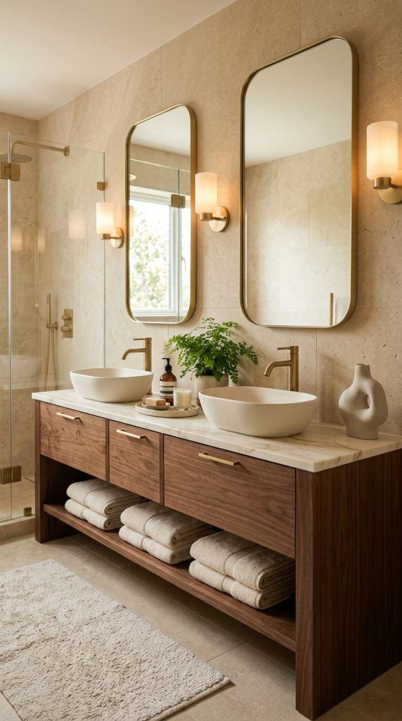
    Make it functional

    A bedroom bench should not exist purely for decoration.

    Use it for:

    • Sitting while getting dressed
    • Placing folded blankets
    • Storing extra pillows
    • Putting on shoes
    • Creating a comfortable pause between the bed and the rest of the room

    A storage bench is particularly helpful in bedrooms where space is limited.

    Add a throw

    Place one carefully folded throw across one side of the bench.

    Avoid covering the entire bench with blankets and pillows.

    The luxury effect comes from restraint.

    Create a conversation corner

    In a larger master bedroom, go beyond a single bench.

    Place two comfortable chairs across from a small round table.

    This can create a private morning coffee area or reading space.

    Use a floor lamp nearby to visually define the zone.

    The furniture should be positioned so that it feels connected to the room but does not interfere with movement around the bed.
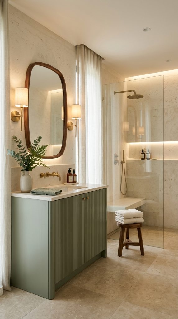
    Pay attention to empty space

    Luxury interiors often feel spacious because they allow furniture to breathe.

    Do not fill every corner simply because you have space.

    An elegant bedroom needs negative space around major furniture pieces.

    7. Use Elegant Wall Treatments to Add Architectural Character

    Walls provide one of the biggest opportunities to make a bedroom feel custom.

    If the room has plain drywall, even a simple wall treatment can add architectural depth.

    Try wall molding

    Traditional panel molding can create an elegant backdrop for the bed.

    Use a monochromatic approach by keeping the molding and wall color similar.

    This creates subtle shadows rather than a high-contrast pattern.

    Consider textured wallpaper

    Wallpaper can bring personality to a master bedroom without requiring large pieces of furniture.

    For a sophisticated appearance, consider:

    • Grasscloth-inspired textures
    • Linen-look wallpaper
    • Soft geometric patterns
    • Botanical designs
    • Subtle stripes
    • Hand-painted-style patterns
    • Tonal damask

    If you prefer a calm bedroom, select a low-contrast design.

    If the furniture is simple, you can allow the wall treatment to become the main decorative feature.

    Create a wood-paneled wall

    Vertical wood paneling can make a ceiling appear taller.

    Warm oak or walnut tones are particularly effective in bedrooms because they immediately introduce warmth.

    You can combine the wood wall with cream bedding and soft lighting for a modern luxury appearance.

    Use color drenching

    For a more dramatic room, paint the walls, trim, and possibly ceiling in a related shade.

    A smoky olive bedroom can feel sophisticated with cream bedding and walnut furniture.

    A chocolate brown bedroom can feel luxurious with ivory textiles and aged brass.

    A deep blue-gray bedroom can become elegant when paired with warm wood and soft beige.

    Color drenching is one of the bedroom directions highlighted by designers for 2026. (ELLE Decor)

    Keep wall art intentional

    Do not cover every available wall.

    One oversized artwork above a dresser may have more impact than six small unrelated pieces.

    Choose artwork that repeats one or two colors already present in the room.

    This creates cohesion without looking overly coordinated.

    8. Design a Calm Luxury Bedroom With Hotel-Inspired Details

    A hotel-inspired bedroom does not mean copying a hotel exactly.

    Instead, borrow the principles that make hotel bedrooms feel comfortable: clear organization, quality-looking bedding, symmetry, soft lighting, layered textures, and minimal visual clutter.

    Current bedroom designers are describing this direction as a move toward calm, cocooning, hotel-like comfort at home. (Homes and Gardens)

    Start with symmetry

    Place matching nightstands on either side of the bed.

    Add similar lamps and keep the visual weight balanced.
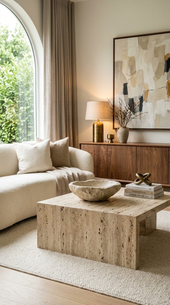
    Symmetry immediately creates a sense of order.

    Hide unnecessary clutter

    Luxury becomes difficult to achieve when chargers, packaging, random cosmetics, clothes, and miscellaneous objects cover every surface.

    Use drawers, baskets, trays, and concealed storage.

    Keep only the things you genuinely need on display.

    Create a beautiful bedside arrangement

    A sophisticated nightstand could contain:

    • One warm lamp
    • One small ceramic object
    • One book
    • One small tray
    • A glass or carafe

    That is enough.

    Upgrade the small details

    Luxury is often communicated through small elements.

    Replace mismatched plastic containers with coordinated storage.

    Use attractive tissue-box covers.

    Choose a beautiful tray for jewelry or perfume.

    Select matching hangers inside the closet.

    Use soft baskets for blankets.

    These details may not be the first thing visitors notice, but together they make the room feel carefully considered.

    Add a subtle scent

    A bedroom should feel pleasant without being overwhelmed by fragrance.

    A light diffuser, natural candle, or linen spray can become part of the evening ritual.

    Choose a subtle scent profile such as:

    • Sandalwood
    • Vanilla
    • Lavender
    • Cedar
    • Bergamot
    • Amber

    Keep fragrance products safely positioned away from fabrics and areas where they could be knocked over.

    9. Create a Moody, Cozy Retreat With Deeper Tones

    Not every luxurious bedroom needs to be pale and bright.

    A darker bedroom can feel exceptionally cozy when its colors and lighting are carefully balanced.
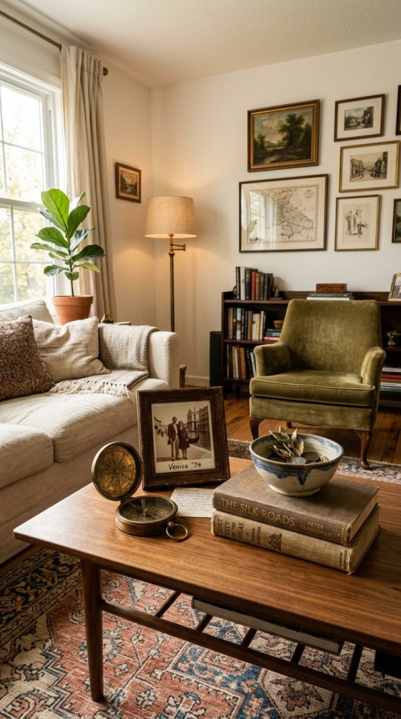
    The key is to create depth rather than darkness.

    Choose a deep base color

    Consider:

    • Chocolate brown
    • Charcoal
    • Deep olive
    • Navy
    • Espresso
    • Warm taupe
    • Blue-gray

    The exact color should respond to the room’s natural light.

    A room with large windows can often support deeper colors more easily than a small room with limited natural light.

    Balance dark walls with lighter bedding

    This is one of the easiest ways to prevent the room from becoming visually heavy.

    Imagine:

    Chocolate walls + ivory bedding + walnut furniture + brass accents.

    Or:

    Deep olive walls + cream bedding + natural oak + aged bronze.

    The contrast keeps the room sophisticated.
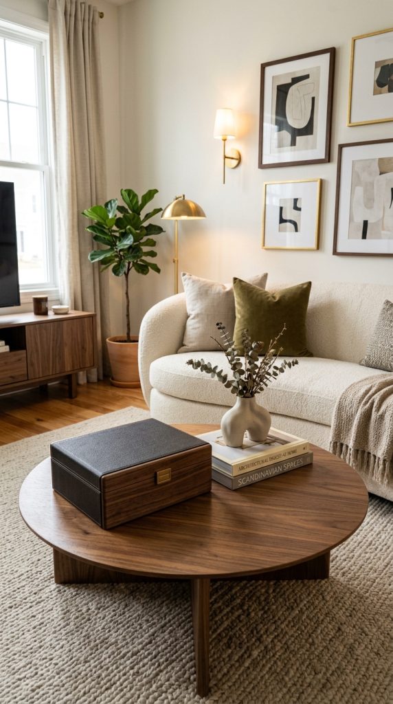
    Use multiple sources of warm light

    Dark colors absorb more visual light, so lighting becomes even more important.

    Place warm lamps beside the bed.
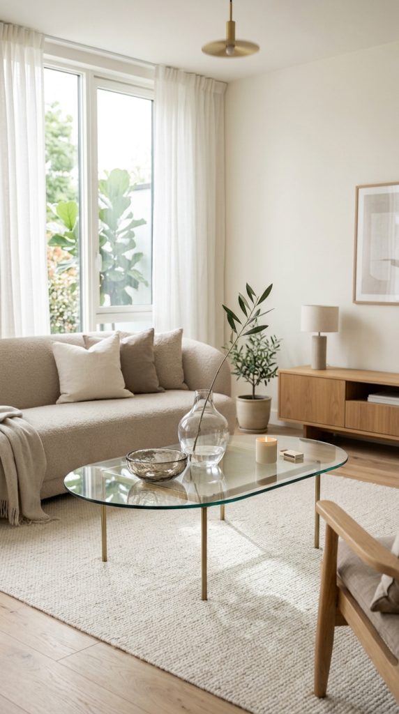
    Add a decorative ceiling fixture.
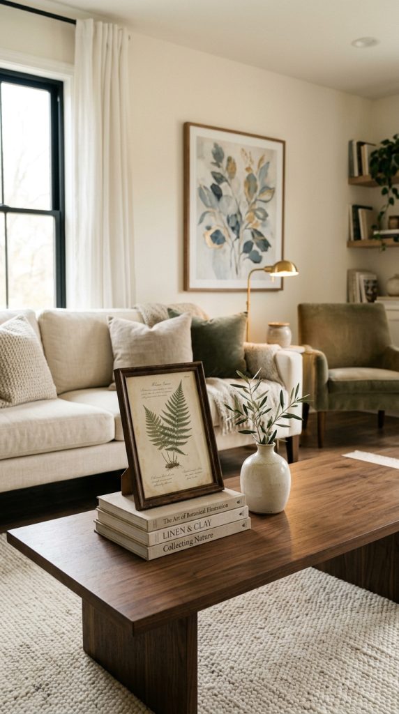
    Use a floor lamp in a seating corner.

    Consider concealed lighting around architectural elements.

    The objective is not to make every corner equally bright. Instead, create several pools of soft illumination.

    Introduce reflective details

    Small reflective surfaces can prevent a moody bedroom from feeling flat.

    Use:

    • Antique brass
    • Aged bronze
    • Smoked glass
    • Antique mirror
    • Polished stone

    Do not overuse shiny finishes.

    A few carefully positioned reflective details are enough.

    Add softness

    Dark rooms benefit from tactile materials.

    Use velvet, linen, wool, boucle, quilted fabrics, and plush rugs to make the space feel inviting.

    The result should feel like a cocoon rather than a cave.

    10. Finish the Room With Thoughtful Luxury Accessories

    Accessories should be the final layer rather than the foundation.

    Once the bed, furniture, lighting, walls, curtains, and rug are working together, add a small number of carefully selected decorative pieces.

    Style the dresser

    Instead of covering the dresser with objects, create one intentional arrangement.

    For example:

    • One oversized mirror
    • One sculptural lamp
    • One ceramic vase
    • One small tray
    • One framed artwork

    Leave some of the surface visible.

    Use mirrors strategically

    A large mirror can make a bedroom feel brighter and more spacious.

    Place one above a dresser or against a wall where it can reflect natural light.

    For a luxury appearance, consider an arched, oversized, antique-inspired, or subtly framed mirror.

    Add greenery selectively

    One beautiful plant can soften a bedroom.

    Choose plants appropriate for your home’s light and maintenance conditions.

    If you do not want living plants, dried branches or understated botanical arrangements can provide a similar sculptural effect.

    Avoid placing small plants everywhere. One substantial plant often has more visual impact.

    Add meaningful objects

    A master bedroom should feel personal.

    Display:

    • A favorite photograph
    • A travel souvenir
    • A meaningful book
    • A family heirloom
    • A handmade ceramic piece
    • A vintage object
    • A piece of artwork you genuinely love

    Current design coverage is also emphasizing bedrooms that feel collected and personal rather than as though every item was purchased at the same time. (Good Housekeeping)

    Keep accessories connected to your palette

    If your room is cream, taupe, walnut, and brass, avoid suddenly introducing bright red, cobalt blue, neon green, and orange accessories.

    Instead, choose pieces that repeat existing colors.

    This makes the room look curated.

    How to Make a Master Bedroom Look Expensive on a Budget

    You do not need a complete renovation to make your bedroom look luxurious.

    Start with the elements that have the biggest visual impact.

    Upgrade the bedding first

    A beautifully layered bed can transform the entire room.

    Instead of buying numerous decorative items, invest in good-looking bedding and add texture through blankets and pillows.

    Improve the lighting

    Replace a harsh overhead bulb with warm, layered lighting.

    Even inexpensive lamps can look sophisticated when their proportions, placement, and shades are carefully chosen.

    Use large-scale curtains

    Full-length curtains can make a room feel taller and more finished.

    Hang them high and allow them to extend toward the floor.

    Declutter aggressively

    A clean room often looks more expensive than a room filled with decorative objects.

    Clear unnecessary items from:

    • Nightstands
    • Dresser tops
    • Chairs
    • Floor areas
    • Open shelving

    Introduce one substantial statement

    Instead of buying ten small decorations, choose one impressive feature.

    It could be:

    • An oversized headboard
    • Large artwork
    • Sculptural light
    • Statement mirror
    • Beautiful rug
    • Elegant dresser

    One strong focal point creates more impact than many unrelated accessories.

    Master Bedroom Decorating Ideas for Small Rooms

    A smaller bedroom can still feel luxurious.

    The key is to control scale and visual clutter.

    Choose furniture with clean silhouettes rather than extremely bulky pieces.

    Use a tall upholstered headboard to create vertical emphasis.

    Keep the color palette relatively controlled.

    Use mirrors strategically.

    Choose wall-mounted sconces instead of large table lamps when nightstand space is limited.

    Use under-bed storage where appropriate.

    A storage bench at the foot of the bed can provide both seating and hidden organization.

    Avoid placing furniture in front of walking paths.

    The goal is to create a bedroom where every piece has a clear purpose.

    Master Bedroom Decorating Ideas for Large Rooms

    Large bedrooms require a different approach.

    The challenge is often making the room feel cozy rather than empty.

    Use furniture to establish zones.

    You can create:

    • A sleeping zone
    • A reading area
    • A dressing area
    • A small seating area
    • A vanity zone

    A large rug can visually connect the primary furniture.

    A substantial bed and oversized headboard can provide the necessary focal point.

    Large artwork can prevent expansive walls from feeling unfinished.

    Layered curtains can add softness to large windows.

    Do not attempt to fill every empty space. Instead, allow certain areas to remain open so the room retains a sense of luxury.

    How to Choose the Right Master Bedroom Color Scheme

    Before buying anything, select your color palette.

    A simple formula is:

    60% dominant color + 30% supporting color + 10% accent color.

    For example:

    Warm Luxury:
    60% cream and ivory
    30% walnut and taupe
    10% antique brass

    Earthy Retreat:
    60% warm beige
    30% olive and brown
    10% clay

    Moody Luxury:
    60% chocolate brown
    30% cream
    10% aged brass

    Soft Elegant:
    60% warm white
    30% taupe
    10% dusty rose

    This makes decorating much easier because every purchase can be evaluated against the palette.

    How to Make Your Bedroom Feel Cozy Without Looking Cluttered

    Cozy does not mean crowded.

    This distinction is extremely important.

    Use texture instead of excessive objects.

    Use a thick rug instead of multiple small rugs.

    Use layered bedding instead of dozens of pillows.

    Use one large artwork instead of many tiny frames.

    Use a substantial lamp instead of several small decorative lights.

    Use curtains to soften the windows.

    Use baskets to organize necessary items.

    Keep the floor mostly clear.

    The room should feel comfortable and welcoming while still allowing the eye to rest.

    Common Master Bedroom Decorating Mistakes to Avoid

    Choosing furniture that is too large

    Always consider walking space before buying a statement bed, dresser, or seating piece.

    Using only one light source

    A single ceiling light rarely creates the warm atmosphere associated with a luxury bedroom.

    Making everything match perfectly

    A completely matching bedroom set can feel less personal.

    Mix materials and finishes while keeping the overall palette connected.

    Using too many decorative pillows

    Pillows should enhance the bed rather than make it difficult to use.

    Ignoring the windows

    Window treatments have a major effect on the finished appearance.

    Using too many colors

    Choose a controlled palette and repeat the colors throughout the room.

    Filling every surface

    Negative space is part of sophisticated design.

    Forgetting functionality

    A bedroom should be beautiful but also practical.

    Make sure there is comfortable access to storage, lighting, outlets, wardrobes, and walking paths.

    Using cold lighting

    Very cool lighting can undermine a warm bedroom palette.

    Use warm, adjustable illumination where possible.

    A Simple Formula for a Cozy, Elegant and Luxurious Master Bedroom

    If you want an easy starting point, build the room in this order:

    1. Choose the mood.
    Decide whether you want warm neutral, earthy, moody, modern, classic, or romantic.

    2. Select the main color palette.
    Choose two or three major colors and one subtle accent.

    3. Make the bed the focal point.
    Use a substantial headboard and beautifully layered bedding.

    4. Add appropriate furniture.
    Choose nightstands, dresser, bench, and seating according to the room’s proportions.

    5. Add window treatments.
    Use full-length curtains to soften the room.

    6. Anchor the furniture with a rug.
    Choose a size that works with the bed and surrounding furniture.

    7. Layer the lighting.
    Combine bedside, overhead, accent, and task lighting.

    8. Introduce natural materials.
    Add wood, stone, ceramic, linen, or woven pieces.

    9. Add wall character.
    Consider molding, wallpaper, paneling, artwork, or color drenching.

    10. Edit the accessories.
    Keep only the pieces that contribute to the atmosphere or have personal meaning.

    This approach prevents the room from becoming a collection of random purchases.

    Final Thoughts

    The most beautiful master bedrooms are not necessarily the ones with the most expensive furniture or the largest spaces. They are the rooms where every element contributes to a particular feeling.

    A cozy, elegant and luxurious retreat begins with a comfortable bed and grows through thoughtful layers. A substantial upholstered headboard creates a focal point. Warm colors establish atmosphere. Natural wood adds grounding character. Soft bedding creates comfort. Curtains bring softness. A well-sized rug anchors the room. Layered lighting transforms the mood after sunset. Finally, carefully selected accessories give the bedroom personality.

    The 2026 design direction toward warmer, more tactile and personal bedrooms makes this approach particularly relevant. Designers are increasingly emphasizing cocooning spaces, earthy palettes, tactile fabrics, natural materials, layered lighting, and rooms that feel connected to the people who use them. (Homes and Gardens)

    You do not need to copy a showroom or recreate a five-star hotel exactly. Instead, take the elements that make those spaces feel special and translate them into your own home.

    Choose colors that make you feel relaxed. Select fabrics you enjoy touching. Use lighting that creates a peaceful evening atmosphere. Keep clutter under control. Mix timeless furniture with personal pieces. Give the bed enough visual importance to anchor the room, but leave enough negative space for the bedroom to breathe.

    Most importantly, remember that luxury is not only about appearance. A truly successful master bedroom should be comfortable enough to live in every day.

    When soft textures, warm lighting, beautiful proportions, natural materials, and meaningful details come together, an ordinary bedroom can become a private retreat that feels cozy in the evening, elegant during the day, and luxurious without feeling excessive.


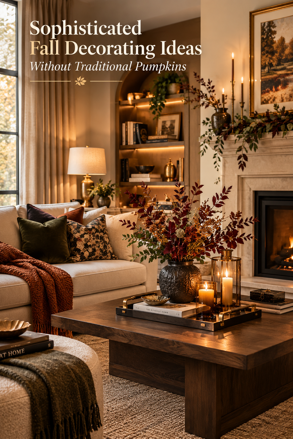
  • Sophisticated Fall Decorating Ideas Without Traditional Pumpkins

    Sophisticated Fall Decorating Ideas Without Traditional Pumpkins

    Sophisticated fall decorating ideas without pumpkins are perfect for creating a warm, elegant home that feels unmistakably autumnal without relying on traditional orange pumpkins, jack-o’-lanterns, or heavily themed accessories. Instead of filling every room with obvious seasonal decorations, you can bring the beauty of fall indoors through rich colors, natural materials, layered textures, warm lighting, dried botanicals, vintage accents, and carefully selected decorative pieces.

    The most beautiful fall interiors do not always announce the season immediately. Sometimes, the feeling comes from a chocolate-brown throw casually placed over a cream sofa, a bowl of seasonal pears on a dining table, dried branches arranged in an aged ceramic vase, or a deep burgundy cushion that changes the mood of an otherwise neutral room. These subtle details create warmth while allowing the existing design of your home to remain visible.

    For 2026, interior design coverage is placing increasing emphasis on warm woods, earthy colors, natural materials, tactile surfaces, layered interiors, aged metals, vintage character, and spaces that feel collected rather than overly decorated. (Houzz) That makes a pumpkin-free approach especially useful if you want your autumn decor to look sophisticated, timeless, and appropriate for the entire season.

    Choosing fall decorating ideas without traditional pumpkins does not mean removing all seasonal personality. It means translating autumn into a more refined visual language. Think deep chocolate brown instead of bright orange, burgundy instead of vivid red, olive instead of artificial green, antique brass instead of glittery metallics, and natural wood instead of plastic seasonal accessories.

    This approach is also ideal for people who prefer neutral home decor, modern interiors, organic modern spaces, luxury decorating, minimalist rooms, or vintage-inspired homes. Rather than forcing a traditional fall theme into a room, you can work with the colors and materials already present and introduce just enough seasonal character to make the space feel warmer.

    Another advantage is longevity. A pumpkin-shaped decoration may immediately communicate October or November, but a beautiful walnut bowl, linen throw, antique brass lamp, dried floral arrangement, or burgundy velvet pillow can remain useful long after the season ends. This makes sophisticated autumn decorating more practical, particularly when you want your home to feel elevated without constantly changing every accessory.

    The following sophisticated fall decorating ideas without traditional pumpkins focus on creating that cozy seasonal atmosphere through color, texture, materials, lighting, natural elements, and thoughtful styling. Each idea can stand alone, or you can combine several throughout your home for a cohesive autumn transformation.

    1. Create a Chocolate Brown and Cream Fall Living Room

    Chocolate brown is one of the easiest colors to use when you want your living room to feel distinctly autumnal without adding pumpkins. Current 2026 fall color coverage highlights chocolate and espresso browns as important grounding shades, making them especially useful for sophisticated seasonal interiors. (Homes and Gardens)

    Start with a warm cream sofa or existing neutral seating and introduce chocolate brown through textiles. A deep brown throw can be folded over the arm of the sofa, while two or three cushions in different brown textures create visual depth.

    The key is not to make everything brown. Instead, use cream as the light foundation and chocolate as the grounding accent.

    A walnut or dark-oak coffee table works beautifully with this palette. Add a simple stone bowl, a stack of neutral coffee-table books, and one sculptural ceramic object. Avoid filling the surface with small seasonal accessories.

    For additional warmth, choose a rug containing cream, espresso, taupe, or subtle rust. The rug can quietly establish the entire fall color story without requiring seasonal motifs.

    Lighting is equally important. Replace harsh overhead illumination with warm table lamps, floor lamps, or softly glowing accent lights. A room with rich brown textiles and warm lighting immediately feels more intimate.

    You can also introduce a small amount of aged brass through a lamp base, picture frame, or candleholder. The metallic accent prevents the brown palette from becoming visually heavy.

    For a polished result, keep the color distribution intentional. Cream should remain the dominant light tone, chocolate should create depth, and brass or muted rust should appear only in small amounts.

    The finished room should feel like a sophisticated autumn retreat rather than a themed seasonal display.

    2. Decorate With Dried Branches and Autumn Botanicals

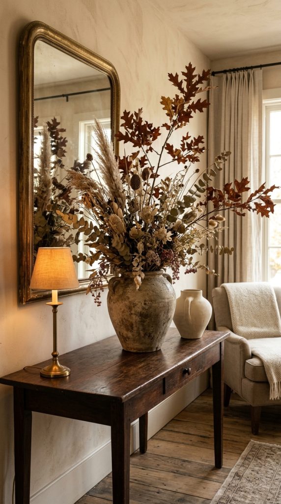
    Dried botanicals offer one of the strongest ways to create fall atmosphere without using pumpkins. Designers discussing 2026 fall decor are highlighting dried hydrangeas, eucalyptus, baby’s breath, branches, and other botanical arrangements because they naturally introduce autumnal color and texture. (Martha Stewart)

    Instead of using a small vase filled with artificial orange leaves, choose one substantial arrangement.

    A tall ceramic vase or antique-style urn can hold long dried branches in muted brown, beige, dusty burgundy, or soft tan. Place the arrangement on a console, dining table, fireplace mantel, or entryway table.

    The arrangement should have movement. Avoid making every stem perfectly symmetrical.

    Some of the most beautiful dried arrangements have an intentionally relaxed appearance. A few branches can extend higher than the others, while smaller stems create volume around the center.

    Choose a vessel with personality. Handmade ceramic, aged stone, vintage glass, or weathered terracotta can make even inexpensive dried branches appear more luxurious.

    If your room is small, create a lower arrangement instead. A wide ceramic bowl filled with dried leaves and grasses can provide seasonal texture without taking up too much vertical space.

    Another option is to use dried botanical stems in two different locations rather than creating one enormous display. For example, use a large arrangement in the living room and a smaller matching arrangement on the dining table.

    Keep the color palette restrained. Beige, brown, muted olive, dusty burgundy, and warm cream will generally look more sophisticated than highly saturated artificial colors.

    This approach also allows the arrangement to remain in place for several months, making it more practical than highly specific seasonal decorations.

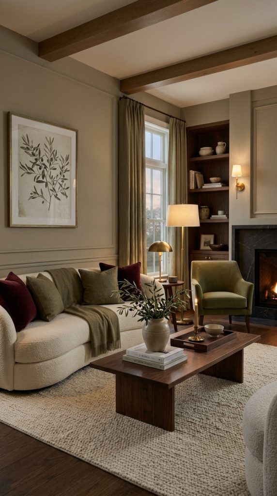
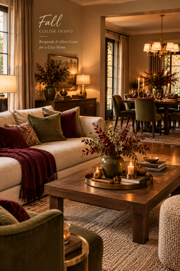
    3. Layer Burgundy and Olive Green Throughout the Home

    If you want fall decor with stronger color, burgundy and olive green provide a sophisticated alternative to traditional orange.

    Deep burgundy introduces warmth and richness, while olive green connects the interior to the natural landscape outside.

    Rather than decorating an entire room in both colors, distribute them carefully.

    For example, a neutral living room might have an olive green cushion on one side of the sofa and a burgundy cushion on the other. A small burgundy vase can repeat the color on the coffee table, while olive branches appear in a ceramic vessel nearby.

    The repetition creates visual connection without making the room look overly coordinated.

    Burgundy also works particularly well with dark wood. A walnut coffee table, burgundy velvet cushion, cream upholstery, and antique brass lamp can create an expensive-looking fall composition.

    In a bedroom, use burgundy through a folded throw or accent pillow rather than replacing all the bedding.

    For a dining room, try burgundy napkins with cream linen and olive-colored glassware.

    The colors should feel slightly muted rather than neon or overly bright. Current 2026 fall palettes are emphasizing richer reds, moody greens, warm browns, and natural neutrals. (Martha Stewart)

    The result is autumnal without depending on any recognizable fall symbol.

    4. Use Dark Wood to Create a Rich Autumn Atmosphere

    Wood is one of the most timeless ways to bring fall warmth into a home.

    For a sophisticated autumn look, focus on walnut, dark oak, smoked wood, aged timber, or other naturally rich wood tones.

    You do not necessarily need to replace furniture. Small wooden accessories can make a surprisingly noticeable difference.

    Try a dark wooden tray on a coffee table, a carved bowl on a console, wooden candlesticks on a dining table, or a walnut frame around artwork.

    If your room already contains light wood, you can introduce one or two darker pieces for contrast.

    A dark wood side table beside a cream sofa can create depth without changing the entire room.

    In the dining room, dark wood chairs paired with natural linen can create a refined fall atmosphere. Add warm cream ceramics and antique brass candleholders for a quietly luxurious table.

    Wood also works beautifully in bedrooms. A walnut bedside table combined with cream bedding, textured blankets, and warm lighting creates a cozy seasonal feeling without adding obvious autumn decorations.

    One reason this approach works so well is that natural wood does not look temporary. It can remain part of the room after fall is finished.

    Current fall design reporting is also emphasizing warm wood tones and natural materials as part of a broader movement toward warmer, more layered interiors. (Houzz)

    The goal is not to make your room look darker. Instead, use dark wood selectively to create visual anchors.

    5. Style a Cozy Fireplace With Candles and Natural Elements

    A fireplace naturally becomes a seasonal focal point as temperatures fall, making it an excellent place to decorate without pumpkins.

    Start with the mantel itself. Remove unnecessary objects and allow the architectural feature to become the foundation.

    Place one substantial mirror or piece of artwork above the fireplace.

    Then introduce candles in different heights along the mantel. Use ivory, cream, taupe, or warm brown candles rather than brightly colored seasonal versions.

    Add one botanical arrangement to one side. Dried branches can provide height while smaller ceramic objects balance the opposite side.

    For a more collected appearance, incorporate an antique brass candlestick, vintage frame, or small aged-metal object.

    Do not make both sides perfectly identical. Slight asymmetry often creates a more natural and sophisticated composition.

    If your fireplace is nonfunctional, the firebox can also become part of the styling. Arrange several large pillar candles inside it, or use a beautiful woven basket filled with folded blankets beside the hearth.

    Lighting should be soft and layered.

    The combination of candlelight, warm lamps, natural wood, and textiles can create an unmistakably autumnal atmosphere without a single pumpkin.

    For safety, always follow the manufacturer’s instructions for candles and never leave an open flame unattended.

    6. Create a Luxurious Fall Tablescape With Seasonal Produce

    Your dining table does not need pumpkins to become a beautiful autumn focal point.

    Instead, use seasonal produce as the centerpiece.

    Figs, pears, apples, grapes, pomegranates, or other rich-colored fruits can create an organic seasonal arrangement while remaining elegant.

    Begin with a natural linen tablecloth or runner. Choose ivory, oatmeal, taupe, muted brown, or soft sage.

    Add ceramic plates in warm neutral colors.

    Wooden serving boards can introduce another natural texture, while smoked or amber glassware provides a subtle autumn color accent.

    For the centerpiece, use a low ceramic bowl filled with pears, figs, or apples. This keeps the arrangement functional because guests can still see one another across the table.

    Alternatively, create several small vessels along the center of the table instead of one large centerpiece.

    Add taper candles in cream or warm beige holders.

    Burgundy napkins can introduce a deeper seasonal color without overwhelming the neutral foundation.

    A few dried leaves or delicate branches can be placed loosely around the centerpiece.

    The important thing is to avoid making every element look seasonal. The table should feel like an elegant dinner setting first and a fall table second.

    This approach is especially useful for Thanksgiving entertaining because it remains sophisticated while still reflecting the season.

    7. Add Velvet and Bouclรฉ for Sophisticated Fall Texture

    Sometimes the easiest way to decorate for fall is not to add seasonal accessories at all.

    Instead, change the textures in the room.

    Velvet, bouclรฉ, wool, brushed cotton, linen, and chunky knits can make a room feel considerably warmer.

    A cream sofa can instantly become more autumnal with a chocolate velvet cushion.

    A simple accent chair can feel cozier with a soft wool throw.

    A bedroom can become more luxurious with a velvet lumbar pillow placed in front of neutral bedding.

    Texture works particularly well when your home has a minimalist design because it introduces richness without adding visual clutter.

    Try combining three different tactile surfaces.

    For example, pair a smooth linen cushion with a velvet pillow and a chunky woven throw.

    In a living room, a textured rug can anchor the seating area while soft cushions create comfort.

    In the bedroom, combine crisp cotton bedding with a quilted coverlet and velvet accent pillows.

    Do not use too many textures in equal amounts. One should dominate while the others support it.

    A sophisticated fall interior is often about how a room feels rather than how many seasonal decorations it contains.

    8. Create a Moody Fall Bedroom With Deep Earth Tones

    The bedroom is one of the best places to introduce a darker fall palette because deeper colors naturally create a cozy atmosphere.

    Start with a neutral foundation.

    Cream, oatmeal, warm beige, or soft taupe bedding can keep the room from becoming too dark.

    Then add one deep earth tone.

    Chocolate brown is particularly effective because it feels warm without becoming overly dramatic.

    Burgundy is another option if you want more color.

    Olive green works beautifully with natural wood furniture.

    Instead of changing the entire bedding set, add a throw blanket and two accent pillows.

    A dark wood bedside table can reinforce the autumn palette.

    Place a ceramic lamp with a warm-toned shade on the nightstand.

    If you have artwork above the bed, choose something containing muted earth tones, botanical imagery, landscapes, or abstract forms.

    Avoid excessive seasonal imagery in the bedroom. The goal is to create a relaxing retreat rather than a themed space.

    Curtains also matter.

    Heavy linen or textured cotton curtains in warm beige or taupe can soften the room while filtering evening light.

    Finish the look with a small vase containing dried branches or a simple botanical stem.

    The result should feel cocooning, quiet, and luxurious.

    9. Introduce Antique Brass and Aged Metal Accents

    Metallic accessories can completely change the character of a neutral fall room.

    For sophisticated decorating, avoid using too many shiny metallic surfaces.

    Instead, look for antique brass, aged bronze, brushed brass, or darkened metal.

    These finishes work especially well with brown, cream, olive, burgundy, and natural wood.

    A brass table lamp can become the focal point of a console.

    A pair of aged-brass candlesticks can frame a dining centerpiece.

    An antique-style mirror can add character to an entryway.

    Small metal frames can also create warmth around artwork.

    The beauty of aged metal is that it does not need to look perfectly new.

    Slight variation, patina, and imperfections can make the room feel collected over time.

    This connects with the broader 2026 design movement toward interiors that feel layered, personal, and less dependent on perfectly matched mass-produced accessories. (Houzz)

    If your furniture is modern, aged brass can introduce contrast.

    If your furniture is traditional, antique brass can reinforce the existing character.

    Keep the finish consistent enough to feel intentional, but do not feel obligated to match every metal in the room exactly.

    10. Use Warm Ambient Lighting to Create the Fall Mood

    Lighting can completely transform your home for autumn.

    As the days become shorter, warm lighting becomes particularly important.

    Instead of relying exclusively on ceiling lights, create several small pools of illumination throughout the room.

    A table lamp beside the sofa can create a cozy reading corner.

    A floor lamp can illuminate a dark corner.

    A small lamp on a console can make the entryway feel welcoming.

    Candles can add another layer of atmosphere.

    Choose warm white or amber-toned light rather than cool blue-white bulbs.

    Amber glass lamps and vintage-inspired lighting can be particularly effective for fall. Current 2026 fall trend reporting specifically highlights amber lighting as a way to create a warmer, more relaxed atmosphere. (Martha Stewart)

    The placement of lighting matters as much as the fixture itself.

    Do not place every light at the same height.

    Combine table-level lighting with floor-level illumination and overhead lighting when needed.

    This creates dimension.

    A room decorated with brown, cream, and burgundy can look flat under harsh overhead lighting but dramatically richer under warm layered illumination.

    The goal is to make the home feel inviting when the sun goes down.

    11. Create an Elegant Neutral Fall Entryway

    Your entryway is the first opportunity to introduce your fall color story.

    Rather than using a pumpkin display, create a refined composition around the furniture you already have.

    A natural wood or dark wood console can serve as the foundation.

    Place a large ceramic vase on one side and fill it with dried branches.

    On the other side, add a small table lamp or antique brass candleholder.

    Hang a large mirror above the console to reflect light and make the entryway feel more spacious.

    A woven basket underneath can provide practical storage for blankets, shoes, or accessories.

    Add a runner in a warm neutral shade such as oatmeal, taupe, brown, or muted olive.

    If you have wall space, introduce botanical artwork or a vintage-inspired landscape.

    Avoid filling every surface.

    A sophisticated entryway should have enough open space to let each object breathe.

    This is especially important in small homes where too many accessories can quickly make the entrance feel crowded.

    The result should communicate warmth immediately without looking like a seasonal display.

    12. Introduce Fall Through an Earth-Tone Area Rug

    An area rug can change the entire personality of a room.

    Because rugs occupy a large visual area, they can introduce an autumn color palette without requiring dozens of accessories.

    For a sophisticated look, consider shades such as espresso, chocolate, camel, muted burgundy, terracotta, olive, cream, or greige.

    A patterned rug can add visual interest without using any fall motifs.

    Look for subtle geometric designs, vintage-inspired patterns, organic shapes, or faded botanical influences.

    In a neutral living room, a rug with chocolate and cream can create a warmer foundation.

    In a room with olive furniture, choose a rug containing warm beige and muted brown.

    For a bedroom, a soft wool or wool-look rug can make the space feel warmer underfoot.

    The scale is important.

    A rug that is too small can make an otherwise beautiful room feel disconnected.

    In a living room, try to ensure that the main seating arrangement feels visually connected to the rug.

    You can then repeat one or two colors from the rug through pillows, artwork, or ceramics.

    This creates cohesion without matching everything exactly.

    Current fall decorating coverage also highlights rugs, earthy reds, espresso browns, warm neutrals, and layered textiles as effective ways to shift a room into autumn. (Nourison Inspiration)

    13. Style a Minimalist Fall Coffee Table

    A minimalist coffee table does not need to remain completely undecorated during fall.

    Instead, change the materials and colors of a few carefully selected pieces.

    Start with a decorative tray made from wood, stone, or aged metal.

    Add two or three large coffee-table books with neutral covers.

    Place a sculptural ceramic bowl on top.

    Add one small natural element such as dried leaves, a branch, or a few seasonal fruits.

    If you want more warmth, include one small candle.

    The arrangement should have different heights.

    Books create a low level.

    The bowl adds medium height.

    A botanical stem or candle introduces vertical interest.

    Avoid filling every inch of the table.

    Negative space is important in sophisticated decorating.

    The empty area around each object helps the arrangement look intentional rather than crowded.

    You can also use a dark wood bowl filled with pears or figs as the primary focal point.

    This creates a seasonal moment without adding an obvious fall decoration.

    For a modern home, choose sculptural forms.

    For a traditional room, consider vintage books, antique brass, or an aged ceramic vessel.

    For an organic modern room, combine stone, wood, linen, and handmade ceramics.

    14. Create a Vintage-Inspired Autumn Corner

    One of the easiest ways to make fall decor feel sophisticated is to incorporate vintage character.

    Choose one small area rather than transforming the entire room.

    A reading corner works particularly well.

    Start with a comfortable chair in cream, camel, brown, or olive.

    Place a small wooden side table beside it.

    Add an antique-style lamp with a warm shade.

    Stack two or three old-looking books on the table.

    Hang a vintage landscape painting or botanical print nearby.

    Place a woven basket underneath the table for a folded wool blanket.

    The result creates an atmosphere of quiet autumn living without any traditional seasonal decorations.

    You can also create a similar corner in a dining room using an antique cabinet, vintage mirror, ceramic vessels, and aged brass accessories.

    The important principle is authenticity.

    Do not buy ten objects designed to look old.

    Instead, combine one or two vintage-inspired pieces with contemporary furniture.

    Current 2026 design coverage describes a movement toward collected interiors, craftsmanship, vintage pieces, aged materials, and objects with history. (Houzz)

    This approach makes a home feel personal rather than staged.

    15. Create a Whole-Home Fall Color Story Without Pumpkins

    If you want your home to feel professionally designed, think beyond individual rooms.

    Create one consistent fall color story throughout the house.

    Choose three or four main colors.

    For example:

    Chocolate brown
    Warm cream
    Muted olive
    Deep burgundy

    Then introduce those colors differently in each room.

    In the entryway, use olive artwork and dark wood.

    In the living room, introduce chocolate brown through cushions and a throw.

    In the dining room, use burgundy napkins and warm cream ceramics.

    In the bedroom, bring in chocolate bedding accents and olive botanical artwork.

    The colors do not need to appear in identical proportions.

    That would make the home feel overly coordinated.

    Instead, allow each room to interpret the palette differently.

    Natural materials can provide the connection between spaces.

    Use wood in several rooms.

    Repeat ceramic finishes.

    Carry warm metals from the living room into the dining room.

    Use linen or wool throughout the home.

    This creates continuity without repetition.

    The result is a house that feels like it has transitioned naturally into autumn rather than being decorated room by room.

    How to Choose a Sophisticated Fall Color Palette Without Orange

    Orange is traditionally associated with fall, but it is not necessary for creating an autumn atmosphere.

    A sophisticated palette can be built from several alternative combinations.

    Chocolate brown and cream create a warm, luxurious foundation.

    Burgundy and oatmeal create a rich romantic palette.

    Olive green and natural wood create an organic atmosphere.

    Deep navy and camel create a more unexpected autumn combination.

    Muted plum and warm beige can create a dramatic but elegant look.

    Espresso, ivory, and antique brass create a quiet luxury aesthetic.

    The most important consideration is contrast.

    If everything is dark, the room can lose brightness.

    If everything is pale, the autumn mood may become too subtle.

    Combine one or two deeper colors with lighter neutrals.

    Natural materials can then provide additional variation.

    For example, a cream linen sofa, walnut coffee table, olive cushion, burgundy artwork, and brass lamp can create a complete fall palette without one orange pumpkin.

    How to Make Fall Decor Look Expensive Without Spending a Fortune

    Sophisticated decorating is not necessarily about purchasing expensive objects.

    It is more about choosing fewer pieces and presenting them intentionally.

    Instead of buying ten small decorations, invest in one large ceramic vase.

    Instead of covering the sofa with many seasonal pillows, choose two high-quality-looking textured cushions.

    Instead of filling a mantel with small objects, create one strong arrangement.

    Use natural materials whenever possible.

    Wood, linen, ceramic, stone, glass, and metal tend to look more substantial than inexpensive plastic decorations.

    Scale also matters.

    A large vase with a dramatic arrangement can have greater visual impact than several tiny accessories.

    Lighting is another relatively simple way to elevate a room.

    A beautiful lamp can make inexpensive furniture look more sophisticated by creating a warm focal point.

    Vintage and secondhand shopping can also be useful.

    Aged frames, wooden bowls, ceramic vessels, brass candlesticks, and old books can add personality without requiring a large decorating budget.

    The goal is not to make everything expensive.

    The goal is to make the overall composition feel intentional.

    How to Decorate a Small Home for Fall Without Making It Crowded

    Small homes benefit enormously from pumpkin-free fall decorating because you can create seasonal warmth without adding lots of objects.

    Focus on textiles first.

    A warm throw, textured cushion, and autumn-inspired rug can transform the room without consuming much physical space.

    Use vertical decoration when possible.

    A tall dried branch arrangement can introduce seasonal character while occupying a relatively small footprint.

    Choose multifunctional accessories.

    A wooden tray can hold coffee-table decor while also being useful when entertaining.

    A decorative basket can store blankets.

    A ceramic bowl can display fruit and function as a serving piece.

    Keep surfaces relatively clear.

    One carefully designed coffee table arrangement is often more effective than several small displays scattered around the room.

    In a small bedroom, introduce fall through bedding accents rather than adding decorative objects.

    A burgundy throw and warm bedside lamp may be all you need.

    For a tiny entryway, use one mirror, one narrow console, and one botanical arrangement.

    This keeps the space functional while still creating a seasonal mood.

    How to Decorate a Modern Home for Fall Without Traditional Seasonal Decor

    Modern homes can sometimes feel disconnected from traditional fall decorations because pumpkins, signs, rustic accessories, and heavily themed objects may conflict with clean architectural lines.

    The solution is to translate fall into modern materials and colors.

    Use sculptural ceramics.

    Choose simple glass vessels.

    Add dark wood.

    Introduce rich textiles.

    Use deep brown, burgundy, olive, or muted plum.

    Choose abstract or botanical artwork instead of obvious seasonal signs.

    Lighting should remain simple and architectural.

    A modern living room with a cream sofa, walnut coffee table, large abstract artwork, olive cushion, burgundy throw, and warm floor lamp can feel completely autumnal while maintaining its contemporary identity.

    The seasonal feeling comes from the palette and atmosphere rather than the objects themselves.

    How to Create a Luxury Fall Living Room Without Pumpkins

    For a luxury-inspired living room, start with a neutral foundation.

    Cream, warm beige, taupe, or greige furniture provides flexibility.

    Add one deep color such as chocolate, burgundy, or olive.

    Use premium-looking textures.

    Velvet, linen, wool, boucle, leather, and natural wood can create visual richness.

    Choose one sculptural focal point.

    This might be a large ceramic vase, oversized artwork, statement lamp, or dramatic coffee table.

    Add warm metal accents sparingly.

    Brass and bronze can work beautifully with deep autumn colors.

    Finally, use layered lighting.

    A luxury room should never rely entirely on a single overhead light source.

    Table lamps, floor lamps, sconces, candles, and ambient lighting can create different levels of atmosphere.

    The room should feel comfortable enough for everyday life while still looking polished.

    How to Make Pumpkin-Free Fall Decor Feel Clearly Seasonal

    A common concern is that avoiding pumpkins may make the home look like ordinary year-round decor.

    The solution is layering several subtle seasonal signals.

    Use deeper colors.

    Introduce heavier textures.

    Add natural dried elements.

    Change the lighting temperature.

    Bring in seasonal fruits.

    Use autumn-inspired artwork.

    Add wool, velvet, linen, or chunky textiles.

    Introduce darker wood.

    These elements work together.

    One burgundy pillow alone may not transform the room.

    But burgundy velvet, dark wood, dried branches, warm lighting, and a textured rug create a recognizable autumn atmosphere.

    This is the difference between decorating with a seasonal object and decorating with a seasonal feeling.

    Common Mistakes to Avoid When Decorating for Fall Without Pumpkins

    One mistake is replacing pumpkins with too many other seasonal objects.

    The purpose of a pumpkin-free approach is not to fill the room with different fall decorations.

    Another mistake is using too many colors.

    Choose a defined palette and repeat it naturally.

    Avoid making every accessory brown.

    Brown needs lighter neutrals and contrasting tones to remain sophisticated.

    Do not ignore lighting.

    Even beautiful decor can feel flat under harsh white lighting.

    Avoid perfectly matching everything.

    Collected rooms generally feel more interesting when materials, shapes, and finishes have some variation.

    Do not overcrowd shelves, mantels, or coffee tables.

    Negative space helps decorative pieces stand out.

    Finally, avoid forcing a fall theme into every room.

    A few thoughtful changes can be more effective than completely redesigning the house.

    How to Make These Fall Decorating Ideas Pinterest-Worthy

    Pinterest images need an immediate visual focal point.

    For sophisticated fall interiors, choose one feature that communicates the idea instantly.

    This could be a chocolate-brown sofa with layered textiles, a dramatic dried branch arrangement, a luxurious fall tablescape, or a warm fireplace surrounded by candlelight.

    Use a vertical 2:3 composition for your main Pinterest image.

    Keep the room bright enough for viewers to understand the design while maintaining warm atmospheric lighting.

    Avoid excessive text on the image.

    A short title such as โ€œFall Decor Without Pumpkinsโ€ is usually enough when text is needed.

    Choose uncluttered compositions.

    Pinterest users should be able to understand the room within a second or two of seeing the image.

    Rich textures photograph beautifully, so emphasize velvet, linen, wood, ceramic, glass, stone, and woven materials.

    A sophisticated color palette also helps your images look distinctive among traditional orange-heavy fall content.

    Budget-Friendly Ways to Get the Look

    You do not need a complete home makeover to achieve this aesthetic.

    Start with the room that receives the most attention.

    For many homes, that will be the living room.

    Change the throw blanket.

    Add two textured cushions.

    Rearrange existing books and accessories.

    Bring in a branch arrangement.

    Move a warm lamp into the room.

    Add one seasonal-colored object.

    Then evaluate the room before buying anything else.

    You may discover that the existing furniture already works perfectly.

    Thrift stores and secondhand markets can be particularly useful for this style.

    Look for wooden bowls, ceramic vases, brass candlesticks, vintage frames, woven baskets, and old books.

    Do not worry if everything comes from different places.

    That variation can actually make the room feel more collected.

    Use fresh seasonal fruit as an inexpensive decorative element.

    A bowl of pears or apples can become a beautiful centerpiece.

    Branches collected responsibly from your garden can also provide an inexpensive botanical arrangement.

    The most important investment is thoughtful styling rather than the quantity of products.

    Why Sophisticated Fall Decorating Works Without Traditional Pumpkins

    Traditional pumpkin decor can certainly be beautiful, but it is only one visual interpretation of autumn.

    Fall is also about changing light, cooler evenings, richer colors, natural textures, harvest materials, cozy textiles, gathering, and spending more time indoors.

    A sophisticated decorating approach focuses on those experiences.

    Instead of asking, โ€œWhat fall object should I add?โ€ ask, โ€œHow can I make this room feel warmer, richer, and more inviting?โ€

    That question opens up many more possibilities.

    A darker rug can create visual warmth.

    A wool throw can create physical warmth.

    Warm lighting can create atmospheric warmth.

    Wood can introduce natural warmth.

    Burgundy can add depth.

    Dried botanicals can bring seasonal character.

    Vintage pieces can add history.

    Together, these elements create an autumn home that feels elegant and personal.

    Final Thoughts

    Sophisticated fall decorating ideas without traditional pumpkins offer a beautiful way to celebrate autumn while maintaining an elegant, timeless home.

    The most effective approach is not to remove seasonal character but to express it differently. Rich chocolate brown, burgundy, olive green, warm cream, natural wood, aged brass, dried botanicals, velvet, linen, wool, ceramic, stone, and warm lighting can all communicate the beauty of fall without relying on traditional pumpkin decorations.

    The current 2026 design direction toward warmer interiors, natural materials, layered textures, deeper colors, vintage character, and more personal spaces makes this approach especially relevant. (Houzz)

    You can start with something as simple as changing your living room textiles or creating a dried botanical arrangement. If you want a stronger transformation, build a complete autumn color story across several rooms.

    Most importantly, remember that sophisticated seasonal decorating is about atmosphere.

    You do not need every surface covered with fall accessories.

    You do not need bright orange.

    You do not need seasonal signs.

    And you certainly do not need pumpkins to make your home feel like autumn.

    Sometimes a dark wood table, a bowl of pears, a burgundy velvet cushion, a softly glowing lamp, and a vase of dried branches are enough.

    The result is a home that feels warm, sophisticated, comfortable, and unmistakably ready for fall while remaining beautiful long after the season has passed.


  • Area Rug and Decor Accessory Ideas for a Sophisticated Living Room

    Area Rug and Decor Accessory Ideas for a Sophisticated Living Room

    Introduction

    Sophisticated living room ideas, luxury area rug ideas, and elegant living room decor accessories can completely transform an ordinary space into a stylish, comfortable, and timeless retreat. The right combination of a beautiful area rug, carefully selected decorative pieces, and layered textures can make a living room look professionally designed while still feeling warm and inviting.

    A living room is one of the most important areas in any home because it reflects personal style, comfort, and the way people experience their everyday environment. Whether it is a large family room, a small apartment living space, or an open-concept area connected to the kitchen, thoughtful styling can completely change the atmosphere. While furniture creates the basic structure of the room, rugs and accessories are the elements that bring personality, depth, and visual harmony.

    Many homeowners believe that creating a sophisticated living room requires expensive furniture or a complete renovation. However, elegant interiors are often created through careful choices rather than a large budget. A well-selected area rug, a beautiful coffee table arrangement, textured cushions, artwork, lighting, and natural materials can create the same refined feeling found in professionally designed homes.

    The area rug is often the foundation of the entire living room design. It defines the seating area, adds warmth, improves comfort, and visually connects different furniture pieces. Without the right rug, even beautiful furniture can appear disconnected. A properly sized and styled rug creates balance and gives the room a finished appearance.

    When choosing a rug for a sophisticated living room, several factors matter, including size, material, color, pattern, and texture. Large neutral rugs are popular because they create a calm and timeless background. Shades such as warm ivory, beige, taupe, soft gray, and earthy tones allow other design elements to stand out. However, neutral does not mean boring. Textured surfaces, subtle patterns, woven details, and natural fibers can add character while maintaining an elegant look.

    Decor accessories are equally important because they tell the story of the room. A sophisticated living room does not need dozens of decorations. Instead, it benefits from carefully chosen pieces that create visual interest. A sculptural ceramic vase, a stack of beautiful books, a handmade bowl, a statement lamp, or a unique artwork can become a focal point when placed thoughtfully.

    Modern interior design increasingly focuses on spaces that feel personal and lived-in rather than perfectly staged. The most beautiful rooms often combine comfort with elegance. Soft fabrics, natural materials, warm lighting, and meaningful accessories create an atmosphere that feels welcoming while still looking refined.

    Texture plays a major role in achieving this balance. Combining different materials creates a layered appearance. For example, a wool rug paired with a linen sofa, velvet cushions, a wooden coffee table, and ceramic accessories creates depth and sophistication. The room feels richer because the eye discovers different surfaces and details.

    Color coordination is another essential part of sophisticated living room styling. Many elegant interiors use a carefully selected palette rather than many competing colors. Warm neutrals combined with wood tones create a timeless look, while accents such as olive green, charcoal, muted blue, terracotta, or brass can add personality.

    Lighting also influences how rugs and accessories appear. A beautiful living room should have multiple lighting sources instead of relying only on one ceiling fixture. Floor lamps, table lamps, candles, and warm accent lighting highlight textures and create a cozy atmosphere during the evening.

    The best living room designs balance beauty and function. Accessories should not only look attractive but also support the lifestyle of the people living in the home. A decorative tray can organize everyday items. A woven basket can provide storage. A comfortable throw can add warmth while enhancing the sofa.

    Creating a sophisticated living room is about making intentional choices. It is about understanding how each piece contributes to the overall feeling of the space. A beautiful rug creates the foundation, accessories add personality, textures create comfort, and lighting completes the atmosphere.

    The following ideas will help you design a living room that feels elegant, balanced, and timeless using carefully selected area rugs and decor accessories.

    1. Choose a Large Neutral Area Rug to Create a Luxury Foundation

    A large neutral area rug is one of the most effective ways to instantly elevate a living room. It creates a visual foundation that connects furniture, accessories, and architectural features into one cohesive design.

    One common mistake in living room decorating is choosing a rug that is too small. A small rug placed only beneath the coffee table can make the furniture arrangement feel separated. In sophisticated interiors, rugs usually extend far enough to connect the seating pieces together.

    A properly sized rug allows the front legs of sofas and chairs to sit on the surface, creating a more intentional and luxurious appearance. This simple adjustment can make a room feel larger and more professionally designed.

    Neutral rugs are especially popular because they provide flexibility. They work beautifully with different furniture styles and allow homeowners to update accessories without replacing major pieces.

    Popular sophisticated rug colors include:

    • Warm ivory
    • Soft beige
    • Cream
    • Taupe
    • Light gray
    • Sand tones
    • Natural woven shades

    These colors create a peaceful background that allows furniture and decorative pieces to become the focus.

    However, a neutral rug should still have personality. Texture is the key to avoiding a flat appearance. A wool rug with subtle variations, a handwoven design, or a natural fiber rug can add depth without overwhelming the room.

    For a modern luxury living room, pair a soft cream rug with:

    • A curved sofa
    • Walnut coffee table
    • Brass lighting
    • Neutral artwork
    • Ceramic accessories

    For an organic modern style, combine a natural woven rug with:

    • Linen furniture
    • Wooden accents
    • Stone accessories
    • Earth-tone cushions

    The material of the rug also affects the atmosphere. Wool rugs often create a premium feeling because they are soft, durable, and naturally textured. Jute and woven rugs add warmth and an organic appearance. Cotton rugs can create a relaxed and comfortable feeling.

    When selecting a neutral rug, consider the undertones. A warm beige rug works beautifully with wood furniture and brass details, while cooler gray tones may complement black metal and contemporary interiors.

    Another important factor is contrast. A room where everything is the same color can feel dull. Instead, combine different shades and textures.

    Examples:

    Cream rug + dark wood coffee table

    Beige rug + charcoal accent chair

    Ivory rug + olive green cushions

    Taupe rug + brass accessories

    These combinations create a sophisticated balance.

    A large neutral rug is not simply a decorative item. It acts as the visual anchor of the room and allows every other design choice to feel connected.

    2. Layer Different Rugs for a Designer-Inspired Look

    Layering rugs is a creative technique that adds depth, warmth, and personality to a sophisticated living room. This method is often used by designers because it creates a collected and luxurious feeling without requiring expensive furniture changes.

    The most common approach is placing a larger simple rug underneath and adding a smaller decorative rug on top.

    Examples include:

    • Large jute rug underneath with a vintage patterned rug above
    • Neutral wool rug combined with a subtle geometric design
    • Natural fiber base with a handmade textile rug

    The bottom rug creates structure while the top rug introduces character.

    This technique works especially well in large rooms where one rug may feel too plain. Layering helps define the seating area and adds visual interest.

    When combining rugs, balance is essential. If one rug has a detailed pattern, the other should remain simple. Too many competing patterns can make the space feel busy.

    Successful combinations often include:

    • Beige and cream
    • Natural tan and muted blue
    • Ivory and soft gray
    • Brown and olive
    • Black and neutral shades

    Layered rugs are also useful for open-plan homes. They can visually separate the living room area from dining or kitchen zones without using walls.

    For example, a large natural rug can define the sofa area while a smaller patterned rug highlights a reading corner with an accent chair.

    The style of the layered rugs should match the overall personality of the room.

    A luxury modern room may benefit from simple textures and neutral colors.

    A bohemian room can handle more pattern and handmade details.

    A traditional room may look beautiful with vintage-inspired designs.

    A cozy farmhouse room can combine woven textures with soft neutral tones.

    The biggest mistake with rug layering is adding too much visual competition. The goal is not to make the floor the only focus. Rugs should support the furniture and accessories.

    When done correctly, layered rugs create a designer appearance by adding warmth, texture, and a sense that the room has been carefully developed over time.

    3. Add Sculptural Decor Accessories for a High-End Appearance

    Sophisticated living rooms often rely on fewer accessories with stronger visual impact. Instead of filling every surface with small decorations, choose pieces that create a clear statement.

    Sculptural accessories are especially effective because they add artistic value while maintaining a modern appearance.

    Ideas include:

    • Oversized ceramic vases
    • Stone sculptures
    • Decorative bowls
    • Abstract objects
    • Handmade pottery
    • Brass sculptures

    These pieces work beautifully on:

    • Coffee tables
    • Console tables
    • Shelves
    • Fireplace mantels

    The secret is choosing accessories with interesting shapes and textures.

    A large ceramic vase with an organic silhouette can become the focal point of a coffee table. A carved wooden bowl can add warmth to a minimalist space. A stone object can introduce a natural luxury feeling.

    Materials make a significant difference.

    High-end looking accessories often use:

    • Ceramic
    • Marble
    • Natural stone
    • Wood
    • Glass
    • Brass

    These materials create a timeless appearance.

    When styling accessories, consider height and balance. A tall vase can be paired with shorter books or a small bowl to create visual layers.

    Avoid placing many objects of the same size together because the arrangement can appear flat.

    For example:

    Tall vase + stacked books + small candle

    Large bowl + decorative object + greenery

    Artwork + lamp + ceramic accessory

    This creates a professional styling effect.

    Another important principle is leaving empty space. Luxury interiors are not filled from edge to edge. The empty areas allow important pieces to stand out.

    A single beautiful object can often create more elegance than many inexpensive decorations.

    The goal is not to display everything you own. The goal is to highlight pieces that contribute to the personality of the room.

    4. Use Textured Pillows and Throws to Enhance the Rug and Decor

    Soft furnishings are one of the easiest ways to create a sophisticated living room because they add comfort, color, and personality without requiring major changes. While an area rug creates the foundation of the room, pillows and throws help connect the furniture with the rest of the decor.

    A beautifully styled sofa should feel inviting while maintaining a polished appearance. The key is choosing textiles that complement the rug rather than competing with it.

    Instead of selecting many pillows with different colors and patterns, focus on creating a balanced combination of textures.

    A sophisticated pillow arrangement may include:

    • A soft linen pillow for a relaxed feeling
    • A velvet accent pillow for richness
    • A boucle cushion for cozy texture
    • A patterned pillow with subtle details for visual interest

    Different fabrics create depth because they reflect light differently. Velvet adds a luxurious softness, linen creates a natural casual elegance, and boucle introduces a modern textured appearance.

    Color coordination is also important.

    If your area rug is neutral, pillows can introduce gentle accents such as:

    • Olive green
    • Deep charcoal
    • Warm terracotta
    • Muted navy
    • Chocolate brown
    • Soft rust

    These colors add personality while maintaining an elegant atmosphere.

    Throws are another simple accessory that can transform a living room. A carefully placed throw over the arm of a sofa or accent chair creates a relaxed but intentional look.

    For a luxury-inspired appearance, choose throws made from:

    • Wool
    • Cashmere-style fabrics
    • Cotton knit
    • Linen blends

    The placement matters. A throw should look naturally arranged rather than perfectly folded like a store display.

    A sophisticated combination might include:

    A cream wool rug

    A beige linen sofa

    Olive velvet pillows

    A soft brown knitted throw

    A walnut coffee table

    Ceramic accessories

    Together, these elements create a layered and timeless design.

    Texture is especially important in neutral living rooms. When the color palette is simple, different materials prevent the room from feeling plain.

    For example, a room using only beige can appear flat. But combining:

    A woven rug

    A velvet pillow

    A linen curtain

    A wooden table

    A ceramic vase

    creates visual richness.

    The best interiors feel comfortable because they balance softness and structure. Rugs, pillows, and throws work together to create that feeling.

    5. Create an Elegant Coffee Table Arrangement With Decorative Accessories

    The coffee table is one of the most noticeable areas in a living room, making it an important place for thoughtful styling. A well-designed coffee table can become the centerpiece that connects the rug, furniture, and accessories together.

    The goal is not to cover the entire surface. Sophisticated styling focuses on balance, empty space, and carefully selected objects.

    A simple formula for an elegant coffee table arrangement includes:

    • A decorative tray
    • A stack of books
    • A sculptural object
    • A ceramic vase or bowl
    • A candle or natural element

    A tray is especially useful because it groups smaller items together and creates a cleaner appearance. It prevents accessories from looking scattered.

    Materials that create a luxury feeling include:

    • Marble trays
    • Wooden trays
    • Stone bowls
    • Glass accessories
    • Handmade ceramics

    Coffee table books are another popular styling element. Choose books with beautiful covers related to:

    • Interior design
    • Architecture
    • Art
    • Travel
    • Photography

    Stack two or three books and place one decorative object on top.

    Height variation is important. If everything sits at the same level, the arrangement can appear flat.

    Try combining:

    A tall ceramic vase

    Medium-height books

    A small candle

    A low decorative bowl

    This creates a balanced visual composition.

    Natural elements can also bring warmth.

    Consider adding:

    • Fresh flowers
    • Olive branches
    • Dried stems
    • Seasonal greenery

    However, keep the arrangement simple. One beautiful branch in a ceramic vase can create more impact than a large complicated centerpiece.

    The coffee table should still remain functional. Leave enough open space for everyday use.

    A sophisticated living room should look beautiful but also feel comfortable to live in.

    6. Add Warm Lighting Accessories to Highlight Rugs and Decor

    Lighting is one of the most powerful elements in interior design because it affects how every color, texture, and accessory appears.

    Even the most beautiful rug and decor pieces can lose their impact if the room has poor lighting.

    Sophisticated living rooms usually use multiple light sources instead of depending only on one ceiling fixture.

    Layered lighting may include:

    • Floor lamps
    • Table lamps
    • Wall lights
    • Decorative candles
    • Accent lighting

    A floor lamp beside a sofa creates a cozy reading corner while adding height to the room.

    A table lamp on a console table creates a warm evening glow.

    Candles add atmosphere and highlight nearby textures.

    Warm lighting works especially well with:

    • Wool rugs
    • Wooden furniture
    • Brass accessories
    • Neutral fabrics
    • Ceramic decor

    Avoid overly bright, cool lighting because it can make a living room feel less welcoming.

    The position of lighting also matters.

    Place lamps where they can highlight important features:

    • Beside artwork
    • Near seating areas
    • On console tables
    • Behind accent chairs

    Lighting can also create visual layers by adding contrast between bright and soft areas.

    For example, a softly illuminated corner with a comfortable chair and small table can make the room feel larger and more inviting.

    Beautiful lighting does not always require expensive fixtures. Even a simple lamp with the right shade and placement can create a designer-inspired atmosphere.

    7. Style a Console Table With Balanced Decor Pieces

    A console table provides an excellent opportunity to add sophistication to a living room. Whether placed behind a sofa, against an empty wall, or near an entry area, it creates a surface where accessories can be displayed beautifully.

    The key to console styling is balance.

    A professional-looking arrangement often includes:

    • One large artwork or mirror above the table
    • One tall decorative item
    • One medium accessory
    • One small accent piece
    • A warm light source

    For example:

    A large round mirror

    A ceramic vase with branches

    A stack of books

    A small candle

    A table lamp

    This creates a layered arrangement without feeling crowded.

    Height variation is essential because it guides the eye through different levels.

    A common mistake is placing several small objects in a straight line. This can make the area look like a collection of random items.

    Instead, create groups.

    You can place objects in odd numbers, such as three or five pieces, because these arrangements often feel more natural.

    Materials should connect with the rest of the room.

    If your living room includes a wooden coffee table, introduce wood on the console.

    If your rug has warm tones, choose accessories that repeat those shades.

    If your furniture has brass details, include small brass accents.

    These connections make the room feel intentionally designed.

    8. Choose Artwork That Complements Your Rug and Accessories

    Artwork is one of the strongest ways to personalize a sophisticated living room. It adds character, creates a focal point, and can connect different colors throughout the space.

    When selecting artwork, consider the existing elements:

    • Area rug colors
    • Sofa fabric
    • Pillow shades
    • Decorative accessories

    The artwork does not need to match everything exactly. Instead, it should share similar tones.

    For neutral living rooms, beautiful options include:

    • Abstract beige artwork
    • Black and white photography
    • Minimal botanical prints
    • Textured canvas art

    For warmer spaces:

    • Earth-tone paintings
    • Vintage-inspired artwork
    • Landscape prints
    • Handcrafted pieces

    Large artwork often creates a more expensive appearance than many small frames.

    A single oversized piece above the sofa can create a dramatic focal point.

    Placement also matters.

    Artwork should usually be positioned at eye level and should relate proportionally to the furniture below it.

    A small artwork above a large sofa may feel disconnected, while an appropriately sized piece creates balance.

    Frames also contribute to the overall feeling.

    Natural wood frames create warmth.

    Black frames create modern contrast.

    Gold or brass frames add elegance.

    Choose a style that supports the room rather than competing with it.

    9. Introduce Natural Accessories for Organic Sophistication

    Natural materials are one of the easiest ways to make a living room feel warm and refined.

    They introduce texture and create a connection with nature without overwhelming the design.

    Natural decor accessories include:

    • Wooden bowls
    • Woven baskets
    • Stone objects
    • Ceramic vessels
    • Dried flowers
    • Fresh branches

    These elements work beautifully with modern, luxury, and organic-inspired interiors.

    A simple ceramic vase with olive branches can instantly elevate a coffee table.

    A woven basket beside a sofa can provide storage while adding texture.

    A wooden bowl on a console table can introduce warmth.

    The important thing is choosing natural accessories with purpose.

    Avoid adding too many plants or decorations simply to fill empty spaces.

    Sophisticated rooms usually allow each piece to breathe.

    Natural accessories also work beautifully with area rugs because both elements introduce texture.

    A woven rug paired with wooden furniture and ceramic accessories creates a comfortable layered feeling.

    This approach creates a timeless look that does not depend on temporary trends.

    10. Create a Complete Sophisticated Living Room Styling Formula

    A truly elegant living room is created through the combination of multiple layers working together.

    The area rug provides the foundation.

    Furniture creates comfort and structure.

    Accessories introduce personality.

    Lighting creates atmosphere.

    Textures add depth.

    A successful design formula includes:

    Foundation Layer

    Start with:

    • Properly sized area rug
    • Comfortable seating arrangement
    • Balanced furniture placement

    The rug should connect the room and create a clear visual zone.

    Texture Layer

    Add softness and interest through:

    • Cushions
    • Throws
    • Curtains
    • Upholstery
    • Natural materials

    Different textures prevent the room from feeling flat.

    Decorative Layer

    Choose meaningful accessories:

    • Ceramic objects
    • Artwork
    • Books
    • Bowls
    • Sculptural pieces

    Select fewer items with stronger impact.

    Lighting Layer

    Complete the atmosphere with:

    • Floor lamps
    • Table lamps
    • Candles
    • Warm bulbs

    Good lighting allows every design element to shine.

    Final Thoughts

    Creating a sophisticated living room is not about filling the space with expensive decorations. It is about creating harmony between rugs, furniture, accessories, textures, colors, and lighting.

    A beautiful area rug can completely change the feeling of the room by creating structure and warmth. Carefully selected accessories can add personality without creating clutter. Textured fabrics can make the space comfortable, while lighting can transform the atmosphere from ordinary to elegant.

    The most successful living rooms are those that feel intentional. Every piece has a purpose, but the room still feels relaxed and welcoming.

    Whether your style is modern luxury, organic contemporary, classic elegance, or cozy minimalism, the right combination of area rugs and decor accessories can help you create a living room that looks timeless and beautifully designed.


  • Chocolate Brown Fall Home Decor Ideas With Dark Wood

    Chocolate Brown Fall Home Decor Ideas With Dark Wood

    Chocolate brown fall home decor ideas with dark wood are creating some of the warmest, richest, and most sophisticated interiors for the 2026 autumn season. Instead of relying on bright orange pumpkins, artificial leaves, and heavily themed seasonal accessories, this approach uses deep brown tones, walnut furniture, espresso finishes, warm textiles, natural materials, and soft lighting to create a home that feels beautifully connected to fall while remaining elegant enough for everyday living.

    Fall decorating has traditionally focused on obvious seasonal colors such as orange, rust, red, and yellow. Those colors can certainly create a festive atmosphere, but current interior design is moving toward a more sophisticated interpretation of autumn. Chocolate brown has emerged as one of the strongest fall colors because it provides the warmth of traditional autumn palettes without making a room feel overly seasonal. Homes & Gardens identifies chocolate brown as a key fall 2026 color and notes that designers are using it as a grounding neutral alongside cream, green, natural timber, aged brass, and other warm materials. (Homes and Gardens)

    Dark wood complements this direction particularly well. Walnut, espresso oak, smoked oak, mahogany-inspired finishes, and other deep wood tones bring natural depth to a room without requiring a large amount of seasonal decoration. Current fall design coverage also highlights the return of darker woods after years of pale oak and lighter finishes dominating contemporary interiors. (ELLE Decor)

    The beauty of a chocolate brown and dark wood color palette is that it can work across almost every room in the home. You can use it to create a cozy living room, a sophisticated bedroom, a welcoming dining room, a dramatic reading nook, a warm kitchen, or even a refined home office. It can also be introduced gradually through smaller accessories if you do not want to repaint walls or replace furniture.

    Another reason this palette works so well is its connection to natural materials. Brown naturally appears in wood, leather, woven fibers, stone, clay, dried botanicals, and aged metals. When those materials are layered together, the room develops visual depth without needing excessive decoration. This makes chocolate brown fall decor especially useful for homeowners who want an autumn atmosphere that feels timeless rather than temporary.

    The 2026 design direction is also moving toward interiors that feel collected, personal, and tactile. Designers are increasingly highlighting material contrast, vintage pieces, natural textures, darker woods, and rooms that do not look as though every item was purchased from the same collection. (ELLE Decor)

    That means your fall decorating does not need to look like a seasonal display. Instead, imagine a room with a walnut coffee table, a chocolate velvet pillow, a cream boucle chair, a warm ivory rug, an aged brass lamp, and a few dried branches in a handmade ceramic vase. The result immediately feels like autumn, but nothing has to literally say โ€œfall.โ€

    This is particularly valuable for Pinterest-inspired interiors because sophisticated, highly visual spaces tend to work better when the viewer can imagine living in them. A beautiful room with layered brown tones, dark wood, elegant lighting, and tactile materials can inspire a reader to save the image for an upcoming room makeover, seasonal refresh, or decorating project.

    Whether you live in a small apartment, a traditional house, a modern home, or a rental, you can adapt these ideas according to your existing furniture and budget. You do not need to purchase an entirely new furniture collection. In many cases, one dark wood piece, a carefully selected textile, a warm lamp, or a sophisticated decorative object can completely change the atmosphere.

    The key is balance. Chocolate brown is deep and visually strong, while dark wood also carries significant visual weight. If every surface becomes dark, the room can feel heavy. Pairing those tones with cream, warm white, oatmeal, beige, natural stone, muted olive, soft caramel, antique brass, or aged bronze creates breathing room and allows the darker elements to stand out.

    Below are 10 carefully differentiated chocolate brown fall home decor ideas with dark wood that can help you create a warm, elegant, and Pinterest-worthy home for autumn.

    1. Create a Chocolate Brown and Dark Wood Living Room

    The living room is one of the easiest places to introduce a chocolate brown and dark wood fall color palette because textiles and furniture can dramatically change the mood without requiring permanent renovations.

    Begin with a warm neutral foundation. A cream, ivory, oatmeal, or beige sofa provides an ideal background for deeper brown accents. Instead of covering the entire sofa with dark accessories, introduce chocolate brown selectively through two or three substantial elements.

    A chocolate brown velvet pillow can create an immediate sense of richness. Add a second pillow in a woven caramel or warm taupe fabric to prevent the arrangement from looking too uniform. A folded chocolate, espresso, or cognac-colored throw can be placed over the arm of the sofa for additional depth.

    The dark wood element should have enough visual presence to balance the darker textiles. A walnut coffee table is particularly effective because the rich wood grain adds natural variation to the room. Rather than selecting a perfectly matching set of dark wood furniture, allow different but related wood tones to coexist.

    For example, you might combine a walnut coffee table with a slightly lighter dark oak side table. This creates a collected appearance instead of a showroom-like furniture arrangement.

    Underneath the furniture, use an area rug that provides contrast. A warm ivory, beige, muted taupe, or subtle brown patterned rug can connect the sofa and coffee table while keeping the floor visually lighter.

    Lighting becomes especially important when using chocolate brown and dark wood. Place a warm table lamp on a side table, add a floor lamp beside a reading chair, and use soft ambient lighting instead of relying entirely on one overhead fixture. Layered lighting is also a major part of current fall design direction. (Parade)

    For decorative accessories, think in terms of shape and texture rather than quantity. A sculptural ceramic vase, a stone bowl, a small brass object, or a stack of neutral coffee-table books can provide enough detail without cluttering the room.

    Natural materials work beautifully here. A woven basket beside the sofa can hold a blanket, while a large ceramic vase filled with a few dried branches creates height without introducing excessive seasonal decoration.

    If you want a more dramatic result, paint one architectural feature in a deep warm brown. A fireplace wall, built-in shelving area, or small accent wall can carry chocolate brown beautifully when balanced with lighter upholstery and natural wood.

    The most important principle is to let the room feel like a beautiful everyday living space first and a fall-inspired room second. That makes the design more timeless and gives the chocolate brown palette room to remain relevant beyond October and November.

    2. Style a Walnut Coffee Table With Rich Fall Accessories

    A dark wood coffee table can become the visual anchor of a fall living room, especially when its natural grain is allowed to remain visible.

    Walnut is particularly effective because it has a deep brown character without appearing completely black. Its warmth works naturally with chocolate textiles, cream upholstery, brass, leather, stone, and muted autumn colors. Dark woods such as walnut and smoked oak are receiving renewed attention in 2026 interiors, especially when contrasted with lighter stone and soft furnishings. (Royal Design)

    Rather than filling the coffee table with many small decorations, create one intentional composition.

    Begin with a low-profile tray. A dark wood, aged brass, travertine, or stone tray can establish a visual boundary for your arrangement. Inside the tray, place a small ceramic bowl and one decorative object.

    Next, introduce books with neutral or brown covers. Avoid selecting books simply because their covers match. Choose books that genuinely add character to the space through photography, design, architecture, travel, or art.

    A chocolate brown ceramic vase can become the tallest element in the arrangement. Add a few dried stems rather than an enormous floral arrangement. The goal is to preserve the beauty of the walnut surface.

    You can also introduce an amber glass object. Amber has a naturally warm appearance and becomes particularly attractive when light passes through it. Brown, amber, olive, and smoky glass can create an autumnal feeling without using obvious Halloween or pumpkin-themed decorations.

    Another option is a hand-carved wooden bowl. Its organic shape provides contrast against the straight lines of books and the smooth surface of a tray.

    For a more luxurious composition, combine three different material categories: wood, stone, and metal. For example, use a walnut tray, a cream travertine bowl, and a small aged-brass sculpture.

    This material contrast gives the coffee table a sophisticated quality because each surface reacts differently to light.

    Keep the center of the table visually breathable. A coffee table should still function for everyday living, so leave enough clear space for placing a drink, serving guests, or using the table comfortably.

    The same approach can be adapted to smaller living rooms. Instead of using a large coffee table, choose a compact walnut table and style only one side with a low bowl and one sculptural accessory.

    The finished result should feel collected rather than decorated. That distinction is important. A sophisticated fall coffee table does not need dozens of seasonal items. It needs a few pieces that work together through color, material, scale, and shape.

    3. Use Chocolate Brown Textiles to Warm a Neutral Sofa

    If your existing furniture is light or neutral, textiles offer one of the easiest ways to experiment with chocolate brown fall decor without making a major investment.

    A cream sofa can look completely different when layered with rich brown fabrics.

    Start with one substantial chocolate brown textile. This could be a velvet throw, chunky woven blanket, boucle pillow, linen cushion, or soft wool accent.

    Then build around that color using related shades rather than exact matches. Caramel, tobacco, cognac, taupe, mushroom, warm beige, and espresso can create a sophisticated tonal range.

    This technique prevents the sofa from looking flat.

    For example, imagine an ivory sofa with one chocolate velvet pillow, one caramel woven pillow, one oatmeal boucle pillow, and a dark brown wool throw. Each piece belongs to the same warm family but has a different texture and depth.

    Texture is particularly important during fall because the season naturally encourages tactile materials. Velvet, wool, boucle, brushed cotton, linen, and woven fabrics can make a room visually warmer even when the architecture remains unchanged.

    Chocolate brown also works exceptionally well with leather. A cognac leather accent chair or leather ottoman can introduce another warm brown without making the room feel monochromatic.

    If your room already contains a lot of dark wood, avoid adding chocolate brown to every textile. Instead, allow the upholstery to remain mostly light and use brown as an accent color.

    On the other hand, if your furniture is predominantly white or pale beige, you can use more chocolate brown textiles to create a stronger seasonal transformation.

    One useful approach is to repeat the color in different locations. For example, use chocolate brown on the sofa, then echo it in a small cushion on a nearby chair and a ceramic object on the coffee table.

    The repetition connects the room visually without making everything identical.

    You can also use chocolate brown curtains if the room needs greater visual drama. Floor-length curtains in a warm brown linen or textured fabric can make a living room feel more intimate, especially when paired with walnut furniture.

    However, dark curtains should be balanced carefully. If the room has limited natural light, choose a lighter chocolate or warm taupe rather than an extremely dark espresso fabric.

    Another simple option is a chocolate brown area rug. A large rug can unify the room and provide a stronger foundation beneath lighter furniture. Current fall color coverage specifically highlights chocolate wool rugs as one way to bring this rich shade into interiors. (Homes and Gardens)

    The goal is not to make the room brown from top to bottom. Instead, use textiles to create layers that make your existing neutral furniture feel warmer, richer, and more appropriate for autumn.

    4. Create a Dark Wood Fall Dining Room

    The dining room is an ideal setting for chocolate brown and dark wood because dining furniture naturally provides large surfaces where rich wood tones can become the main architectural feature.

    A dark walnut or espresso dining table can immediately establish the mood.

    If you already own a dark dining table, there is no need to replace it. Instead, update the surrounding styling.

    Begin with the chairs. Cream upholstered chairs provide beautiful contrast against dark wood. Alternatively, use natural woven seating, caramel leather, or deep brown fabric.

    For the dining table itself, avoid an overly complicated centerpiece. A long low arrangement can be made with a stone vessel, dark ceramic bowl, or oversized wood bowl filled with dried branches.

    For a more refined autumn atmosphere, use seasonal produce instead of traditional decorative objects. Figs, pears, artichokes, apples, or pomegranates can create natural color and texture while remaining appropriate for a dinner table.

    This approach aligns with the broader 2026 movement toward more natural, personal, and less overtly themed fall entertaining. (Good Housekeeping)

    Layer the table with linen napkins in chocolate, oatmeal, or warm ivory. Ceramic dinnerware in cream or off-white will stand out beautifully against the dark surface.

    For tableware accents, aged brass or antique bronze can introduce a subtle glow.

    Glassware can provide another visual layer. Amber, smoky, olive, or clear glass can all work with the palette, depending on how dramatic you want the table to feel.

    Lighting should be soft and atmospheric. A pendant above the dining table can provide the primary source, while candles or small lamps can create secondary pools of light.

    If your dining room includes a sideboard, use it as an opportunity to repeat the dark wood theme without creating a matching furniture set. Place a large mirror or artwork above it and style the surface with a ceramic lamp, a sculptural bowl, and a few carefully chosen objects.

    A vintage painting or antique-style frame can add character. Current designer surveys also point toward continued interest in vintage and antique pieces, which fits naturally with rich wood interiors. (Q4 Investor Relations)

    The result should feel suitable for both everyday dinners and special fall gatherings. Rather than creating a Thanksgiving-only table, design a foundation that can remain beautiful throughout the season.

    5. Style a Chocolate Brown Fall Bedroom With Walnut Accents

    The bedroom is where chocolate brown can become especially calming because its depth creates a cocooning atmosphere.

    Instead of introducing brown through dozens of accessories, start with the bed.

    A chocolate brown quilt, duvet cover, or upholstered headboard can become the central feature. Pair it with warm ivory sheets to create contrast and prevent the room from becoming too dark.

    For a sophisticated layered bed, use three levels of color.

    The first layer can be ivory or cream.

    The second can be warm beige, camel, or taupe.

    The final layer can be chocolate brown.

    This creates visual depth without requiring complicated patterns.

    Walnut nightstands are an excellent companion to a chocolate brown bed because the natural grain adds variation. Look for pieces with simple silhouettes rather than ornate finishes if you want a modern bedroom.

    On each nightstand, use a warm-glowing lamp. A ceramic, linen, bronze, or aged-brass lamp can soften the darker palette.

    Wall color is another opportunity.

    A warm off-white wall can make the chocolate bedding and walnut furniture stand out. If you prefer a more enveloping atmosphere, consider a muted mushroom, warm taupe, or brown wall color.

    Dark brown walls can also work beautifully in bedrooms when balanced with sufficient light-colored textiles and appropriate illumination.

    For artwork, select pieces with warm neutrals, landscapes, botanical forms, abstract brown tones, or muted olive accents.

    Avoid filling the bedroom with obvious autumn symbols. Instead, let the color palette and materials communicate the season.

    A small wooden bench at the foot of the bed can provide both function and warmth. A woven basket can hold extra blankets, while a wool rug beside the bed gives the room softness underfoot.

    Window treatments should contribute to the cocooning effect. Linen curtains in warm beige, taupe, or cocoa can soften the room without making it visually heavy.

    For a luxury bedroom feel, incorporate one refined material such as velvet, brushed brass, stone, or boucle.

    For example, a chocolate velvet bench can provide a rich contrast against a light upholstered bed.

    The most successful chocolate brown bedrooms feel restful rather than dramatic. Use the darker tones to create intimacy while allowing cream, natural fibers, and warm light to maintain a sense of comfort.

    6. Create a Cozy Dark Wood Fireplace and Mantel

    A fireplace naturally becomes a focal point during fall, making it a perfect place to highlight the connection between chocolate brown and dark wood.

    If your fireplace already has a dark wood mantel, allow it to become the foundation rather than covering it with excessive seasonal decoration.

    A large piece of artwork or mirror can sit above the mantel. Choose something with warm brown, ivory, muted green, or aged gold tones.

    Below it, create an asymmetrical arrangement.

    Place a tall ceramic vase on one side and a smaller stack of books or a sculptural object on the other. Keep the center relatively open so the architectural feature remains visible.

    If you have built-in shelves around the fireplace, use the shelves to introduce smaller touches of chocolate brown. A dark wooden bowl, brown ceramic vessel, vintage frame, leather-bound books, or amber glass object can bring warmth into the display.

    Do not make every shelf identical.

    One shelf might contain books and a ceramic object. Another might feature artwork leaning against the back. A third can remain partially empty.

    Negative space helps dark colors feel intentional rather than overwhelming.

    If the fireplace itself is light stone or cream, dark wood accessories can provide beautiful contrast. A walnut log holder, dark wooden stool, or brown woven basket can reinforce the theme without changing the architecture.

    For a more rustic interpretation, use natural branches, rough stone, woven fibers, and aged wood.

    For a modern interpretation, use clean-lined walnut, smooth ceramic, bronze, and minimalist artwork.

    For a vintage-inspired room, introduce an antique mirror, old books, brass candlesticks, and a dark wood chest.

    The same palette can therefore support several different interior styles.

    Lighting around the fireplace should be layered. A nearby floor lamp can illuminate the seating area, while candles provide a softer glow around the mantel.

    If you use real candles, place them carefully away from flammable branches and textiles.

    The fireplace area should feel inviting rather than overloaded. One strong composition will generally create more visual impact than many tiny seasonal decorations.

    7. Bring Chocolate Brown Into the Kitchen With Dark Wood Details

    Chocolate brown fall kitchen decor can transform a bright kitchen without requiring a full remodel.

    If your kitchen has cream, white, or beige cabinetry, introduce dark wood through a cutting board collection, stools, open shelving, a small sideboard, or decorative bowls.

    A walnut island or dark wood island extension can become the main visual feature in a neutral kitchen.

    If replacing cabinetry is not realistic, use smaller furniture pieces instead.

    A dark wood breakfast table can create warmth in an open kitchen. Walnut counter stools can also introduce enough depth to make the room feel more grounded.

    Chocolate brown can be added through textiles. Consider cocoa-colored kitchen towels, a warm brown runner, linen napkins, or a subtle patterned fabric.

    Countertop styling should remain restrained.

    A large wooden cutting board can lean against the backsplash. Next to it, place a stoneware bowl containing pears or apples.

    A dark brown ceramic utensil holder can introduce another layer of color.

    For a more refined look, combine dark wood with warm white ceramics and brushed brass.

    This creates a classic combination that feels sophisticated without becoming overly formal.

    Lighting is particularly important in kitchens because dark brown surfaces can appear much richer under warm illumination. Under-cabinet lighting can highlight the countertop and backsplash while pendant lighting above an island provides a stronger focal point.

    If your kitchen includes open shelves, use them carefully. A few dark wood boards, brown ceramics, cream dishes, and amber glass pieces can create a cohesive display.

    Avoid filling every shelf with autumn decorations.

    Instead, allow everyday kitchen objects to create the seasonal feeling.

    This approach also makes the decor more versatile. Once fall ends, you can keep the walnut boards, ceramic vessels, and warm textiles and simply remove a few seasonal accents.

    For homeowners working with a small kitchen, dark wood can be introduced through one compact piece such as a rolling cart or narrow console.

    A chocolate brown runner can visually connect that piece with the rest of the kitchen.

    The goal is to create warmth while maintaining functionality.

    8. Create a Moody Fall Reading Nook With Dark Wood

    A reading nook is one of the most intimate ways to use a chocolate brown and dark wood palette.

    Choose one quiet corner near a window, bookshelf, fireplace, or unused wall.

    The foundation should be comfortable rather than decorative.

    A deep brown leather chair can create a classic library atmosphere. If leather feels too formal, choose an upholstered chair in cream, camel, oatmeal, or muted brown.

    Pair it with a walnut side table.

    The side table only needs enough space for a lamp, book, and drink.

    Lighting is the defining element of a reading nook.

    Use a floor lamp with a warm bulb positioned beside or slightly behind the chair. A small table lamp can provide additional glow if the space allows it.

    Avoid harsh white lighting because it can flatten the richness of brown materials.

    Add a textured throw in chocolate, camel, or warm ivory.

    A small footstool or ottoman can increase comfort.

    Behind the chair, consider a narrow bookshelf in walnut or espresso wood. Style it with a combination of books, pottery, framed artwork, and a few meaningful objects.

    This is an ideal place to embrace the collected aesthetic that is becoming increasingly popular in interiors.

    Instead of purchasing every accessory at once, allow the bookshelf to evolve.

    Include objects from different sources, different periods, and different materials.

    A vintage brass candlestick can sit beside a modern ceramic vase. A dark wood box can be placed near an old-looking frame.

    The contrast creates personality.

    For the wall, choose artwork with warm brown, cream, olive, muted burgundy, or charcoal tones.

    A botanical print can introduce a subtle connection to autumn without using literal seasonal imagery.

    If the reading nook is near a window, use natural linen curtains to soften the daylight.

    At night, the warm lamp becomes the primary visual feature.

    A small rug beneath the chair can define the area and make it feel like a deliberate destination rather than a random corner.

    For a stronger library-inspired look, use a chocolate brown wall behind the chair and balance it with lighter artwork, warm brass, and cream textiles.

    For a modern look, keep the walls light and use dark wood furniture as the main source of contrast.

    The finished nook should communicate one simple idea: this is a place where you want to slow down.

    9. Add Chocolate Brown and Dark Wood Through Accessories and Artwork

    You do not need to change your furniture to embrace this fall palette.

    Accessories can create a surprisingly strong transformation when they are selected strategically.

    Begin with artwork.

    A large abstract print containing chocolate, espresso, cream, muted olive, charcoal, or warm beige can introduce the color palette at a larger visual scale.

    This is often more effective than placing many small brown accessories around the room.

    Next, introduce dark wood.

    A walnut frame can surround artwork or a mirror. A carved wooden bowl can sit on a console. A dark wood pedestal can display a ceramic object.

    Choose pieces with different shapes.

    For example, pair a rectangular framed artwork with a round wooden bowl and an organic ceramic vase.

    The variation keeps the arrangement visually interesting.

    Chocolate brown ceramics are another useful accessory category.

    A large chocolate vase can become the focal point of a console table. A smaller brown vessel can be placed on a bookshelf or nightstand.

    Amber glass is particularly attractive when paired with dark wood because its transparency prevents the arrangement from becoming visually heavy.

    A chocolate brown lamp shade can also create a subtle but significant shift.

    If you have a neutral lamp base, replacing the shade with a deeper brown fabric shade can instantly change its character.

    Mirrors can help balance the darker palette.

    A bronze or antiqued mirror placed near dark wood reflects light and adds dimension. This is particularly useful in smaller rooms where too many dark accessories might otherwise make the space feel enclosed.

    Textiles can continue the color story through a small number of carefully chosen pieces.

    A brown throw on a cream chair, a cocoa cushion on a beige sofa, or a warm brown runner on a console can be enough.

    The key is repetition without duplication.

    Use chocolate brown in several locations, but do not buy ten accessories in exactly the same shade.

    You can move between chocolate, espresso, caramel, cognac, walnut, and warm taupe.

    This creates tonal sophistication.

    Another effective strategy is to introduce one vintage object.

    A dark wood antique-style frame, small chest, carved bowl, old-looking book, or brass accessory can provide the patina that makes the room feel collected.

    Current design reporting emphasizes personalization, patina, vintage character, and interiors that feel lived-in rather than universally styled. (ELLE Decor)

    That makes this approach particularly useful if you want your fall decor to feel distinctive rather than copied from a seasonal catalog.

    10. Create a Whole-Home Chocolate Brown and Dark Wood Fall Color Story

    The final approach is not about decorating one individual room. It is about creating a subtle visual connection throughout the entire home.

    A whole-home chocolate brown and dark wood color story can make separate rooms feel intentionally connected without forcing every space to look identical.

    Start by choosing your core palette.

    Chocolate brown and dark wood should form the foundation.

    Then select two or three supporting colors.

    Warm ivory is one of the most useful because it provides contrast.

    Muted olive green can add an organic note.

    Caramel can soften the transition between light and dark.

    A small amount of burgundy can provide richness.

    Aged brass can add warmth and reflect light.

    Once the palette is established, assign different materials to different rooms.

    In the living room, chocolate brown might appear through pillows, a rug, and a walnut coffee table.

    In the dining room, dark wood can become the main furniture material while chocolate appears in linens and glassware.

    In the bedroom, chocolate can dominate the bedding while walnut appears on the nightstands.

    In the kitchen, dark wood might appear through stools, boards, and accessories.

    In the hallway, the color could appear through artwork, a mirror frame, or a small console.

    This creates continuity without repetition.

    You can also vary the intensity.

    The living room might be warm and moderately dark.

    The bedroom can be deeper and more cocooning.

    The kitchen can remain brighter.

    The dining room can become more dramatic.

    This variation prevents the entire house from feeling like one large themed room.

    Pay attention to transitions between spaces.

    If the living room contains walnut furniture and the dining room contains espresso wood, introduce a small walnut or brown detail near the transition so the materials feel related.

    Do not worry about achieving an exact wood match. Different dark wood tones can coexist when the overall undertone is warm.

    Natural materials can further connect the rooms.

    Use stone in the kitchen, ceramic in the living room, linen in the bedroom, and woven materials in the hallway.

    The materials will change, but the color family remains recognizable.

    Lighting should also follow the same warm philosophy throughout the house.

    Use warm bulbs, table lamps, sconces, pendants, and floor lamps where appropriate.

    This is especially important with chocolate brown because warm illumination reveals its depth.

    Natural daylight should remain part of the design as well. Keep windows relatively open during the day so dark furniture and accessories do not dominate the room.

    Finally, resist the temptation to add seasonal decorations everywhere.

    A few pumpkins or autumn branches can certainly be included if they suit your style, but they should not become the main visual language.

    The strongest whole-home fall interiors allow the materials, colors, lighting, and textures to create the atmosphere naturally.

    How to Choose the Right Chocolate Brown for Fall Decorating

    Not every chocolate brown looks the same.

    Some shades have red undertones, while others lean toward espresso, taupe, caramel, or almost-black brown.

    Before choosing paint, furniture, or textiles, observe the natural light in your room.

    A north-facing room may make brown appear cooler and deeper.

    A south-facing room can bring out warmer red or caramel undertones.

    If the room receives limited daylight, consider pairing chocolate brown with generous amounts of warm ivory and beige.

    If the room is filled with natural light, you can experiment with deeper espresso tones.

    For furniture, look at the wood grain rather than focusing only on the color.

    Walnut can contain subtle variations that make it more visually interesting than a completely uniform dark finish.

    Smoked oak can create a more contemporary atmosphere.

    Mahogany-inspired finishes can feel traditional and dramatic.

    Choose the finish according to the architecture and existing furniture rather than trying to follow a single trend.

    Colors That Pair Beautifully With Chocolate Brown and Dark Wood

    Warm ivory is one of the easiest colors to use because it creates immediate contrast.

    Cream is softer and more relaxed.

    Beige creates a tonal, understated palette.

    Camel introduces warmth.

    Olive green brings an organic quality.

    Muted burgundy creates a richer, more dramatic fall atmosphere.

    Ochre can add a small amount of golden warmth.

    Dusty blue can create an unexpected contrast while maintaining sophistication.

    Aged brass works beautifully as a metallic accent.

    Natural stone provides another useful neutral.

    Current designer guidance specifically highlights combinations such as chocolate brown with warm cream, olive, ochre, green, natural timber, aged brass, and antiques. (Homes and Gardens)

    How to Make Chocolate Brown Fall Decor Look Expensive

    Luxury is not necessarily about buying expensive objects.

    It is more often about proportion, material quality, editing, and visual consistency.

    Choose fewer substantial pieces instead of many tiny decorations.

    A large ceramic vase generally has more visual impact than a collection of small ornaments.

    A beautiful walnut side table can contribute more to a room than ten decorative accessories.

    Use texture to create richness.

    Velvet, wool, linen, leather, stone, ceramic, glass, and wood all reflect light differently.

    This material variation makes a room feel layered.

    Pay attention to scale.

    An oversized artwork can look more sophisticated than several tiny frames scattered across a wall.

    A large rug can make furniture feel intentionally connected.

    A substantial coffee table can anchor a seating arrangement.

    Lighting also plays a major role.

    A room filled with beautiful furniture can still look flat if it is illuminated only by a ceiling fixture.

    Use several light sources at different heights.

    A floor lamp, table lamp, wall light, pendant, and candlelight can create a much more dimensional environment.

    Finally, leave some empty space.

    Luxury interiors rarely require every surface to be filled.

    Chocolate Brown Fall Decor Ideas for Small Spaces

    Small rooms can use this palette successfully as long as dark elements are carefully balanced.

    Instead of painting every wall chocolate brown, consider one focal wall or introduce brown through furniture.

    A walnut coffee table can work beautifully in a small living room.

    A chocolate brown accent chair can define a reading corner.

    A brown rug can anchor a compact seating area.

    In a small bedroom, chocolate bedding can provide the seasonal transformation while the walls remain warm ivory.

    Mirrors can reflect light and prevent the room from feeling enclosed.

    Use furniture with visible legs when possible because it allows more floor area to remain visually open.

    Choose one substantial statement piece rather than many small accessories.

    The fewer objects you use, the more intentional each piece can feel.

    Budget-Friendly Chocolate Brown Fall Decorating

    You can create this look without replacing major furniture.

    Start with textiles.

    Pillow covers are often one of the easiest ways to introduce chocolate brown.

    A brown throw can create another layer.

    Next, look for small dark wood objects.

    A secondhand wooden bowl, vintage frame, small stool, or compact side table can provide character without requiring a major purchase.

    Paint can also make a difference.

    A small accent wall, built-in shelf, or piece of furniture can be transformed with a warm brown finish.

    Lighting is another high-impact area.

    A warm lamp can completely change the evening atmosphere.

    Look for lamps with ceramic, wood, bronze, or linen elements that complement your existing furniture.

    Instead of buying a large seasonal centerpiece, use natural branches from your garden or locally available dried botanicals in a simple ceramic vessel.

    This keeps the look elegant and economical.

    How to Avoid Making Chocolate Brown Decor Feel Too Dark

    The easiest way to prevent heaviness is contrast.

    Pair dark wood with lighter walls.

    Pair chocolate textiles with cream upholstery.

    Use natural stone alongside dark wood.

    Introduce glass so light can pass through the arrangement.

    Use brass or bronze for small reflective highlights.

    Keep windows visually open.

    Layer lighting at different heights.

    And most importantly, avoid using dark brown on every surface.

    A room becomes more sophisticated when dark elements are allowed to stand out.

    Think of chocolate brown as punctuation rather than filling every sentence with the same word.

    How to Make This Fall Style Pinterest-Worthy

    A Pinterest-worthy chocolate brown fall interior should have a strong focal point.

    The viewer should immediately understand what makes the room special.

    In a living room, this could be a walnut coffee table against a cream sofa.

    In a bedroom, it could be a chocolate upholstered bed surrounded by warm lighting.

    In a dining room, it could be a dark wood table with elegant neutral tableware.

    In a reading nook, it could be a deep brown chair beside a walnut bookshelf.

    Use vertical composition when photographing or creating Pinterest graphics.

    Show enough of the room to communicate the complete design while keeping the primary focal point visually dominant.

    Natural-looking styling is generally more inspiring than an overloaded seasonal arrangement.

    Use warm lighting, visible textures, balanced furniture placement, and a clear color story.

    If text is added to the Pinterest image, keep it minimal.

    A simple title such as โ€œChocolate Brown Fall Decorโ€ or โ€œChocolate Brown + Dark Woodโ€ is enough.

    The image should do most of the communication.

    Final Thoughts

    Chocolate brown fall home decor ideas with dark wood offer a sophisticated way to welcome autumn without relying on overly obvious seasonal decorations. The combination works because both colors are naturally connected to materials found in beautiful interiors: walnut, espresso wood, leather, wool, stone, ceramic, woven fibers, and aged metal.

    For 2026, chocolate brown is receiving significant attention as a grounding interior color, while darker wood tones such as walnut and espresso oak are returning to prominence. Designers are also emphasizing richer materials, contrast, personalization, and spaces that feel collected rather than perfectly coordinated. (Homes and Gardens)

    The most effective way to use this trend is not to turn your home completely brown.

    Instead, create contrast.

    Let chocolate brown bring depth.

    Let dark wood provide structure.

    Let cream and warm ivory create light.

    Let natural textures introduce softness.

    Let brass or bronze add subtle reflection.

    Let olive, burgundy, caramel, or muted ochre appear in carefully selected areas.

    Most importantly, allow your existing home to influence the final design.

    A modern home might use sleek walnut furniture, chocolate textiles, stone, and minimal accessories.

    A traditional home might combine dark wood, antique frames, brass, velvet, and classic artwork.

    A small apartment might use chocolate pillows, a walnut side table, and warm lighting.

    A farmhouse-inspired home might combine dark wood with linen, woven baskets, ceramics, and natural branches.

    A luxury interior might layer walnut, chocolate velvet, travertine, aged brass, and sculptural lighting.

    The possibilities are broad because chocolate brown is not limited to one decorating style.

    Rather than treating fall as a short season that requires an entirely different home, think of autumn as an opportunity to make your existing rooms warmer, deeper, and more inviting.

    A dark wood coffee table can remain long after fall.

    A chocolate velvet pillow can work throughout winter.

    A walnut console can become part of your permanent furniture collection.

    A warm ivory rug can transition between seasons.

    A beautiful ceramic vase can hold autumn branches in October and fresh greenery in spring.

    This is what makes the chocolate brown and dark wood approach so practical.

    You are not simply decorating for a holiday.

    You are creating a home with depth, texture, warmth, and character.

    For a Pinterest audience, that timeless quality is particularly valuable. A beautifully styled chocolate brown living room can inspire a fall makeover today while still remaining relevant when someone saves the image for a future renovation.

    The best fall interiors do not need to announce the season loudly.

    Sometimes the feeling comes from a walnut table glowing beneath a warm lamp, a chocolate throw resting on a cream sofa, a ceramic vase filled with dried branches, and the quiet contrast between dark wood and soft natural textiles.

    That is the essence of sophisticated fall decorating: warmth without clutter, richness without heaviness, and seasonal character without sacrificing timeless style.


  • Modern Kitchen Ideas on a Budget That Look Expensive & High-End

    A beautiful kitchen does not have to come with a luxury-sized renovation budget. In fact, some of the most effective modern kitchen ideas are not about replacing everything in the room. They are about knowing which details create the strongest visual impact and spending money selectively on those areas.

    The modern kitchen has evolved beyond the cold, ultra-minimal spaces that once dominated interior design. Today, high-end kitchens are becoming warmer, more personalized, functional, and visually layered. Natural wood, soft neutrals, sophisticated lighting, clean cabinetry, subtle hardware, textured surfaces, and carefully chosen accessories are all contributing to this newer interpretation of modern kitchen design. Current industry research also points toward natural materials, wood cabinetry, minimalist details, and warmer palettes as important directions for kitchens in 2026. (NKBA Knowledge Base)

    That is excellent news if you are decorating on a budget.

    You do not necessarily need custom cabinets, expensive marble, designer appliances, or a complete kitchen renovation to make your space look expensive. A carefully painted cabinet, a beautiful faucet, upgraded lighting, organized countertops, or a simple wood accent can completely change how the kitchen feels.

    The secret is visual editing.

    Luxury kitchens usually look expensive because they feel intentional. There is a sense of balance between materials, colors, lighting, storage, and empty space. Nothing appears randomly placed. Countertops are not overwhelmed by appliances and miscellaneous objects. Hardware feels coordinated. Lighting highlights the areas that matter. Natural textures add depth without making the room feel busy.

    This approach is particularly useful for small kitchens, apartment kitchens, rental kitchens, outdated kitchens, and homeowners who want a modern kitchen makeover without committing to a major remodel.

    Another advantage of a budget-friendly kitchen makeover is that you can work in stages. You might start by painting the cabinets, then replace the hardware a few weeks later. Later, you can introduce under-cabinet lighting, update the backsplash, add a wood accent, or replace an old faucet. Instead of spending a huge amount at once, you can gradually build the look.

    Current 2026 kitchen research also shows that homeowners are paying close attention to functionality and storage, with pantry cabinets and built-in storage remaining important features. (Houzz) This means that making your kitchen look high-end is not simply about decoration. A beautiful kitchen that is difficult to use will never feel truly luxurious.

    The best modern kitchen ideas combine appearance with practicality.

    For a budget makeover, think about your kitchen in layers. First, consider the large visual surfaces: cabinets, walls, flooring, countertops, and backsplash. Then look at functional details such as hardware, faucets, lighting, and storage. Finally, add decorative elements such as wood boards, ceramic vessels, bowls, artwork, greenery, or a carefully styled coffee station.

    You also do not have to copy a single design style. Modern kitchens can be warm modern, contemporary, organic modern, minimalist, modern farmhouse, transitional, Scandinavian-inspired, or even slightly vintage while still looking sophisticated.

    The goal is not to make your kitchen look expensive because it contains expensive objects.

    The goal is to make inexpensive choices look intentional.

    Here are 10 modern kitchen ideas on a budget that can help create a polished, high-end appearance without requiring a complete luxury renovation.

    1. Give Your Kitchen Cabinets a Sophisticated Modern Paint Makeover

    Cabinets occupy one of the largest visual areas in a kitchen, which makes them one of the best places to focus your budget.

    Replacing an entire set of kitchen cabinets can become extremely expensive, especially when installation, hardware, countertops, and related work are included. If the existing cabinet boxes are in good condition, painting the doors and drawer fronts can create a dramatically different appearance for much less money.

    The key is choosing a sophisticated color rather than simply choosing whatever paint happens to be available.

    For a high-end modern kitchen, consider warm white, creamy ivory, soft greige, muted taupe, deep olive, charcoal, mushroom, or a restrained blue-gray. If you want the kitchen to feel warmer and more contemporary, natural-looking colors usually work particularly well.

    Wood cabinetry is also increasingly prominent in 2026 kitchen design, with medium and light wood tones receiving significant attention. (Houzz) If your cabinets are already wood, you may not need to paint them at all. Instead, consider cleaning, refinishing, or refreshing their finish so the natural grain becomes part of the design.

    For painted cabinets, preparation matters more than people expect.

    Remove the doors and hardware, clean the surfaces thoroughly, lightly sand where appropriate, repair visible damage, use a suitable primer, and apply thin, even coats of quality cabinet paint. Allow proper drying time between coats rather than rushing the process.

    A professional-looking finish is what makes the difference.

    You can also create a more customized appearance by using two related tones. For example, use warm ivory on the upper cabinets and a muted taupe or medium wood tone below. Another approach is to keep the cabinets consistent while giving the island a slightly darker color.

    This creates visual structure without requiring expensive cabinetry.

    If you already have attractive cabinets but they look dated, do not automatically assume replacement is necessary. Sometimes the problem is simply that the hardware, lighting, backsplash, and countertop styling no longer complement them.

    After painting, add modern hardware in a consistent finish. Long bar pulls can create a streamlined appearance, while smaller knobs can soften a minimalist kitchen.

    The expensive-looking effect comes from coordination.

    Instead of combining several unrelated colors and finishes, choose one main cabinet color, one hardware finish, and one or two supporting materials.

    For example, imagine creamy cabinets, brushed brass hardware, natural oak accessories, and a warm stone-look countertop. The result can feel considerably more luxurious than a kitchen containing many unrelated finishes.

    A cabinet makeover is particularly effective because it changes the overall visual identity of the room without changing its footprint.

    For renters or people who cannot paint permanent cabinetry, removable options may provide another route, although compatibility with the existing surface should always be checked before installation.

    The important principle is simple: make the cabinetry look intentional, clean, and cohesive.

    That alone can make a dated kitchen feel significantly more modern.

    2. Replace Basic Hardware With Simple Designer-Looking Cabinet Handles

    Small details can have a surprisingly large effect on kitchen design.

    Cabinet hardware is one of the easiest elements to change, and it can instantly influence whether a kitchen feels dated, traditional, contemporary, or modern.

    If your cabinets are structurally good but the handles look old, replacing them may be one of the smartest budget kitchen upgrades you can make.

    For an expensive-looking modern kitchen, avoid hardware that is overly decorative if your goal is a clean contemporary appearance. Instead, look for simple silhouettes with good proportions.

    Long linear pulls can emphasize horizontal cabinet lines and make the kitchen feel more streamlined. Rounded knobs can work beautifully in softer modern kitchens. Minimal cup pulls can introduce a subtle vintage influence without overwhelming the design.

    Finish matters too.

    Matte black can create a crisp architectural contrast. Brushed brass introduces warmth and works beautifully with cream, beige, white oak, and earthy colors. Brushed nickel or stainless finishes can create a cooler contemporary appearance.

    Rather than mixing several metallic finishes without a plan, choose one dominant hardware finish and repeat it consistently.

    This repetition creates cohesion.

    For example, if you select brushed brass cabinet pulls, you might repeat the same general tone in the faucet, pendant light, or a small decorative accessory. You do not have to make every metal identical, but there should be a visual relationship between them.

    Before buying new hardware, measure the existing hole spacing if you are replacing handles. Choosing replacement pulls that fit the existing holes can save you from additional drilling and repairs.

    This is particularly useful when working with a tight budget.

    You can also create a more expensive-looking effect by choosing hardware with substantial proportions. Very tiny handles can disappear against large cabinet doors, while excessively large hardware can dominate the room. Look at the scale of the cabinetry before deciding.

    One modern approach is to use longer pulls on wide drawers and proportionally smaller pulls on narrower doors. This creates a custom appearance.

    Another inexpensive trick is to coordinate hardware with the kitchen’s architectural lines.

    If your kitchen has black window frames, black hardware can reinforce that visual detail. If the room features warm wood, brass or bronze can complement it. If the countertop has cool gray tones, brushed nickel can create a unified appearance.

    The goal is not simply to buy expensive-looking handles.

    It is to make every hardware choice feel connected to the rest of the room.

    When the cabinets are freshly painted or beautifully maintained and the hardware is carefully selected, the entire kitchen can look more customized.

    That is exactly the kind of detail that makes a budget modern kitchen feel high-end.

    3. Use Warm Under-Cabinet Lighting to Create a Luxury Kitchen Atmosphere

    Lighting is one of the most powerful tools for changing a kitchen without dramatically changing its structure.

    A kitchen may contain beautiful cabinets and countertops, yet still look ordinary if the lighting is flat or overly harsh.

    Modern high-end kitchens typically benefit from several layers of illumination rather than relying on one central ceiling fixture.

    Under-cabinet lighting is especially useful because it provides practical task lighting while creating a soft visual glow.

    It can illuminate countertops, highlight backsplash materials, and make the kitchen feel warmer in the evening.

    For a budget makeover, LED strip lighting or compact under-cabinet fixtures can provide a relatively affordable way to introduce this effect.

    Choose a warm or warm-neutral light temperature that complements the finishes in your kitchen. Extremely cool lighting can make warm wood and cream finishes appear harsh, while overly yellow lighting can distort colors.

    If you have glass-front cabinets, interior lighting can also turn them into a subtle display feature.

    Place attractive ceramics, glasses, or dishes inside and use gentle lighting to create depth.

    You can also use lighting above cabinets if there is enough architectural space. A subtle glow can visually lift the ceiling and make the room feel more layered.

    Pendant lighting is another opportunity.

    You do not need an enormous designer fixture. A simple pair of well-proportioned pendants over an island or peninsula can create a sophisticated focal point.

    Current kitchen design coverage also highlights both bold lighting and integrated lighting as important 2026 directions. (Good Housekeeping)

    If your kitchen has a dining corner, a small pendant over the table can visually define that area.

    For a kitchen without an island, consider a decorative pendant above a sink or breakfast table if the electrical arrangement allows it.

    The most important principle is layering.

    Think about three levels:

    Ambient lighting for general illumination.

    Task lighting for food preparation, washing, and cooking.

    Accent lighting for atmosphere and visual interest.

    Even a budget kitchen can feel dramatically more luxurious when these layers work together.

    Avoid making every light equally bright. Instead, create variation. Countertops should be well illuminated for tasks, while decorative areas can remain softer.

    This gives the kitchen the atmosphere of a thoughtfully designed interior rather than a brightly lit utility room.

    Lighting is especially important at night because it changes how finishes are perceived.

    A kitchen with warm cabinet colors, natural wood, subtle brass, and soft lighting can feel exceptionally welcoming after sunset.

    That sense of atmosphere is one of the easiest ways to make a modern kitchen appear more expensive.

    4. Add a Budget-Friendly Wood Accent for Warmth and Natural Texture

    One of the easiest ways to prevent a modern kitchen from feeling cold is to introduce natural wood.

    Wood adds warmth, texture, and visual character. It can also make inexpensive finishes feel more sophisticated because natural texture creates depth.

    You do not need to install expensive custom wood cabinetry.

    Instead, introduce wood through carefully selected accents.

    A wooden cutting board can sit against the backsplash. A small oak shelf can replace an unused decorative area. Wooden counter stools can introduce warmth around a peninsula. A simple wooden tray can organize oils or coffee accessories.

    If your kitchen has a small island, consider adding a wood-toned panel to one side if the existing construction allows for it.

    Another possibility is a freestanding wood piece.

    A narrow wood console, vintage stool, small cabinet, or open shelving unit can create the feeling of customized furniture within the kitchen.

    Current kitchen research shows natural materials and wood grain continuing to gain importance, with white oak particularly prominent in industry reporting. (NKBA Knowledge Base)

    This makes wood a particularly useful material if you want your budget makeover to feel current without looking overly trendy.

    The key is restraint.

    Do not introduce five different wood colors.

    Choose one dominant wood tone and repeat it in a few places.

    For example, imagine a kitchen with warm ivory cabinets, a natural oak shelf, oak counter stools, and a wooden cutting board. The wood becomes a visual thread connecting different areas of the room.

    If your existing kitchen already has wood flooring, coordinate your decorative wood pieces with it rather than introducing an unrelated tone.

    You can also use woven natural materials alongside wood. A small rattan basket or woven container can add texture while keeping the color palette restrained.

    This approach works especially well in organic modern kitchens.

    The combination of clean cabinetry, natural wood, stone-like surfaces, ceramic accessories, and warm lighting can create a sophisticated atmosphere without relying on expensive decorative objects.

    Wood also photographs beautifully for Pinterest.

    The visible grain provides natural texture and gives an image more visual depth, especially when paired with neutral backgrounds.

    If you are creating a kitchen makeover on a tight budget, you can start with just two or three wood elements.

    One cutting board.

    One shelf or tray.

    One pair of stools or a decorative wood accessory.

    That can be enough to change the character of the room.

    5. Create a High-End Look With a Simple Stone-Look Backsplash

    A backsplash can completely change the appearance of a kitchen, but a full custom stone installation can be expensive.

    A more budget-conscious strategy is to choose a backsplash that creates the visual impression of luxury without requiring premium materials throughout the room.

    Large-format, simple tile can create a clean modern appearance. Depending on your kitchen, you might consider warm white, ivory, soft beige, muted gray, or a stone-inspired finish.

    If you want more character, choose a subtle veining pattern rather than an extremely dramatic print.

    The goal is to make the backsplash feel architectural rather than decorative.

    A simple backsplash extending across the main countertop wall can visually connect the cabinets and work surface.

    For smaller kitchens, lighter backsplash colors can help maintain an open feeling.

    For a more dramatic modern kitchen, a darker backsplash can create contrast against lighter cabinets.

    Handmade-looking tile can also add texture. Current kitchen trend coverage notes growing interest in textured and traditional tile surfaces alongside warmer, more personalized kitchen designs. (ELLE Decor)

    You do not necessarily need to cover every wall.

    If your budget is limited, focus your backsplash investment on the most visible area behind the cooktop, sink, or main preparation zone.

    Another strategy is to use a budget-friendly tile but make the installation look intentional.

    Choose a consistent grout color. Keep lines clean. Avoid excessive decorative borders unless they genuinely complement your kitchen.

    If you are considering peel-and-stick materials, carefully check their suitability for your specific wall, heat exposure, moisture conditions, and manufacturer instructions.

    For homeowners who cannot make permanent changes, removable backsplash products can sometimes provide a temporary visual upgrade.

    The luxury effect comes from simplicity.

    Instead of combining several patterns, use one strong surface and allow it to breathe.

    Imagine a kitchen with flat-panel cream cabinets, understated brushed hardware, a softly veined backsplash, and warm oak accents.

    There is nothing extravagant about each individual component.

    Together, however, they can create a refined appearance.

    This is one of the central principles of budget-friendly luxury design: visual restraint can make ordinary materials look intentional.

    6. Turn the Countertops Into a Carefully Styled Modern Display

    One of the easiest ways to make a kitchen look expensive costs almost nothing: remove unnecessary objects.

    Countertop clutter can make even a beautiful kitchen look chaotic.

    Luxury kitchens tend to have clear surfaces with a few carefully selected functional objects.

    Instead of covering the countertop with every appliance, container, bottle, and utensil, decide which items genuinely deserve to remain visible.

    Start by removing everything that does not need to stay out.

    Then create small functional zones.

    A coffee station might include a coffee machine, a ceramic cup, and one attractive container for essentials.

    A cooking zone might contain a wooden cutting board, a ceramic utensil holder, and a small bottle of cooking oil.

    Near the sink, a simple tray can hold hand soap and dish soap.

    The tray is important because it visually groups multiple objects into one intentional composition.

    This is a designer styling technique that works extremely well in budget kitchens.

    Instead of five separate objects scattered across a counter, you have one defined zone.

    Use materials that complement your kitchen.

    A wooden tray works beautifully with warm cabinetry. A stone-look tray can complement marble-inspired surfaces. A ceramic tray can soften a minimalist kitchen.

    Avoid filling every available surface.

    Negative space is part of the design.

    If you have an island, resist the temptation to create a giant centerpiece. A single vase, bowl, or small arrangement can often be more effective.

    You can also introduce fresh produce as decoration.

    A ceramic bowl filled with lemons, apples, pears, or seasonal produce can add natural color without looking artificial.

    This creates the feeling of a lived-in kitchen while maintaining a curated appearance.

    For open shelving, follow the same principle.

    Do not fill every shelf with dishes. Leave breathing room between objects and vary heights.

    Place taller pieces behind shorter ones, but avoid creating a wall of accessories.

    A few beautiful ceramics often look more sophisticated than dozens of inexpensive decorations.

    Current kitchen design is increasingly emphasizing personalization and lived-in character rather than sterile perfection. (ELLE Decor)

    That means your kitchen does not have to look like nobody uses it.

    It simply needs to look organized.

    A polished countertop tells the eye that the kitchen has been intentionally designed.

    That perception can make a surprisingly large difference.

    7. Upgrade the Faucet for an Instant Modern Kitchen Transformation

    A kitchen faucet is both functional equipment and a visual feature.

    Because it sits directly above one of the most frequently used areas in the kitchen, an outdated faucet can make the entire space feel old.

    Replacing it with a modern, well-proportioned faucet can therefore create a noticeable transformation.

    You do not need the most expensive model.

    Instead, prioritize shape, finish, scale, and coordination.

    A simple high-arc faucet can create a contemporary appearance. A more compact curved faucet may work better in a small kitchen.

    Choose a finish that works with your cabinet hardware and other visible metals.

    Matte black can create a graphic modern effect.

    Brushed brass can make a neutral kitchen feel warmer and more luxurious.

    Brushed stainless or nickel can provide a clean, timeless appearance.

    Avoid selecting the faucet in isolation.

    Look at the whole room.

    If your kitchen has black cabinet pulls, black window frames, and a dark pendant, a black faucet can visually connect these elements.

    If your cabinets are cream and your lighting contains warm brass, a brass faucet can reinforce the palette.

    This is how inexpensive individual improvements start to look like a professionally planned renovation.

    You can also choose a faucet with useful functionality such as a pull-down sprayer or convenient control design, depending on your needs.

    A high-end kitchen is not simply attractive.

    It works well.

    That is why functional upgrades can be more valuable than purely decorative ones.

    Before replacing a faucet, check compatibility with your sink configuration and plumbing. If the installation requires modifications beyond your comfort level, professional help may be appropriate.

    For a renter, replacing a faucet may not be practical depending on the lease.

    In that case, focus on complementary upgrades such as hardware, lighting, organization, and styling.

    A faucet is particularly useful in Pinterest imagery because it sits at the intersection of several major visual elements: cabinets, countertop, sink, backsplash, and lighting.

    When those elements coordinate, the kitchen immediately feels more cohesive.

    8. Use Open Shelving Selectively Instead of Covering the Kitchen in Decor

    Open shelving can make a kitchen feel lighter and more contemporary, but it needs to be used carefully.

    Too many open shelves can quickly become cluttered.

    The expensive-looking approach is to use open shelving as a curated display rather than as a place to store everything.

    One or two shelves may be enough.

    Natural wood shelves can introduce warmth against a neutral wall. Black shelves can create architectural contrast. A painted shelf can blend into the surrounding cabinetry for a quieter appearance.

    Once installed, style the shelf with restraint.

    Start with practical pieces such as ceramic plates, bowls, glasses, or mugs.

    Then introduce one or two decorative objects.

    Vary height and shape.

    For example, a stack of plates can sit beside a taller ceramic vase, while a small bowl or cup fills the lower visual area.

    Leave some empty space.

    That empty space is what prevents the shelf from looking like storage overflow.

    If you have attractive cookware, a few pieces can also become part of the design. Copper pans, wooden cutting boards, ceramic pitchers, and textured serving bowls can create a warm collected appearance.

    Do not feel obligated to use only brand-new items.

    Vintage or thrifted ceramics can add individuality and character.

    Current design commentary is increasingly highlighting kitchens that feel personal and lived-in rather than overly uniform. (ELLE Decor)

    That means a carefully selected secondhand piece can actually make the room feel more sophisticated than a shelf filled with identical mass-produced accessories.

    For a small kitchen, one shelf can also create useful vertical storage.

    This is especially helpful when cabinets are limited.

    However, make sure frequently used items remain easy to access and that the shelf does not become a collection of objects you never use.

    Open shelving works best when it solves a real storage or display need.

    If you have children, pets, or a kitchen with heavy daily use, enclosed storage may be more practical for certain items.

    You can still achieve the visual effect through one decorative shelf.

    The high-end look comes from editing, not quantity.

    9. Create a Modern Coffee or Beverage Station With a Small Budget

    A dedicated beverage area can make an ordinary kitchen feel more customized.

    You do not need a built-in coffee bar.

    A small section of countertop can become a beautiful coffee or beverage station with only a few carefully selected pieces.

    Choose one area that does not interfere with food preparation.

    Start with the essentials: coffee machine or kettle, cups, a container for coffee or tea, and perhaps a small tray.

    Use matching or complementary containers rather than displaying multiple branded packages.

    Transfer frequently used ingredients into simple glass or ceramic containers if practical.

    This immediately creates a cleaner visual appearance.

    Add one decorative element such as a small framed print, a ceramic vase, or a wooden board.

    If you have a floating shelf above the station, use it to display a few attractive mugs or glasses.

    Keep the palette coordinated.

    For a warm modern kitchen, combine cream ceramics, natural wood, amber glass, and brushed brass.

    For a more contemporary black-and-white kitchen, use black, white, clear glass, and one warm wood accent.

    For a soft organic modern kitchen, combine beige, oatmeal, light oak, stone, and muted green.

    A beverage station is also a good opportunity to introduce one of the principles of luxury design: repetition.

    Repeat the same material in several places.

    For example, the wooden coffee tray can relate to the wooden shelf, while the brass spoon or hardware relates to the faucet.

    These small connections make the space feel designed rather than randomly decorated.

    If you have a small kitchen, use vertical space.

    A narrow shelf above the coffee area can provide storage without consuming additional countertop area.

    A peg rail can also hold a few mugs if it fits your kitchen style.

    The important thing is not to create a giant coffee display.

    Keep it functional.

    A compact beverage station can also make a Pinterest image more interesting because it gives the kitchen a lifestyle story.

    Instead of showing an empty room, the image communicates how the space is actually used.

    That emotional connection can make a kitchen feel more inviting.

    10. Finish the Kitchen With a Curated Mix of Modern Decor and Natural Details

    The final layer is where your kitchen begins to feel truly finished.

    After the major surfaces, hardware, lighting, and organization are addressed, use a small number of decorative elements to create personality.

    This does not mean filling the kitchen with accessories.

    In fact, the opposite is usually more effective.

    Choose several pieces with strong visual value.

    A sculptural ceramic vase can sit on an island.

    A wooden cutting board can lean against the backsplash.

    A textured bowl can hold fresh produce.

    A small framed artwork can occupy an empty wall.

    A woven basket can soften an open shelf.

    A small plant or branch arrangement can introduce organic texture if the location receives suitable light.

    Natural materials are particularly effective because they add visual richness without requiring elaborate decoration.

    Wood, stone, ceramic, glass, woven fibers, linen, and aged metal can all contribute texture.

    Current 2026 kitchen research continues to emphasize natural materials, warm woods, neutral palettes, and more personalized kitchen environments. (NKBA Knowledge Base)

    When combining materials, think about contrast.

    Smooth cabinetry looks more interesting beside textured wood.

    Matte finishes can be balanced by glass.

    Stone surfaces can be softened by woven materials.

    Metal hardware can be warmed by ceramics and wood.

    This contrast creates depth.

    You should also pay attention to scale.

    One oversized ceramic vase may look more luxurious than five tiny decorative objects.

    One large framed artwork can have more impact than a wall covered with small unrelated prints.

    One beautiful wooden board can look more intentional than a collection of kitchen signs.

    This is particularly important for Pinterest because strong compositions are easier to understand visually.

    When someone sees a kitchen image while scrolling, the eye should immediately understand the main focal point.

    Perhaps it is the warm wood island.

    Perhaps it is the sculptural pendant.

    Perhaps it is the beautiful backsplash.

    Perhaps it is the cream cabinetry with brass hardware.

    Choose one primary focal point and allow the remaining elements to support it.

    Avoid decorating every corner equally.

    Luxury interiors often contain visual pauses.

    An empty section of countertop.

    A blank wall.

    A clear area around the sink.

    Space between decorative objects.

    These areas allow the important details to stand out.

    Finally, consider the view from different parts of the kitchen.

    Does the island look attractive from the living room?

    Does the sink area feel organized?

    Does the lighting create a pleasant evening atmosphere?

    Can appliances be visually minimized when not in use?

    Does the color palette remain consistent from one side of the room to the other?

    These questions help turn individual budget upgrades into a complete design.

    The result should feel modern, warm, practical, and personal.

    How to Make a Budget Kitchen Look More Expensive

    The most important principle is to prioritize visual impact rather than the number of changes.

    Start with the surfaces that occupy the most visual space.

    If the cabinets are unattractive, consider painting or refinishing them.

    If the lighting is harsh, improve the lighting.

    If the hardware looks dated, replace it.

    If the countertops are overwhelmed with objects, declutter and create functional zones.

    If the room feels cold, introduce natural wood and textured materials.

    If everything feels visually disconnected, establish a limited color palette.

    You do not need to change everything at once.

    A modern kitchen can often be improved through several smaller projects completed over time.

    Another important principle is consistency.

    Choose a small palette.

    For example:

    Warm white + oak + brass

    Cream + walnut + matte black

    Greige + light oak + brushed nickel

    Soft sage + cream + natural wood

    Charcoal + warm white + oak

    Once you select the palette, use it repeatedly.

    This makes inexpensive materials appear more cohesive.

    Budget Modern Kitchen Color Combinations That Look High-End

    Color can dramatically influence how expensive a kitchen feels.

    Warm white and natural wood create a timeless modern combination.

    Cream and muted sage can produce a softer organic atmosphere.

    Greige and walnut can create a sophisticated contemporary appearance.

    Charcoal and warm white can provide dramatic contrast.

    Soft taupe and oak can create a calm minimalist kitchen.

    For a bolder modern kitchen, consider using one deeper color on the island while keeping the surrounding cabinetry lighter.

    The important point is not to use too many competing colors.

    A restrained palette gives architectural details more importance.

    Current industry research continues to show strong interest in neutral kitchens, with greens and blues also appearing prominently among reported kitchen color preferences. (NKBA Knowledge Base)

    Modern Kitchen Ideas for Small Kitchens on a Budget

    Small kitchens require careful editing because every object occupies valuable visual space.

    Instead of adding more decoration, focus on making the room appear organized and open.

    Use lighter cabinet colors if you want a brighter appearance.

    Choose streamlined hardware.

    Keep countertops mostly clear.

    Use vertical storage wherever possible.

    Consider one open shelf rather than several.

    Add under-cabinet lighting to visually extend the countertop.

    Use a mirror strategically if the architecture allows it.

    Choose furniture with slim profiles.

    If you have room for stools, select simple designs that do not visually block the kitchen.

    In a small kitchen, natural wood accessories can add warmth without requiring large decorative pieces.

    The result should feel efficient rather than crowded.

    Modern Kitchen Ideas for an Apartment Makeover

    Apartment kitchens can be transformed without major construction.

    Start with removable or low-commitment improvements where permanent changes are restricted.

    Update cabinet hardware if permitted.

    Introduce attractive countertop accessories.

    Use a portable lamp or approved lighting solution to create warmer evening illumination.

    Add a small rolling cart for additional storage.

    Style it as a beverage station, baking station, or produce area.

    Use a washable runner to add texture and visual softness.

    Introduce artwork that relates to your color palette.

    If you cannot change the backsplash, use accessories to create a stronger focal area instead.

    The most important thing is to work with the existing architecture instead of fighting it.

    How to Make Cheap Kitchen Decor Look Expensive

    Cheap decor does not automatically look cheap.

    Poor coordination is usually the bigger problem.

    When selecting budget accessories, look for simple shapes, restrained colors, natural-looking materials, and useful objects.

    Ceramic bowls, wooden boards, glass containers, woven baskets, linen towels, simple framed artwork, and neutral trays can all look sophisticated when grouped thoughtfully.

    Avoid excessive novelty signs, overly coordinated sets, and too many small decorative objects.

    Instead, select fewer pieces with stronger silhouettes.

    One attractive vase is enough.

    One beautiful tray is enough.

    One large bowl can create more impact than multiple small accessories.

    Think like a stylist rather than a collector.

    Common Mistakes That Make a Modern Kitchen Look Less Expensive

    One common mistake is trying to use every trend at once.

    A kitchen can contain wood, brass, marble-inspired surfaces, colorful cabinets, open shelving, dramatic lighting, patterned tile, and decorative accessoriesโ€”but if all of these elements compete, the result may feel chaotic.

    Another mistake is ignoring lighting.

    Even beautiful finishes can look ordinary under poor lighting.

    Overdecorating is another issue.

    Too many appliances, containers, signs, plants, and accessories can overwhelm the clean lines that make modern kitchens attractive.

    Inconsistent metals can also create visual noise.

    Choose a primary metal finish and use additional finishes sparingly.

    Finally, avoid copying a kitchen simply because it is trending.

    The most successful interiors are adapted to the architecture and lifestyle of the home.

    Current design commentary increasingly emphasizes personalization and authentic character rather than creating spaces that look completely generic. (House Beautiful)

    How to Make Your Modern Budget Kitchen Pinterest-Worthy

    For Pinterest, visual clarity is essential.

    A strong kitchen image should have one obvious focal point.

    Use a clean composition.

    Show the best architectural feature.

    Keep countertops organized.

    Use natural textures.

    Layer warm lighting.

    Include just enough decor to make the room feel lived in.

    For a Pinterest cover image, a vertical 2:3 composition works particularly well for presenting the kitchen as a complete visual story.

    Instead of filling the image with text, let the kitchen itself communicate the idea.

    A warm wood island, creamy cabinets, elegant lighting, clean counters, and a beautiful backsplash can instantly communicate โ€œmodern kitchen ideas on a budget that look expensive.โ€

    If text is used, keep it short and readable.

    The image should remain the hero.

    Final Thoughts

    Creating a modern kitchen that looks expensive does not require an unlimited renovation budget.

    The strongest transformations often come from smaller decisions: painting existing cabinets, changing hardware, improving lighting, introducing natural wood, simplifying countertops, upgrading the faucet, adding a refined backsplash, organizing open shelves, creating a compact beverage station, and carefully styling the final details.

    The key is to stop thinking about luxury as a price tag.

    Luxury is often created through proportion, consistency, texture, lighting, organization, and restraint.

    A budget kitchen can look sophisticated when every visible element has a purpose.

    Start with the change that will have the biggest visual impact in your kitchen. If the cabinets dominate the room, refresh them. If the lighting is poor, address that first. If the space feels cluttered, edit it before buying anything new. If the room feels cold, introduce warm wood and natural textures.

    Then build gradually.

    You may discover that you do not need a complete kitchen renovation at all.

    You simply need a more intentional version of the kitchen you already have.

    With the right combination of modern colors, natural materials, streamlined hardware, warm lighting, functional storage, and carefully selected accessories, even a modest kitchen can feel polished, welcoming, and remarkably high-end.

    And because these ideas focus on visual impact rather than expensive structural changes, they can work for homeowners, apartment dwellers, small-space decorators, and anyone looking for a beautiful modern kitchen makeover on a realistic budget.


  • Coffee Table Decor Accessories for a Stylish Living Room

    Coffee Table Decor Accessories for a Stylish Living Room

    A coffee table may be one of the smallest pieces of furniture in your living room, but it can have an enormous effect on how the entire space looks and feels. Positioned at the center of the seating area, it naturally becomes one of the first places the eye travels. When it is thoughtfully styled, even a simple living room can feel polished, welcoming, and professionally decorated.

    The best coffee table decor is not about covering every inch of the surface with beautiful objects. In fact, current interior styling is moving toward fewer, more meaningful pieces, natural materials, sculptural accessories, and arrangements that feel collected rather than perfectly manufactured. Designers are increasingly treating coffee tables as a place to show personality through vintage finds, handmade objects, books, natural elements, and pieces that have a story.

    That shift makes coffee table decorating much more approachable.

    You do not need a huge collection of expensive accessories to create a stylish arrangement. A carefully selected tray, a beautiful book stack, a sculptural vase, a natural branch, or a handmade bowl can provide more visual impact than a tabletop filled with random decorative objects.

    The secret is understanding how each accessory contributes to the overall composition.

    A tray can create structure and contain smaller items. Books introduce height and personality. A vase can provide vertical interest. A bowl can create a low sculptural layer. Candles add warmth. Natural elements soften hard surfaces. A small decorative object can provide an unexpected focal point. When these elements are combined thoughtfully, the coffee table becomes a miniature composition that complements the entire living room.

    Your coffee table accessories should also relate to the furniture surrounding them.

    A warm walnut table might look beautiful with handmade ceramic accessories, cream books, aged brass, and natural greenery. A marble table can be softened with woven textures, wood, linen, and organic shapes. A glass coffee table can benefit from sculptural pieces and carefully selected books because the transparent surface already creates visual lightness.

    The shape of the table matters too.

    A rectangular coffee table can accommodate multiple zones, while a round table often benefits from a central composition that allows the curved edges to remain visible. An oval table can be styled with a long horizontal arrangement. A small coffee table requires greater editing because too many accessories can quickly make it impractical.

    Function should always remain part of the design.

    Your coffee table is not simply a display pedestal. It is where you put your coffee, book, remote control, snacks, flowers, and sometimes even your laptop. A beautiful arrangement that prevents you from actually using the table is not successful decorating.

    That is why negative space is so important.

    Leaving part of the surface empty gives your arrangement room to breathe and preserves the table’s practical function. Current coffee-table styling advice frequently emphasizes intentional empty space rather than filling the entire tabletop.

    There is also a growing preference for personal objects.

    Instead of relying entirely on generic decorative accessories, consider including something that has meaning to you. It could be a small travel souvenir, an inherited ceramic dish, a vintage frame, a handmade sculpture, or a beautiful object discovered at a local market. These pieces make the room feel authentic.

    A stylish coffee table should look as though someone actually lives there.

    That does not mean clutter.

    It means creating a balance between beauty and everyday life.

    You can also use coffee table decor to reinforce the colors already present in your living room. If your sofa is cream, you might introduce warm brown, olive, burgundy, or muted black through accessories. If your room contains walnut furniture, repeat that warmth through a wooden tray or natural object. If your artwork contains blue, green, or terracotta, a small accessory in the same family can create visual continuity.

    Texture is another important element.

    A table covered entirely in glossy objects can feel cold and flat. Mix smooth ceramic with rough stone, soft linen with hard wood, matte finishes with subtle metallic details, or transparent glass with woven fibers. Designers are increasingly emphasizing layered textures to create comfortable, tactile interiors.

    The following 15 coffee table decor accessory ideas will help you create a stylish living room that feels intentional, sophisticated, and comfortable without becoming cluttered.

    1. Style a Decorative Tray as the Foundation

    A decorative tray is one of the most useful accessories for creating an organized coffee table arrangement.

    Rather than placing several small objects directly across the surface, use a tray to establish a visual zone. It immediately makes individual pieces feel like part of one intentional composition.

    For a warm and luxurious living room, consider a walnut, dark wood, natural stone, marble, brass, or textured ceramic tray. The material should complement the coffee table rather than simply match it.

    For example, a walnut tray on a lighter oak table creates subtle contrast. A marble tray can look sophisticated on dark wood. A woven tray can soften a modern glass table.

    Place the tray slightly off-center instead of automatically positioning it directly in the middle.

    Inside the tray, keep the arrangement simple.

    You might use a candle, a small bowl, a decorative object, and a few coasters. The tray provides containment while still allowing the objects to remain visible.

    For everyday living, choose a tray that is large enough to lift easily when you need to clear the table.

    This is particularly helpful when entertaining.

    Instead of individually moving every accessory, you can simply move the entire arrangement.

    Avoid filling the tray completely. A tray packed with objects can look more like storage than decoration.

    Allow some of its surface to remain visible.

    That empty area provides contrast and helps the objects appear more intentional.

    The best tray arrangements also relate to the surrounding room. If your living room contains brass lighting, a subtle brass tray can repeat that finish. If your furniture is dominated by natural wood, a wooden tray can reinforce the organic feeling.

    Think of the tray as the architectural foundation of your coffee table styling.

    Everything else should build around it.

    2. Add a Stack of Beautiful Coffee Table Books

    Coffee table books are classic for a reason.

    They add height, color, personality, and visual weight while remaining genuinely useful.

    Choose books with attractive covers and subjects that reflect your interests. Interior design, architecture, travel, fashion, photography, art, gardening, food, and cultural books can all work beautifully.

    Avoid selecting books simply because they have fashionable covers.

    The most interesting coffee tables often include books that reveal something about the people who live in the home.

    Stack two to four books horizontally.

    The largest book should generally form the base, with smaller books placed above it.

    You can place a small decorative object on top of the stack to create another level.

    For example, a ceramic bowl on a stack of neutral books creates a simple layered arrangement.

    Color matters as well.

    If your living room is neutral, a muted olive, burgundy, charcoal, terracotta, or deep brown book cover can provide a subtle accent.

    If the room already contains strong colors, choose books with cream, beige, taupe, or muted covers to prevent visual competition.

    Books also provide a natural opportunity to introduce personality.

    A travel book can remind you of a favorite destination. An art book can connect with wall artwork. A photography book can become a conversation starter.

    Current coffee-table styling is increasingly moving away from perfectly matched decorative book stacks and toward more personal pieces that tell a story.

    That makes your book collection part of the decor rather than simply a styling prop.

    3. Use a Sculptural Object as the Main Focal Point

    A sculptural accessory can give your coffee table an artistic quality without requiring a large arrangement.

    Choose one object with a strong silhouette.

    It might be an abstract ceramic sculpture, carved wooden form, stone object, metal sculpture, or handmade clay piece.

    The shape is more important than the number of objects.

    One beautifully designed sculptural piece can create stronger visual impact than several small accessories competing for attention.

    Place it directly on the table or elevate it slightly on a stack of books.

    If the object has a tall silhouette, position it where it will not interfere with conversation across the table.

    Organic shapes work particularly well in contemporary and organic-modern interiors.

    Rounded ceramic forms, irregular stone shapes, curved wood, and handmade pottery can soften rooms dominated by straight furniture lines.

    For a more sophisticated look, choose a sculptural piece with a matte finish.

    Cream stone, charcoal ceramic, dark bronze, natural wood, and warm clay tones are versatile choices.

    You can also use the sculpture to introduce contrast.

    A black sculptural object on a light marble table can become a dramatic focal point.

    A cream ceramic sculpture on dark walnut can create a quieter, more elegant effect.

    The important thing is to give the piece breathing room.

    Do not surround it with numerous small objects.

    Let the silhouette speak for itself.

    4. Introduce a Handmade Ceramic Vase

    A ceramic vase can bring both height and texture to your coffee table.

    Look for pieces with an artisanal appearance rather than perfectly uniform shapes.

    Handmade ceramics often have subtle irregularities that make them feel more personal and collected.

    A low, rounded vase works well on smaller tables.

    A taller narrow vase can create vertical interest on a larger rectangular table.

    Choose the color according to your living room palette.

    Cream and ivory work beautifully in neutral interiors.

    Olive green can introduce an earthy accent.

    Burgundy can provide dramatic fall color.

    Warm terracotta can complement natural wood.

    Charcoal can add modern contrast.

    You do not necessarily need flowers.

    An empty sculptural vase can look just as beautiful, particularly when its shape is distinctive.

    If you want to soften the arrangement, add a few branches.

    Fresh eucalyptus, olive branches, flowering stems, dried grasses, or seasonal foliage can introduce organic movement.

    Keep the arrangement relatively loose.

    A perfectly symmetrical bouquet can make the table feel formal, while a naturally shaped branch arrangement feels relaxed and sophisticated.

    If your table is already visually busy, choose a monochromatic vase rather than one with a strong pattern.

    5. Add a Decorative Bowl for Low-Level Interest

    Not every accessory needs to create height.

    A decorative bowl creates an attractive low layer that balances taller objects.

    Choose a bowl made from ceramic, stone, wood, marble, glass, or metal.

    The shape should complement the other objects rather than repeat them.

    For example, if you already have a rectangular tray and square books, a rounded bowl introduces useful visual contrast.

    You can leave the bowl empty or fill it with a carefully selected collection.

    Seasonal fruit is an easy option.

    Figs, pears, apples, lemons, or oranges can add natural color while remaining functional.

    For a more minimalist arrangement, place a few smooth decorative stones inside.

    You can also use the bowl to hold small everyday items such as remote controls, although it is better to keep practical objects visually contained rather than allowing them to spread across the table.

    A handmade ceramic bowl with a slightly irregular edge can add warmth to a modern living room.

    A polished stone bowl can create a more luxurious effect.

    A dark wooden bowl works beautifully in organic and earthy interiors.

    The bowl also helps fill the visual space without making the table feel overcrowded.

    6. Use Candles to Add Warmth and Atmosphere

    Candles can transform the mood of a living room, especially in the evening.

    Rather than using many small candles scattered randomly across the table, choose one or two substantial pieces.

    A sculptural pillar candle can act as both lighting and decoration.

    A glass candle can introduce transparency.

    A ceramic candle container can add texture.

    A brass candleholder can bring a subtle metallic accent.

    For a sophisticated look, select candle colors that connect with the room.

    Cream, ivory, taupe, warm brown, burgundy, olive, charcoal, and muted amber can all work beautifully.

    If your coffee table is made from natural wood, warm ivory candles can create a soft contrast.

    On a marble table, aged brass or dark ceramic candleholders can provide warmth.

    Safety should always remain a priority. Keep candles away from loose textiles, overhanging branches, and areas where children or pets can easily reach them.

    If you want the appearance of candlelight without an open flame, high-quality flameless candles can provide a similar warm glow.

    The purpose is not simply to add another decorative object.

    Candlelight changes the way the entire room is perceived.

    It highlights textures, creates softer shadows, and makes neutral interiors feel more intimate.

    7. Bring in a Natural Element

    Natural elements prevent a coffee table arrangement from feeling overly manufactured.

    This could be a small plant, fresh flowers, dried branches, a piece of natural stone, a wooden object, or a bowl filled with seasonal produce.

    Greenery is particularly effective because it introduces an organic color and irregular shape.

    A small potted plant can work well on a modern coffee table.

    For a more refined arrangement, use a single branch in a sculptural vase.

    Natural stone accessories are another option.

    A piece of travertine, marble, limestone, or river stone can add visual weight without requiring strong color.

    Wood can also provide warmth.

    A carved wooden bowl or small turned object can introduce natural grain and texture.

    The important point is to avoid using too many natural elements at once.

    One or two are usually enough.

    The natural element should feel like part of the composition rather than an afterthought.

    Current styling trends favor organic materials and handmade objects because they create a warmer, more personal atmosphere.

    8. Create a Luxe Look With a Marble or Stone Accessory

    Stone accessories can make a coffee table feel instantly sophisticated.

    You do not need an entire marble collection.

    One carefully chosen piece can provide enough luxury.

    Consider a marble tray, stone bowl, travertine pedestal, limestone object, or small alabaster accessory.

    The natural variations in stone create visual interest without requiring patterns.

    Cream marble works beautifully with warm neutral living rooms.

    Dark stone can create contrast in lighter spaces.

    Travertine is particularly useful in organic-modern interiors because its warm beige color works naturally with wood, linen, and cream upholstery.

    Pair stone with softer materials.

    A marble tray with a linen-bound book and a ceramic candle feels more inviting than several polished stone objects grouped together.

    This combination of hard and soft materials creates balance.

    Stone also works well with brass.

    A small aged-brass object placed beside a pale stone bowl can produce a subtle luxury effect without becoming overly glamorous.

    If your coffee table itself is marble, choose accessories in contrasting materials rather than adding more marble.

    Wood, ceramic, linen, and glass will create more dimension.

    9. Display a Meaningful Personal Object

    One of the easiest ways to make your coffee table feel genuinely stylish is to include something that means something to you.

    This could be a small sculpture purchased during travel, an inherited bowl, a vintage object, a framed photograph, a handmade ceramic piece, or a souvenir with beautiful design.

    The goal is not to display personal belongings randomly.

    Choose one object that has both meaning and visual appeal.

    For example, a small vintage brass box might sit on top of your coffee-table books.

    A ceramic object from a favorite trip could become the focal point of a tray.

    A small framed photograph can introduce warmth and personality.

    Current design thinking increasingly favors coffee tables that feel personal and collected rather than perfectly coordinated with mass-produced accessories.

    This approach also helps your home feel less like a showroom.

    Your living room becomes a reflection of your experiences.

    When styling the piece, give it space.

    Meaningful objects become more powerful when they are not surrounded by dozens of competing decorations.

    10. Add a Small Decorative Box for Hidden Organization

    Beautiful decor can also solve practical problems.

    A decorative box is an excellent coffee-table accessory because it can conceal small items while maintaining a polished appearance.

    Use it for remote controls, charging cables, matches, coasters, or other everyday items that would otherwise make the tabletop look messy.

    Choose a box that complements your interior.

    Wood works well in warm and organic rooms.

    Lacquer can suit contemporary spaces.

    Leather adds softness.

    Rattan introduces texture.

    Brass or metal can create a more glamorous effect.

    A box can also provide a lower visual layer when placed beside books or a tray.

    If your coffee table is small, choose a compact box with a clean silhouette.

    Avoid highly decorative patterns unless they connect with your overall interior.

    The best storage accessories should almost disappear into the composition.

    Guests should see an elegant decorative box rather than immediately recognizing it as a storage solution.

    This is especially useful for family living rooms where the coffee table needs to remain practical.

    11. Use Glass Accessories to Keep the Table Feeling Light

    Glass accessories can prevent a heavily styled coffee table from feeling visually dense.

    A transparent vase, glass candleholder, decorative bowl, or small glass object can add shape without introducing much visual weight.

    This is particularly useful on smaller tables.

    If your living room already contains dark wood, burgundy, olive, or other rich colors, transparent glass can provide breathing room.

    Pair glass with natural materials.

    A clear glass vase containing one branch can look beautiful beside a walnut tray.

    A smoked-glass bowl can create a more dramatic appearance.

    Amber glass can add warmth.

    For an elegant arrangement, avoid combining too many transparent objects because the composition can begin to feel disconnected.

    One glass element is often enough.

    Glass also interacts beautifully with light.

    During the day, it catches natural light.

    In the evening, it reflects warm lamp or candlelight.

    This gives the coffee table subtle movement throughout the day.

    12. Layer a Small Framed Artwork or Photograph

    A small framed piece can bring vertical interest and personality to the tabletop.

    Lean it against a stack of books or place it inside a tray arrangement.

    Choose artwork that relates to the larger room.

    If your living room contains botanical artwork, use a smaller botanical print on the coffee table.

    If your walls contain abstract art, choose a small piece with similar colors but a different composition.

    A family photograph can create a warmer atmosphere.

    For an elegant look, choose a refined frame.

    Aged brass, walnut, black, brushed silver, or natural wood can all work depending on the room.

    Avoid placing too many framed photographs together.

    One meaningful image usually has more impact.

    This technique is particularly useful if your coffee table is large and you need a vertical element without using a tall vase.

    It also makes the coffee table feel personal rather than purely decorative.

    13. Create a Minimalist Coffee Table With One Statement Accessory

    Sometimes the most stylish coffee table is the simplest one.

    If your living room already contains dramatic furniture, artwork, lighting, or architectural details, you may not need a complicated tabletop arrangement.

    Choose one statement accessory.

    This could be an oversized sculptural bowl, a large stone object, a dramatic ceramic vase, or an artistic centerpiece.

    Place it slightly off-center.

    Then leave the rest of the tabletop open.

    This approach is especially effective with beautiful coffee tables made from walnut, marble, stone, or distinctive wood grain.

    The table itself becomes part of the composition.

    Minimalist styling also works well in small living rooms because it preserves visual openness.

    The key is choosing an accessory with enough presence to hold the space.

    A tiny object sitting alone on a large table may look accidental.

    A substantial sculptural piece looks intentional.

    Consider scale carefully.

    The accessory should feel proportionate to the table and the furniture surrounding it.

    14. Combine Vintage and Modern Coffee Table Accessories

    Mixing old and new can create a much more sophisticated living room than purchasing a matching accessory set.

    For example, combine a modern stone tray with a vintage brass object.

    Place contemporary ceramic beside an antique bowl.

    Pair modern coffee-table books with an old wooden box.

    Use a sleek candleholder beside a handmade pottery piece.

    The contrast makes the arrangement feel collected over time.

    This approach also prevents your living room from looking overly coordinated.

    Vintage pieces introduce patina, irregularity, and history.

    Modern objects provide clean lines and simplicity.

    The combination works especially well in transitional, traditional, organic-modern, and contemporary interiors.

    Current design coverage is placing greater emphasis on meaningful, collected pieces and handmade or vintage objects rather than interiors filled entirely with mass-produced accessories.

    You do not need expensive antiques.

    Even a small vintage brass dish from a thrift store can create a beautiful contrast against modern decor.

    The key is selecting pieces with attractive shape, material, or patina.

    15. Create a Complete Layered Coffee Table Arrangement

    If you want the most versatile approach, combine several accessory types into one carefully edited composition.

    Begin with one anchor.

    A tray, decorative bowl, or substantial sculptural piece can establish the main zone.

    Next, add a stack of two or three coffee-table books.

    Place one medium-height object on top, such as a ceramic bowl, candle, or small sculpture.

    Then introduce a natural element.

    This could be a small plant, one branch, or a few flowers.

    Finally, add one personal or decorative object.

    The arrangement should contain different heights and materials without becoming crowded.

    For example, imagine a rectangular walnut coffee table.

    On one side, place a textured cream tray holding a candle and small ceramic bowl.

    Beside it, stack three neutral books with a small sculptural object on top.

    At the opposite side, add an olive ceramic vase containing one loose branch.

    Leave a generous section of the tabletop completely empty.

    This creates a balanced composition while preserving space for everyday use.

    The arrangement works because each element has a role.

    The tray creates structure.

    The books create height.

    The sculpture creates personality.

    The vase adds organic movement.

    The empty space prevents visual overload.

    This kind of layered but edited arrangement reflects the current preference for coffee tables that feel collected and personal rather than excessively staged.

    How to Choose Coffee Table Accessories for Different Table Shapes

    The shape of your coffee table should influence the arrangement.

    Rectangular Coffee Tables

    Rectangular tables provide the most flexibility.

    You can create two or three visual zones along the length of the table.

    Use a tray on one side, books in the center, and a vase or natural element toward the opposite end.

    Keep enough space between each group so they do not merge visually.

    Round Coffee Tables

    Round tables benefit from a central or triangular arrangement.

    A large tray can anchor the center.

    Alternatively, place a book stack, small vase, and sculptural bowl at slightly different positions to create movement.

    Keep the outer edge relatively clear so the circular shape remains visible.

    Oval Coffee Tables

    Oval tables work beautifully with elongated arrangements.

    A long tray can follow the shape of the table.

    Pair it with a low bowl and one vertical vase.

    Avoid placing everything directly in the center because it can make the arrangement feel static.

    Small Coffee Tables

    Small tables require editing.

    Choose two or three important elements rather than trying to recreate a large tabletop arrangement.

    A small tray, one book stack, and one ceramic object may be enough.

    Function should take priority.

    How to Make Coffee Table Decor Look Expensive

    Expensive-looking decor is usually about presentation rather than price.

    Start by choosing materials with visual depth.

    Natural wood, stone, ceramic, glass, linen, aged brass, and leather can all create a sophisticated appearance.

    Then vary the textures.

    A smooth stone object beside a rough ceramic vase creates contrast.

    A soft linen book cover next to polished glass adds another layer.

    Scale also matters.

    Instead of displaying many tiny accessories, select fewer objects with stronger silhouettes.

    Color coordination can help too.

    Choose two or three colors already present in your living room and repeat them subtly.

    For example, if your sofa is cream and your rug is beige, introduce walnut, olive, and muted brass.

    If your room contains burgundy artwork, echo that color through one candle or decorative bowl.

    The arrangement should look intentional rather than purchased as a complete matching set.

    How to Avoid a Cluttered Coffee Table

    The easiest way to prevent clutter is to begin with an empty surface.

    Do not simply add new accessories on top of whatever is already there.

    Remove everything.

    Clean the table.

    Then select the pieces you actually want to use.

    Start with one major object.

    Add one or two supporting pieces.

    Step back.

    If the table still looks empty, add something with a different height or texture.

    Do not automatically add another small object.

    Sometimes the missing element is height, not quantity.

    You can also remove one item after finishing.

    This editing step often makes the arrangement stronger.

    Keep everyday clutter contained.

    Remote controls can go inside a decorative box.

    Mail should not become part of the styling.

    Chargers should be stored when possible.

    Coasters can be grouped inside a tray.

    The goal is for practical items to have designated places rather than becoming visual noise.

    How to Keep Coffee Table Styling Functional

    A coffee table must still work as furniture.

    Leave enough open surface for a drink.

    Make sure decorative objects do not block the television remote or prevent people from placing down a plate.

    Avoid extremely tall arrangements in homes where people frequently gather around the table.

    If you entertain often, choose accessories that can be moved quickly.

    A large tray is particularly useful because it allows you to relocate the entire arrangement in seconds.

    Families with young children or pets should also consider stability.

    Avoid fragile objects placed near edges.

    Choose heavier ceramic or stone accessories when appropriate.

    Beautiful styling should make daily life easier rather than more difficult.

    Final Thoughts

    The right coffee table decor accessories can completely transform the personality of a living room.

    You do not need a huge collection of objects.

    You need a thoughtful combination of shape, height, texture, color, function, and personality.

    Start with a foundation such as a tray or decorative bowl. Add books for visual layering, introduce a sculptural object for character, and bring in something natural to soften the arrangement. From there, consider candles, handmade ceramics, stone accessories, personal treasures, vintage pieces, or a small framed artwork.

    Most importantly, leave room to breathe.

    An elegant coffee table is not the one with the most accessories. It is the one where every object feels intentional.

    For a modern room, keep the arrangement clean and sculptural.

    For an organic-modern interior, emphasize wood, stone, ceramics, and greenery.

    For a traditional living room, combine books, brass, vintage objects, and classic pottery.

    For a luxury space, focus on scale, natural materials, and restrained composition.

    For a small apartment, prioritize function and visual lightness.

    And for a cozy fall room, introduce richer colors and tactile materials without turning the table into a seasonal display.

    The strongest coffee-table styling also tells a story. A favorite book, a handmade bowl, an object collected during travel, a vintage frame, or a sculptural piece can make the living room feel like your home rather than a showroom.

    Current design direction is increasingly favoring this sense of personality and collected character.

    So before buying another accessory, look around your home.

    You may already own everything you need.

    Sometimes the most beautiful coffee table arrangement is simply a few meaningful pieces, arranged with intention, surrounded by enough empty space to let each one be appreciated.

    That is the real secret to creating a stylish living room: decorate less, choose better, layer thoughtfully, and always leave space for real life.


  • Fall Home Decor Ideas With Burgundy and Olive Green for a Cozy, Sophisticated Home

    Fall Home Decor Ideas With Burgundy and Olive Green for a Cozy, Sophisticated Home

    Fall decorating does not have to mean filling every corner with pumpkins, orange leaves, and traditional seasonal signs. A more sophisticated approach is to create an atmosphere that feels warm, layered, inviting, and distinctly autumnal through color, texture, lighting, and carefully selected decorative details. One of the most beautiful combinations for achieving that look is burgundy and olive green.

    Burgundy brings richness, depth, and a luxurious autumn character, while olive green introduces an earthy, natural quality that keeps the palette grounded. Together, they create a refined color story that can work beautifully with cream, beige, warm white, walnut, oak, taupe, aged brass, natural linen, and soft brown.

    This combination is especially useful if you want your home to feel seasonal without looking overly decorated. Instead of depending on obvious fall motifs, you can allow deeper colors and tactile materials to create the atmosphere. A burgundy velvet pillow, an olive ceramic vase, a walnut tray, a linen throw, or a branch arrangement can completely change the mood of a room without making the space look like a temporary holiday display.

    Current fall decorating coverage is moving toward exactly this type of approach. Designers and home publications are highlighting richer earthy colors, natural materials, warm woods, deeper greens, burgundy, and layered textures as alternatives to traditional bright orange fall styling. (The Spruce)

    Burgundy is particularly effective because it can act almost like jewelry in a room. You do not need much of it. A few carefully positioned burgundy accents can add visual weight to an otherwise neutral space. Depending on the shade, burgundy can range from wine-inspired and romantic to dramatic and luxurious. It works especially well in velvet, linen, wool, ceramic, glass, artwork, and floral arrangements.

    Olive green performs differently. Rather than creating drama, it provides a quiet connection to nature. It looks beautiful beside natural wood, stone, woven fibers, cream upholstery, aged brass, and warm neutral walls. Because olive is muted rather than extremely saturated, it can be used in larger quantities without overwhelming a room.

    The secret is balance.

    If both colors are used everywhere, the room can begin to feel overly coordinated. Instead, allow warm neutrals and natural materials to act as the foundation. Then introduce olive green through larger grounding pieces such as upholstery, artwork, ceramics, or textiles. Use burgundy selectively in smaller moments such as cushions, throws, candles, flowers, table linens, or decorative accessories.

    This creates a layered color story rather than a themed room.

    Another advantage of this palette is versatility. Burgundy and olive green can work in a traditional home, modern apartment, organic modern interior, vintage-inspired space, transitional living room, farmhouse-inspired home, or even a luxury minimalist room. The final appearance depends largely on the materials and supporting colors you choose.

    For a softer interpretation, combine burgundy and olive with ivory, oatmeal, light oak, and linen.

    For a more luxurious appearance, add walnut, dark bronze, aged brass, velvet, marble, and smoked glass.

    For a rustic autumn atmosphere, introduce woven baskets, distressed wood, dried branches, wool, pottery, and natural stone.

    For a modern look, keep the shapes simple and use burgundy and olive as controlled accents against cream, black, taupe, or warm white.

    You also do not need to redecorate your entire home. Seasonal decorating can be accomplished through small changes that have a surprisingly large visual impact. Swapping lightweight summer cushions for richer textiles, adding an autumn-colored throw, changing a centerpiece, introducing olive-toned ceramics, or placing a burgundy floral arrangement on a console can make a room feel completely different.

    Lighting matters just as much.

    The deeper colors in this palette become particularly beautiful under warm evening illumination. Table lamps, floor lamps, sconces, candles, and small accent lights can emphasize velvet, woven fabrics, ceramic surfaces, wood grain, and metallic finishes. Instead of depending on one bright overhead light, layer several sources throughout the room to create depth and softness.

    Another important consideration is proportion. You can think of your palette as a visual hierarchy rather than simply choosing two colors. A useful starting point is to let warm neutrals dominate the room, use olive as the grounding secondary color, and reserve burgundy for concentrated accents.

    For example, imagine a cream sofa with olive green cushions, a burgundy throw, a walnut coffee table, an ivory rug, and aged-brass lighting. The burgundy immediately attracts attention, while the olive connects the composition to the natural wood and neutral textiles.

    That is what makes this color combination feel sophisticated.

    The following 15 elegant fall home decor ideas with burgundy and olive green are designed to help you bring this palette into different areas of your home without creating repetition or excessive seasonal clutter.

    1. Create a Burgundy and Olive Green Living Room With Warm Neutrals

    The living room is one of the easiest places to introduce a burgundy and olive green fall color palette because textiles can completely change the appearance of an existing space without requiring major renovations.

    Begin with a warm neutral foundation. A cream, ivory, oatmeal, beige, or light taupe sofa provides the perfect background for deeper autumn colors. Instead of replacing the main furniture, introduce the seasonal palette through cushions, throws, artwork, ceramics, and small decorative pieces.

    Use olive green as the grounding color.

    Try two or three olive cushions in different textures rather than selecting several identical pillows. A soft linen pillow beside a slightly heavier woven or velvet pillow creates more depth. Then introduce burgundy through one statement throw or a pair of smaller cushions.

    The contrast between the two colors becomes much more attractive when they are surrounded by neutral upholstery.

    A walnut or medium-brown coffee table can connect the palette to the earthy feeling of fall. On top, use a simple ceramic bowl, a low olive-toned vase, and perhaps a small stack of neutral coffee-table books. Avoid filling every inch of the table.

    For the rug, choose a neutral design with subtle variation rather than a strongly patterned seasonal rug. Cream, beige, taupe, muted brown, or ivory with a soft geometric texture will allow the burgundy and olive accents to remain visually important.

    Lighting should be warm and layered. A floor lamp beside the sofa can create a soft evening glow, while a table lamp on a nearby console can illuminate decorative objects and artwork.

    If you have a fireplace, use the mantel as a controlled focal point rather than covering it with seasonal decorations. A large ceramic vase filled with olive branches, a burgundy-toned floral arrangement, or a framed botanical print can provide enough autumn character.

    The result should feel like a naturally warmer version of your everyday living room rather than a completely different seasonal installation.

    2. Style a Burgundy Velvet Accent Chair Beside an Olive Green Reading Corner

    A single burgundy velvet chair can become a powerful focal point in an otherwise neutral room.

    Choose a chair with a classic or sculptural silhouette rather than an overtly seasonal design. Velvet naturally reflects light and gives burgundy a particularly rich appearance, making the color feel luxurious.

    Position the chair beside a window, bookcase, fireplace, or floor lamp to create a dedicated reading corner.

    Add a small olive green lumbar pillow or textured cushion. The olive does not need to dominate the chair. A small amount is enough to connect the chair to the rest of the room.

    Next to the chair, use a dark wood or antique-style side table. A ceramic olive-toned lamp base or aged-brass lamp can introduce another layer without making the corner feel busy.

    A folded cream or oatmeal throw placed over one arm of the chair softens the strong burgundy color. The neutral textile also prevents the arrangement from becoming too dark.

    For the floor, a small woven rug can visually define the reading zone. Natural jute, wool, or a muted vintage-style rug works especially well.

    This idea is particularly effective in homes where you want to experiment with burgundy without committing to a burgundy sofa or accent wall.

    The chair becomes a seasonal statement piece, but because the silhouette and materials are timeless, it can remain useful throughout the year.

    3. Decorate the Fireplace With Olive Branches and Burgundy Accents

    A fireplace naturally attracts attention, making it an ideal location for creating an elegant fall focal point.

    Instead of placing multiple pumpkins, signs, garlands, and seasonal ornaments across the mantel, create a more restrained composition.

    Start with a large olive green ceramic vase or a neutral stone vessel. Fill it with olive branches, eucalyptus, preserved greenery, or realistic seasonal stems.

    Place the arrangement slightly off-center rather than directly in the middle.

    On the opposite side, introduce a smaller burgundy element. This could be a ceramic vase, candleholder, floral arrangement, or decorative object.

    The difference in scale creates visual balance.

    If your fireplace has a neutral stone or white mantel, burgundy immediately provides contrast. If the fireplace is made from dark brick or walnut-toned material, olive green can help soften the heavier background.

    Add one or two aged-brass candleholders for a warm metallic detail. Avoid creating a row of identical objects.

    Above the mantel, a large mirror or neutral artwork can complete the arrangement. Botanical artwork with muted olive and burgundy tones can connect the seasonal palette without appearing overly literal.

    For evening styling, use warm candlelight or low-level accent lighting around the fireplace. The deeper colors will become especially atmospheric under warm illumination.

    This approach works beautifully for both modern and traditional fireplaces because the design relies on composition rather than a specific decorating style.

    4. Use Burgundy and Olive Green on a Fall Coffee Table

    A coffee table can become an elegant seasonal display with only a few carefully chosen objects.

    The key is to create height variation without overcrowding the surface.

    Begin with a rectangular or round decorative tray in walnut, dark wood, aged brass, or natural stone. The tray visually organizes the objects and makes the arrangement feel intentional.

    Place a low olive green ceramic bowl inside the tray. Fill it with natural seasonal elements such as pears, figs, walnuts, or a small number of dried botanicals.

    Introduce burgundy through a candle, small vase, floral stem, or decorative book cover.

    The combination of burgundy, olive, and natural brown creates an autumn palette without requiring traditional fall decorations.

    Texture is equally important. A matte ceramic vase beside a glossy glass candleholder creates subtle contrast. A linen-bound book can add softness to harder surfaces.

    Keep some of the coffee table visible.

    Negative space is important because it allows each piece to be noticed individually. A luxurious arrangement often looks expensive because it is edited rather than because it contains many expensive objects.

    If your coffee table is already visually busy, remove several existing accessories before adding seasonal pieces.

    This simple adjustment can make the burgundy and olive palette feel much more intentional.

    5. Create an Elegant Fall Bedroom With Burgundy Bedding Accents

    The bedroom can take on a dramatically warmer feeling through textiles alone.

    Rather than using burgundy bedding from top to bottom, begin with cream, ivory, or oatmeal sheets and a neutral duvet.

    Layer a burgundy quilt or folded coverlet near the foot of the bed.

    Then add olive green cushions against the neutral pillows.

    This creates a clear color hierarchy.

    For an especially sophisticated result, use different textures within the same palette. Burgundy velvet can be paired with olive linen, cream boucle, and a soft wool throw.

    Avoid choosing every item in exactly the same shade. Slight variations make the composition feel more collected.

    Wooden nightstands work beautifully with this palette. If your bedroom has walnut furniture, the warm brown tones naturally connect with both burgundy and olive.

    Use aged-brass or bronze bedside lamps to introduce a subtle metallic element.

    Curtains should remain relatively neutral if the bedding is already colorful. Warm ivory, beige, taupe, or natural linen curtains will soften the overall composition.

    You can also bring the palette into the artwork. Choose abstract or botanical artwork with small touches of wine, olive, brown, and cream.

    The goal is to create a bedroom that feels cozy enough for fall but remains elegant throughout the season.

    6. Design a Burgundy and Olive Green Dining Room for Fall Entertaining

    A dining room offers an opportunity to use the palette in a more dramatic way.

    Start with the dining furniture.

    A walnut or dark oak table provides a rich foundation for burgundy and olive accessories. If the table is lighter, use darker textiles to create contrast.

    Olive green dining chairs can establish the primary color, especially when paired with a natural wood table.

    If replacing chairs is not practical, introduce olive through seat cushions or a narrow runner.

    Burgundy can appear through napkins, floral arrangements, candles, or glassware.

    For the centerpiece, create a low arrangement that does not block conversation. Use burgundy flowers mixed with muted greenery and a few olive branches.

    A long wooden bowl filled with pears, figs, or seasonal produce can provide a more natural alternative to a traditional floral arrangement.

    Use warm pendant lighting above the table and supplement it with candlelight during dinner.

    The combination of wood, linen, greenery, burgundy accents, and warm illumination creates a sophisticated autumn atmosphere without relying on obvious seasonal symbols.

    For everyday use, reduce the arrangement to a single olive vase and burgundy candle. For entertaining, build the table out with coordinated linens and ceramics.

    7. Build a Burgundy and Olive Green Fall Tablescape

    For an elegant fall tablescape, let the table itself remain relatively calm.

    Use a cream or oatmeal tablecloth, natural linen runner, or bare wood surface depending on your dining style.

    Then introduce olive green through plates, napkins, foliage, or ceramic vessels.

    Burgundy can become the accent color through linen napkins, flowers, taper candles, or small glass details.

    One effective arrangement is an ivory plate layered over a slightly darker neutral charger, finished with an olive napkin and a burgundy floral stem.

    Aged brass flatware can add warmth without becoming overly formal.

    For the centerpiece, use several low vessels rather than one extremely large arrangement. This allows guests to see across the table.

    Mix natural textures such as linen, ceramic, wood, and glass.

    The contrast between matte and reflective surfaces makes the tablescape more interesting.

    You can also add seasonal fruit such as pears, figs, or grapes. These natural elements reinforce the fall feeling while remaining elegant.

    The finished table should look inviting enough for a formal dinner but relaxed enough for a casual family meal.

    8. Refresh the Entryway With Burgundy, Olive, and Natural Wood

    The entryway is a small space, but it can establish the color story for the entire home.

    If you have a console table, begin with a large mirror or artwork above it.

    Place an olive green ceramic vase on one side of the console and a burgundy decorative object on the other.

    Use a wooden tray to collect small everyday items so the surface remains functional.

    A woven basket beneath the console can introduce natural texture and provide practical storage.

    For a seasonal floral moment, choose dried branches or preserved foliage in muted earthy colors.

    If you have a bench, place an olive green cushion on it with a small burgundy lumbar pillow.

    Keep the floor relatively open.

    Entryways benefit from visual simplicity because they are transitional spaces. Too many accessories can make them feel cramped.

    Warm lighting is especially important here. A table lamp on the console can create an inviting glow in the evening and highlight the deeper colors.

    A burgundy runner or muted olive rug can also establish the palette underfoot without requiring major changes.

    9. Add Burgundy and Olive Green to a Cozy Fall Kitchen

    The kitchen does not need traditional fall decorations to feel seasonal.

    Instead, focus on functional objects that happen to reinforce your color palette.

    An olive green ceramic utensil holder can sit beside the stove. Burgundy dish towels can be folded over the oven handle or placed near the sink.

    A wooden cutting board leaning against the backsplash introduces warmth.

    On open shelving, combine cream ceramics with olive pottery and one or two burgundy-toned pieces.

    A bowl of pears or apples can act as a natural centerpiece on the kitchen island.

    If your kitchen is primarily white, these darker colors will create beautiful contrast.

    If your kitchen has dark cabinets, keep the burgundy accents limited and use more cream or warm wood to maintain brightness.

    Lighting beneath cabinets and above the island should provide enough illumination for practical use while warmer decorative lighting can create atmosphere in the evening.

    Avoid covering countertops with seasonal objects.

    The most successful kitchen decor keeps working areas functional while allowing the color palette to appear through everyday accessories.

    10. Create an Olive Green Home Office With Burgundy Details

    An olive green home office can feel grounded and sophisticated without becoming visually heavy.

    If painting the walls is not an option, introduce olive through the desk chair, curtains, artwork, rug, or storage accessories.

    A burgundy desk lamp or small upholstered chair cushion can become the accent point.

    Use warm wood furniture to bridge the colors.

    A walnut desk with an olive chair and burgundy notebook, vase, or artwork detail creates a sophisticated autumn composition.

    Keep the desktop relatively clear.

    Instead of displaying many small decorations, select one sculptural object, one ceramic container, and perhaps a small botanical arrangement.

    Wall artwork can incorporate burgundy, olive, cream, and brown in a subtle abstract or botanical composition.

    For lighting, combine a functional desk lamp with a secondary floor or table lamp. This prevents the room from relying entirely on harsh overhead lighting.

    The result is an office that feels seasonally appropriate but professional enough for everyday work.

    11. Style a Burgundy and Olive Green Fall Mantel With Vintage Character

    For homes with a traditional or vintage aesthetic, burgundy and olive can create a particularly beautiful mantel arrangement.

    Start with an antique-style mirror, vintage artwork, or aged frame.

    Add olive ceramic vessels with irregular handmade shapes.

    Then introduce burgundy through a small floral arrangement or deep-colored candleholders.

    Vintage brass is an excellent supporting material because it adds warmth without creating excessive shine.

    You can also incorporate old books, a small wooden box, or a decorative object with visible patina.

    The arrangement should not look perfectly symmetrical.

    A slightly collected appearance gives the mantel more character.

    If you use dried branches, allow their natural shape to remain visible rather than trimming everything into a perfect arrangement.

    The combination of aged materials, olive green, burgundy, and natural wood creates an autumn atmosphere that feels established rather than newly purchased.

    This is especially effective in dining rooms, libraries, living rooms, and homes with traditional architectural details.

    12. Introduce Burgundy and Olive Through Artwork Instead of Accessories

    If you prefer minimal decorating, artwork may be the best way to introduce the palette.

    Choose a large piece containing subtle burgundy, olive, cream, taupe, and brown.

    Abstract landscapes, botanical artwork, still-life paintings, and vintage-inspired prints all work well.

    Hang the artwork above a neutral sofa, console, dining table, or bed.

    Then repeat only one or two colors from the artwork elsewhere in the room.

    For example, if the painting contains a small burgundy shape, repeat burgundy in a single cushion.

    If olive appears in the background, echo it with a ceramic vase.

    This creates a coordinated room without matching everything.

    The artwork becomes the source of the palette rather than the accessories being selected first.

    For a more luxurious effect, choose a substantial frame in walnut, dark wood, antique brass, or matte black.

    Large-scale artwork can also make a room feel more finished without requiring many decorative objects.

    This is an excellent option for people who prefer a clean, sophisticated interior.

    13. Layer Burgundy and Olive Green Textiles for a Cozy Fall Sofa

    Textiles are among the easiest ways to transition a home into fall.

    Start with your existing neutral sofa.

    Instead of adding a large number of seasonal cushions, choose a small collection with clearly different textures.

    An olive linen cushion can establish the earthy foundation.

    A burgundy velvet cushion introduces depth.

    A cream boucle or woven cushion provides softness and prevents the palette from becoming too dark.

    Then add one warm neutral throw, such as oatmeal, camel, beige, or soft brown.

    The important detail is variation.

    Avoid using five pillows with the same material and identical color.

    Texture allows a limited color palette to feel much richer.

    You can also change the arrangement depending on the season. During early fall, use more cream and olive. As temperatures become cooler, increase burgundy and heavier fabrics.

    This approach gives you a seasonal refresh without purchasing an entirely new collection of decor.

    For a final touch, place a natural wood or stone side table beside the sofa and add a warm table lamp.

    The result is comfortable, layered, and sophisticated.

    14. Create a Luxury Fall Bathroom With Olive and Burgundy Accents

    The bathroom is often overlooked when decorating for fall, but a few subtle changes can create a surprisingly elegant seasonal atmosphere.

    Keep the permanent finishes neutral.

    Cream stone, white tile, warm beige, natural wood, or soft gray can all provide an excellent foundation.

    Introduce olive through hand towels, a small ceramic container, a soap dispenser, or botanical artwork.

    Use burgundy sparingly.

    A burgundy hand towel, small candle, or floral arrangement can provide the richer autumn accent.

    Wooden accessories can make the space feel warmer. A teak bath tray, wood stool, or natural basket introduces organic texture.

    For a spa-like appearance, keep the countertop mostly clear.

    Place only a few intentional objects around the sink.

    A small olive branch in a stone vase can provide seasonal character without making the bathroom feel decorated for a specific holiday.

    Warm lighting is essential.

    Use layered illumination around the vanity and, when possible, a secondary low-level light source for evening relaxation.

    The deeper palette should remain an accent rather than overwhelming the room.

    This creates a bathroom that feels warm and luxurious while remaining clean and functional.

    15. Create a Whole-Home Burgundy and Olive Green Fall Color Story

    The most sophisticated way to use burgundy and olive green is not necessarily to decorate one room dramatically.

    Instead, allow the colors to appear subtly throughout the home.

    This creates continuity.

    For example, the living room might feature an olive cushion and burgundy throw.

    The dining room could use burgundy napkins and olive foliage.

    The entryway might contain an olive vase.

    The bedroom could introduce burgundy through a quilt.

    The kitchen could feature olive ceramics.

    The bathroom might have one burgundy towel.

    None of these spaces needs to contain both colors in equal quantities.

    The repeated color relationship is enough to make the home feel cohesive.

    Use warm neutrals as the connecting foundation.

    Cream, ivory, beige, oatmeal, walnut, natural wood, taupe, and warm white can appear throughout multiple rooms.

    This approach is particularly useful in open-plan homes because the eye can move naturally from one area to another.

    You can also vary the intensity.

    Use lighter olive in one room and deeper olive in another.

    Similarly, burgundy can range from muted wine to deeper oxblood depending on the surrounding colors.

    The result should feel collected rather than color-matched.

    The purpose of a whole-home palette is not to make every room identical. It is to create visual relationships between different spaces.

    How to Choose the Right Burgundy for Fall Home Decor

    Not every burgundy shade produces the same atmosphere.

    A wine-inspired burgundy creates a romantic and elegant feeling.

    A deeper oxblood shade feels more dramatic.

    A muted berry-burgundy can feel softer and more relaxed.

    For bright rooms with lots of natural light, deeper burgundy can create beautiful contrast.

    For darker rooms, choose a slightly warmer or softer burgundy and balance it with cream, warm white, or light wood.

    If your home already contains warm brown furniture, burgundy will usually integrate naturally.

    If your home is very cool-toned, introduce warm neutrals before adding significant amounts of burgundy.

    This prevents the colors from appearing disconnected.

    How to Choose the Right Olive Green

    Olive green can range from grayish and muted to warm and yellow-leaning.

    For an elegant fall interior, muted olive usually works particularly well because it has enough color to create interest without becoming overpowering.

    If your room has warm wood, choose an olive with earthy undertones.

    If the room has lots of cream and ivory, a slightly deeper olive can create attractive contrast.

    For small rooms, consider using olive in accessories, textiles, or artwork rather than covering large surfaces.

    For larger rooms, olive upholstery or cabinetry can create a stronger statement.

    Always examine the color under both daytime and evening lighting because green can change dramatically depending on the surrounding light.

    How to Make Burgundy and Olive Green Look Expensive

    Luxury is not created simply by using dark colors.

    It comes from the relationship between color, texture, proportion, material, and lighting.

    Choose fewer pieces but make them visually intentional.

    Velvet can make burgundy feel richer.

    Linen can soften olive.

    Walnut can ground the palette.

    Aged brass can add warmth.

    Natural stone can create visual sophistication.

    Ceramic surfaces can introduce handmade character.

    Glass can add lightness.

    The most expensive-looking spaces also tend to have negative space.

    Do not fill every shelf, tabletop, or mantel.

    Allow some surfaces to remain quiet.

    This gives the eye somewhere to rest and makes the selected pieces feel more important.

    How to Decorate for Fall Without Making the Home Look Too Themed

    One of the biggest advantages of burgundy and olive green is that they can create an autumn atmosphere without obvious seasonal decorations.

    You do not need pumpkins everywhere.

    You do not need large seasonal signs.

    You do not need orange accessories in every room.

    Instead, allow the season to appear through deeper colors, warmer lighting, richer fabrics, natural branches, wood, ceramics, and subtle botanical elements.

    A burgundy velvet cushion can feel like fall without showing any seasonal symbol.

    An olive linen runner can create the same effect.

    A bowl of figs or pears can become a natural seasonal centerpiece.

    This restrained approach is particularly suitable for elegant, modern, organic, transitional, and luxury interiors.

    Budget-Friendly Burgundy and Olive Green Fall Decorating Ideas

    You do not need to buy new furniture to create this look.

    Start with textiles.

    A few cushions or one throw can change the color balance of a living room.

    Second, shop your existing home.

    Move an olive vase from one room to another.

    Rearrange books and decorative objects.

    Bring a wooden tray into the living room.

    Repurpose a neutral vase with dried branches.

    Use seasonal produce as decoration.

    Pears, figs, grapes, and apples can provide beautiful natural color.

    You can also create inexpensive arrangements using branches from your garden or preserved foliage.

    If purchasing new items, prioritize pieces that can remain useful beyond fall.

    A burgundy velvet cushion, olive ceramic vase, walnut tray, or neutral linen throw can work throughout multiple seasons.

    This is more practical than buying highly specific seasonal decorations that will only be used for a few weeks.

    Burgundy and Olive Green Fall Decor for a Cozy Traditional Home

    Traditional interiors can support a richer interpretation of this palette.

    Use burgundy velvet, patterned textiles, dark wood, brass, vintage artwork, and olive upholstery.

    A patterned rug containing muted burgundy and olive can connect multiple furniture pieces.

    Layer curtains, cushions, throws, and traditional accessories to create depth.

    Vintage-inspired lighting can make the room particularly atmospheric in the evening.

    The key is to keep the colors slightly muted so the room feels collected rather than overly saturated.

    Common Mistakes to Avoid With Burgundy and Olive Green Decor

    Using equal amounts of burgundy and olive everywhere can make the room feel overly coordinated.

    Instead, establish one as the dominant accent and allow the other to appear in smaller doses.

    Another common mistake is combining too many additional colors.

    If burgundy and olive are already strong accents, you usually do not need bright orange, yellow, red, purple, and multiple greens.

    Let the primary palette breathe.

    Another mistake is ignoring lighting.

    Deep colors can appear dramatically different under cool white bulbs compared with warm lighting.

    Use warm illumination where appropriate to bring out the richness of the palette.

    Finally, avoid turning every surface into a seasonal display.

    The most elegant fall interiors usually feel seasonal because of atmosphere, texture, and color rather than because every object announces the season.

    How to Make Burgundy and Olive Green Fall Decor Pinterest-Worthy

    Pinterest-friendly interiors benefit from a strong visual focal point.

    Choose one element that immediately catches the eye.

    This could be a burgundy velvet chair, an olive green sofa, a beautifully styled fireplace, a dramatic dining table, or a layered fall bedroom.

    Keep the surrounding area relatively clean so the focal point remains clear.

    Natural light is excellent for daytime images, while warm lamps and candles can create beautiful evening scenes.

    Use vertical compositions when photographing rooms for Pinterest.

    Show enough of the room to communicate the overall design while keeping the main decorating detail visually prominent.

    Avoid excessive text over the image.

    A strong photograph with a simple title is generally more visually appealing than an image covered with multiple lines of information.

    For this topic, visual details such as velvet, linen, walnut, olive foliage, burgundy florals, brass, ceramic, and warm lighting can communicate the entire decorating concept without requiring heavy graphic elements.

    Final Thoughts

    Elegant fall decorating does not require a complete home makeover.

    The combination of burgundy and olive green offers a sophisticated way to bring autumn warmth into your home while maintaining a timeless interior style. Burgundy adds depth and richness, while olive green provides an earthy foundation that connects beautifully with natural materials.

    The most successful approach is to balance these colors with warm neutrals, natural wood, soft textiles, aged metals, ceramics, and carefully layered lighting.

    You can begin with something as simple as a burgundy throw and olive cushions in the living room. From there, repeat the palette through a dining centerpiece, bedroom textiles, entryway accessories, kitchen ceramics, or artwork.

    The goal is not to make every room look identical.

    Instead, create a subtle visual relationship throughout the home.

    Let cream and warm neutrals provide the background. Let olive green bring nature and depth. Let burgundy appear as the richer autumn accent. Then use texture and lighting to make the entire palette feel warm and dimensional.

    Most importantly, decorate with restraint.

    A beautifully styled olive vase, a single burgundy velvet pillow, a walnut tray, warm candlelight, and natural foliage can often create more impact than an entire room filled with seasonal decorations.


  • Halloween Dining Table Decorating Ideas for an Elegant Dinner

    Halloween Dining Table Decorating Ideas for an Elegant Dinner

    Halloween decorating does not have to mean bright orange pumpkins, plastic spiders, cartoon ghosts, or an overwhelming collection of novelty decorations. If you are hosting an adult Halloween dinner, an intimate October gathering, or a sophisticated seasonal dinner party, your dining table can feel mysterious, atmospheric, elegant, and beautifully curated without looking like a traditional Halloween party display.

    The secret is to treat Halloween as an interior design mood rather than a theme that needs to be displayed everywhere.

    Think candlelight reflecting from glassware, deep burgundy napkins beside ivory plates, black taper candles rising from aged brass holders, dark botanical branches running naturally along the center of a wooden table, and a few carefully selected seasonal details that create a subtle sense of mystery.

    This approach allows your dining room to feel festive while still looking sophisticated enough for a formal dinner.

    The best Halloween dining table decorating ideas for an elegant dinner combine traditional Halloween atmosphere with timeless entertaining details. Instead of relying on obvious decorations, they use color, texture, lighting, tableware, flowers, natural materials, and carefully chosen accents to create the mood.

    Current 2026 Halloween decorating inspiration is increasingly showing how dark, refined palettes can replace overly bright seasonal colors. Black, burgundy, cream, antique brass, deep green, smoky glass, dried botanicals, and warm candlelight are particularly effective for creating an elevated Halloween atmosphere. (DecorWillow)

    This style is also practical because many of the elements can be reused beyond Halloween. A black linen runner can become part of a fall table. Brass candlesticks can be used throughout the year. Cream dinnerware works for Thanksgiving and Christmas. Dried branches can remain in your dining room long after October ends.

    That makes an elegant Halloween tablescape a worthwhile decorating project rather than a collection of decorations that only works for one night.

    Another important advantage is that sophisticated Halloween decor photographs beautifully.

    Pinterest is highly visual, so your dining table should have a clear focal point, a cohesive color palette, interesting textures, and enough negative space for every detail to remain visible. A table covered with too many pumpkins, signs, figurines, and novelty decorations may technically communicate Halloween, but it can become visually overwhelming.

    An elegant table works differently.

    It creates atmosphere through restraint.

    You might use one dramatic centerpiece, several candles, beautiful napkins, refined dinnerware, and one or two unexpected Halloween details. The result can feel more memorable because every piece has a purpose.

    Before decorating, think about the type of dinner you are hosting.

    A formal dinner may benefit from black and ivory with antique brass. A romantic Halloween dinner can use burgundy roses, candlelight, and dark velvet. A modern gathering may look better with charcoal, matte black, smoky glass, and sculptural ceramics. A vintage-inspired table could combine aged silver, lace, old-fashioned glassware, and antique-style candlesticks.

    The possibilities are much broader than the traditional orange-and-black combination.

    Below are ten elegant Halloween dining table decorating ideas designed to help you create a sophisticated dinner setting that feels seasonal, inviting, and Pinterest-worthy.

    1. Create a Moody Black, Burgundy, and Brass Tablescape

    For an elegant Halloween dinner, one of the most sophisticated combinations is black, deep burgundy, and aged brass.

    This palette immediately creates a dramatic atmosphere without depending on novelty Halloween decorations. Burgundy brings warmth, black provides depth, and aged brass prevents the arrangement from feeling too cold.

    Begin with your table itself.

    If you have a beautiful dark wood dining table, allow the natural wood to remain visible and use a narrow burgundy or charcoal runner instead of covering the entire surface. The warmth of the wood will provide an important contrast against the darker decorative elements.

    For a lighter dining table, use a black or deep charcoal tablecloth as the foundation.

    Layer the table with neutral dinnerware rather than making every element black. Ivory or cream plates will create a beautiful contrast and keep the setting visually balanced.

    Add dark burgundy linen napkins at each place setting.

    Fold them simply rather than creating complicated shapes. Place them directly on the plate or slightly underneath it, depending on the style of your dinnerware.

    Now introduce aged brass.

    Use brass candleholders, vintage-inspired flatware, small brass bowls, or subtle metallic napkin rings. The brass should appear warm and slightly aged rather than extremely shiny.

    For the centerpiece, create a low arrangement of deep burgundy flowers and dark foliage. Burgundy roses, dahlias, dark chrysanthemums, dried branches, or preserved botanicals can work beautifully.

    Add black taper candles between the floral elements.

    Keep the centerpiece low enough that guests can comfortably see one another across the table. This is especially important for a seated dinner because a beautiful arrangement should never interfere with conversation.

    Finish the table with smoky glassware or clear glasses with dark-colored details.

    The result should feel like a sophisticated autumn dinner with an unmistakable Halloween atmosphere.

    The beauty of this color palette is that it can transition into late fall. After Halloween, remove the most obviously seasonal accents and keep the burgundy, brass, candles, and flowers for another elegant autumn dinner.

    2. Design an Ivory and Matte Black Halloween Table

    If you prefer a lighter dining room, create your Halloween tablescape around ivory and matte black.

    This combination feels modern, dramatic, and sophisticated while still being relatively easy to recreate.

    Start with a warm ivory tablecloth or natural linen table runner.

    The soft fabric creates a gentle background for the darker accessories.

    Use ivory or cream dinner plates and layer them over matte black charger plates. The contrast between the two colors creates an immediate visual statement without requiring elaborate decorations.

    At each place setting, use a black linen napkin.

    You can place the napkin across the plate or fold it loosely beside the flatware.

    For glassware, clear crystal-style glasses are ideal because they allow the dark elements to remain dominant without making the table visually heavy.

    The centerpiece can be intentionally simple.

    Place several matte black candlesticks along the middle of the table. Use ivory taper candles to create contrast rather than black candles.

    Between the candlesticks, add a few small white pumpkins.

    Choose pumpkins with smooth, understated shapes rather than highly decorated or brightly painted versions.

    A few white pumpkins can communicate the Halloween season while maintaining an elegant appearance.

    For an additional detail, introduce a small black ceramic bird, raven-inspired sculpture, or abstract sculptural object.

    Use only one or two.

    The goal is subtle symbolism rather than a collection of Halloween props.

    This look works particularly well in modern dining rooms with white walls, light wood furniture, black window frames, or contemporary lighting.

    It also photographs beautifully because the strong contrast between black and ivory creates clear visual definition.

    If you want a Halloween table that feels elegant rather than heavily themed, this is an excellent direction.

    3. Style a Romantic Halloween Dinner With Burgundy Florals and Candlelight

    Halloween can also become surprisingly romantic when the table is styled around deep flowers, warm candlelight, and luxurious textiles.

    This idea is ideal for couples, intimate dinner parties, or anyone who wants Halloween decorating to feel atmospheric rather than spooky.

    Use a dark wooden table if available.

    The natural warmth of wood will make the burgundy floral arrangement feel richer.

    Add a soft black, wine-colored, or deep plum runner through the center.

    For the centerpiece, use a low arrangement of burgundy roses, dark dahlias, plum-colored flowers, dried foliage, and delicate branches.

    Avoid making the arrangement perfectly symmetrical.

    A slightly organic shape will make it feel more natural and romantic.

    Surround the arrangement with candles.

    Use slender taper candles in antique brass holders or low ivory pillar candles in textured ceramic vessels.

    The combination of flowers and candlelight creates a warm glow across the table.

    For the place settings, use cream plates with dark burgundy napkins.

    Add gold-toned or aged-brass flatware for a subtle luxurious accent.

    You can introduce velvet through the napkins, ribbon details, or small table accessories.

    Velvet works especially well for Halloween because it naturally evokes old-world interiors and evening entertaining.

    For glassware, choose clear glasses with a delicate silhouette.

    Avoid overly decorative wine glasses because the table already contains strong visual elements.

    If you want a small Halloween detail, place a single dark feather or miniature black botanical element beside each napkin.

    Keep it subtle.

    The overall atmosphere should feel like a candlelit autumn dinner with a mysterious Halloween influence.

    This approach proves that Halloween decoration does not have to be frightening to be memorable.

    4. Create a Gothic Manor-Inspired Dinner Table

    For a more dramatic look, transform your dining table into an elegant gothic manor-inspired Halloween setting.

    This style works particularly well if your dining room already contains dark wood, traditional furniture, antique-style mirrors, ornate frames, or vintage lighting.

    Begin with a dark foundation.

    A charcoal, black, or deep brown tablecloth can create the feeling of an old European dining room.

    Layer black chargers underneath cream or bone-colored plates.

    This gives the place settings architectural depth.

    Use dark napkins folded simply at each setting.

    If you have antique silverware, this is the perfect opportunity to use it.

    If not, brushed silver or aged-metal flatware can create a similar impression.

    For the centerpiece, choose a black or aged-brass candelabra.

    Use several taper candles of different heights to create vertical drama.

    Allowing a small amount of natural wax to build up can add an old-world quality, but keep the arrangement controlled and safe.

    Surround the candelabra with dried branches, deep burgundy foliage, and a few small antique-inspired decorative objects.

    A vintage-looking glass bottle can be particularly effective.

    You can also add a small dark ceramic vessel filled with dried stems.

    The table should feel as though it belongs in an old manor prepared for an elegant evening gathering.

    However, avoid adding too many overtly gothic props.

    A few carefully selected elements will communicate the theme more effectively than a table covered in skulls and skeletons.

    For lighting, keep the overhead light soft.

    Use the warm glow from candles and nearby lamps to create depth.

    Place lights at appropriate locations around the dining room so the table remains visible without losing its atmospheric quality.

    The finished effect should be mysterious, sophisticated, and slightly theatrical.

    5. Build a Natural Halloween Tablescape With Dried Botanicals

    If you prefer organic interiors, create a Halloween table using dried branches, natural textures, muted colors, and subtle seasonal accents.

    This approach is particularly useful if your home already follows an organic modern, rustic, Scandinavian, or neutral decorating style.

    Instead of changing your entire dining room for Halloween, simply introduce seasonal texture through the table.

    Start with a natural linen runner in oatmeal, beige, cream, or taupe.

    Allow the wood surface of the table to remain visible.

    For the centerpiece, choose a low ceramic or stone-colored vessel.

    Fill it with dried branches, seed pods, preserved foliage, wheat-like stems, dried grasses, and a few dark burgundy elements.

    Keep the arrangement loose.

    It should look gathered from nature rather than perfectly manufactured.

    Add a few small matte black pumpkins around the base.

    These provide the Halloween reference without dominating the arrangement.

    For dinnerware, use cream or ivory ceramic plates.

    Add brown, charcoal, or muted burgundy linen napkins.

    Natural wood serving boards can be incorporated into the table as functional pieces.

    For example, a wooden board could hold bread, appetizers, or a small selection of seasonal foods.

    This makes the table feel lived-in rather than purely decorative.

    Add simple black or aged-brass candleholders.

    The contrast between natural wood, dried botanicals, black accents, and warm candlelight creates an elegant seasonal atmosphere.

    This style is particularly versatile because the same dried arrangement can remain on the table throughout fall.

    After Halloween, simply remove the black pumpkins and replace them with small gourds or neutral autumn accents.

    6. Create a Sophisticated Black-and-Gold Halloween Dinner

    For a glamorous Halloween dinner, combine matte black, warm gold, and soft cream.

    The important distinction is choosing sophisticated gold finishes rather than extremely shiny metallic decorations.

    Aged brass, brushed gold, or antique gold will generally create a richer appearance.

    Begin with a black table runner or dark charcoal tablecloth.

    Layer cream plates over black chargers.

    Add warm gold flatware.

    At each place setting, use a cream or champagne-colored napkin with a simple gold-toned napkin ring.

    For the centerpiece, use a mixture of black candles and small gold accents.

    A long arrangement of low black candleholders can create a dramatic horizontal line across the table.

    Between them, place a few cream pumpkins or small matte-black pumpkins with subtle gold stems.

    Avoid painting everything gold.

    The purpose of the metallic finish is to create highlights rather than dominate the table.

    For glassware, use clear glasses with thin gold rims if available.

    If your existing glassware does not have gold details, clear crystal-style glasses will still work beautifully.

    A small floral arrangement can be added using cream roses, dried grasses, or pale flowers with dark foliage.

    This prevents the table from becoming too monochromatic.

    The result is sophisticated enough for a formal dinner but still unmistakably appropriate for Halloween.

    This look is particularly effective in dining rooms with dark wood furniture because the black and gold details naturally reinforce the room’s architectural warmth.

    7. Create an Elegant Halloween Table With Dark Green and Brass

    Halloween decorating does not have to revolve around black.

    Deep forest green can create a mysterious, luxurious atmosphere while offering a softer alternative to an entirely dark table.

    Start with a forest-green runner.

    Choose one made from velvet or textured linen if possible.

    The texture will add richness before you add any decorations.

    Use ivory or cream dinnerware.

    Introduce brass through the flatware, candleholders, or small decorative accents.

    For the centerpiece, create a low arrangement of dark green foliage, dried branches, and a few deep burgundy flowers.

    You can also add small matte-black pumpkins as subtle seasonal accents.

    The combination of forest green, black, brass, and cream feels sophisticated because the colors are naturally deep and muted.

    For napkins, use either cream or dark green.

    If the table already contains a lot of green, cream napkins can provide visual relief.

    Choose simple place settings rather than highly decorated plates.

    This allows the textiles and centerpiece to remain the stars.

    For the lighting, use warm candlelight.

    Brass candleholders will reflect the flame beautifully and create small points of light across the table.

    A nearby floor lamp or dining room wall light can provide gentle background illumination.

    Avoid strong cool-white lighting because it can flatten the rich green and brass tones.

    This table is especially beautiful in rooms with natural wood.

    The green connects with the organic character of the wood, while the brass provides the polished element that makes the arrangement feel suitable for an elegant dinner.

    8. Style a Vintage Halloween Tablescape With Antique Details

    A vintage-inspired Halloween dining table can feel incredibly sophisticated because the style naturally works with old-world textures and atmospheric lighting.

    Instead of purchasing a complete Halloween tableware collection, use ordinary vintage-looking objects and allow the Halloween mood to come from the combination.

    Begin with a linen tablecloth in ivory, faded cream, or soft charcoal.

    Use antique-style plates if you have them.

    They do not have to match perfectly.

    In fact, slightly different plates can make the table feel collected over time.

    Add old-fashioned glassware.

    Cut-glass tumblers, amber glasses, smoky goblets, or vintage-inspired wine glasses can create visual character.

    For the centerpiece, use an antique brass candlestick collection.

    Mixing slightly different candlestick designs can actually make the arrangement more convincing.

    Use ivory or dark burgundy taper candles.

    Add a few dried roses or dark botanical stems in a small vintage vase.

    For the place settings, use cloth napkins tied loosely with black ribbon.

    A small handwritten place card can be tucked beneath the ribbon.

    If you want a Halloween-specific detail, use a tiny wax seal on the place card.

    This gives the table a mysterious old-world quality without introducing obvious novelty decor.

    You can also place one small vintage-style framed photograph or botanical print near the centerpiece.

    Do not overdo the antique objects.

    The table should still feel like a dinner table rather than a historical display.

    The goal is to create the impression that every piece has a story.

    9. Create a Minimalist Halloween Table With One Dramatic Centerpiece

    If you prefer modern interiors or dislike heavily decorated tables, a minimalist Halloween tablescape may be the perfect choice.

    The concept is simple:

    Use fewer objects, but make each one visually important.

    Start with a clean dining table.

    If the table has beautiful natural wood, allow most of it to remain visible.

    Use a narrow black runner if you want additional contrast.

    Set the table with simple cream plates and dark napkins.

    Then choose one dramatic centerpiece.

    This could be an oversized matte-black ceramic vase filled with dark branches.

    It could be a large ivory sculptural pumpkin.

    It could be one substantial black candelabra.

    Or it could be a long arrangement of dark foliage.

    Do not combine all four.

    Choose one.

    Surround the centerpiece with only a few supporting elements.

    For example, if the centerpiece is a large black vase with branches, add three small candles and nothing else.

    If you choose a large candelabra, allow the candlelight to provide the drama.

    This approach is particularly effective for contemporary dining rooms because the clean architecture becomes part of the decoration.

    The empty space around the centerpiece is not wasted space.

    It is part of the design.

    A minimalist Halloween table can also be one of the easiest styles to recreate because it requires fewer purchases and less preparation.

    The finished effect is calm, sophisticated, and editorial.

    10. Create an Elegant Halloween Dinner With Moody Smoked Glass and Candlelight

    For the most atmospheric option, build your table around smoked glass, dark textiles, candlelight, and warm neutral dinnerware.

    This is a beautiful choice for an evening Halloween dinner because the glass catches and reflects the candlelight.

    Start with a dark wood or black table.

    Add a charcoal, black, or deep burgundy runner.

    Use ivory plates to provide contrast.

    Then introduce smoky gray or dark-tinted glassware.

    The glasses should remain transparent enough to show their shape and allow the candlelight to pass through them.

    For the centerpiece, use a collection of low candles.

    Black, charcoal, ivory, or deep burgundy tapers can all work.

    Place them at varied heights using simple holders.

    Between the candles, add dark foliage or a few dried branches.

    Avoid a large floral arrangement because the visual interest is already coming from the glass and candlelight.

    At each place setting, use a folded linen napkin.

    A small black or burgundy detail can be added through a ribbon, napkin ring, or place card.

    For the final Halloween touch, consider a few tiny matte-black pumpkins or sculptural ceramic objects positioned between the candleholders.

    Keep these details sparse.

    Once the candles are lit, the smoked glass will catch the warm reflections and create a beautiful evening atmosphere.

    This type of tablescape is particularly effective for photography because it creates depth.

    The foreground contains dinnerware and glassware, the middle contains candles and botanicals, and the background can contain softly illuminated dining-room furniture.

    Use warm lamps in the surrounding room rather than relying only on the candles.

    Place lights at appropriate locations so the dining area remains comfortable and visible while the candlelight remains the primary mood element.

    How to Choose the Right Color Palette for an Elegant Halloween Dining Table

    Choosing a controlled palette is one of the easiest ways to make Halloween decorating look sophisticated.

    Instead of using every traditional Halloween color at once, choose two or three dominant colors and one supporting neutral.

    For example, black, burgundy, and cream create a dramatic autumn atmosphere.

    Black, ivory, and aged brass feel more glamorous.

    Forest green, brass, and cream create an organic luxury appearance.

    Charcoal, smoky gray, ivory, and black feel modern.

    Deep plum, burgundy, and antique gold create a romantic gothic atmosphere.

    If you want to use orange, choose a muted version.

    Burnt orange, terracotta, rust, or ochre can feel much more sophisticated than extremely bright orange.

    The same principle applies to purple.

    A deep plum or aubergine is generally easier to integrate into an elegant dinner setting than a bright purple.

    The goal is not to eliminate color.

    It is to control it.

    How to Choose a Halloween Centerpiece for Dinner

    The centerpiece should be beautiful but practical.

    Before choosing one, consider the size of your table and how many guests will be seated.

    A very tall centerpiece can interfere with conversation.

    For a dinner party, low arrangements are usually easier because guests can see across the table.

    If you prefer height, use slender candleholders rather than a wide, oversized arrangement.

    This creates vertical interest while keeping the center visually open.

    Another useful strategy is creating a centerpiece in sections.

    Instead of one enormous arrangement, use several small vessels, candles, and decorative elements spread along the center.

    This creates rhythm and allows guests to see the table more easily.

    Current Halloween tablescape guidance also emphasizes keeping dinner-party centerpieces low enough to preserve conversation and sightlines. (Red Cheeks Girl)

    How to Make an Elegant Halloween Place Setting

    A sophisticated place setting does not require expensive tableware.

    Start with the largest layer and work inward.

    Place the charger first.

    Add the dinner plate.

    If you are serving multiple courses, layer the appropriate plates carefully.

    Fold the napkin in a simple shape.

    Add flatware according to the meal.

    Then introduce one small seasonal detail.

    This could be a wax-sealed place card, a dark feather, a tiny dried botanical, a small black pumpkin, or a miniature ceramic accent.

    The detail should feel personal rather than theatrical.

    If every place setting has several decorations, the table may become crowded.

    One memorable detail is often enough.

    How to Use Candles Without Making the Table Look Overdone

    Candles are particularly powerful for Halloween because they create atmosphere through light rather than decoration.

    Use different heights to create visual rhythm.

    Taper candles provide vertical drama.

    Pillar candles create a heavier architectural presence.

    Small votives provide low points of light.

    You can combine them, but avoid using too many different candle styles.

    Choose one main type and one supporting type.

    For example, black taper candles could be the main feature with a few small ivory votives.

    Or ivory pillar candles could be combined with several thin burgundy tapers.

    Keep the holders visually consistent.

    Aged brass and matte black are particularly versatile finishes for this type of table. Current 2026 Halloween tablescape inspiration frequently uses these finishes alongside dark botanical elements and restrained seasonal accents. (DecorWillow)

    Always consider candle safety, especially around dried foliage, fabric napkins, and guests.

    If children or pets will be present, flameless candles can provide a similar visual atmosphere with less risk.

    How to Make a Halloween Tablescape Look Expensive

    You do not need expensive tableware to create an elevated table.

    The biggest difference often comes from styling.

    First, use textiles.

    Linen-look runners and cloth napkins immediately feel more intentional than disposable paper products.

    Second, focus on materials.

    Ceramic, glass, wood, brass, dried botanicals, and fabric create richer visual texture than a collection of plastic decorations.

    Third, repeat your palette.

    If you choose black, burgundy, cream, and brass, carry those colors through the table rather than introducing many unrelated shades.

    Fourth, create variation in height.

    Candles, flowers, glasses, and dinnerware should not all sit at the same visual level.

    Finally, leave some empty space.

    An expensive-looking table does not need to be completely covered.

    Negative space allows beautiful pieces to stand out.

    How to Decorate a Halloween Dining Table on a Budget

    An elegant Halloween dinner table can absolutely be created without a large decorating budget.

    Start with pieces you already own.

    Use your existing white or cream plates.

    Use ordinary clear glassware.

    Look around your home for wood trays, vases, bowls, candlesticks, and neutral textiles.

    Then purchase only a few seasonal additions.

    Black taper candles can create a dramatic transformation.

    A small bundle of dried branches can become a centerpiece.

    Dark ribbon can transform ordinary napkins.

    A few inexpensive miniature pumpkins can add seasonal character.

    Thrift stores can also be useful for finding brass candlesticks, vintage glassware, old frames, and decorative vessels.

    The objective is not to buy ten new Halloween products.

    It is to transform familiar pieces through styling.

    How to Keep an Elegant Halloween Table From Looking Too Themed

    This is one of the most important principles for an adult Halloween dinner.

    Choose one or two recognizable Halloween elements and allow the rest of the table to look like an elegant dinner setting.

    For example, you could use black taper candles and small matte-black pumpkins.

    Everything else can be classic dinnerware, linen, flowers, brass, and glassware.

    Or you could use a sculptural skull as the centerpiece while keeping the rest of the table neutral.

    The seasonal element becomes more powerful when it is not repeated everywhere.

    Avoid placing a ghost, spider, pumpkin, skull, bat, witch hat, and skeleton at the same table.

    That turns the dinner into a themed party display.

    Elegant Halloween decorating is more about suggestion.

    A black candle.

    A dark flower.

    A mysterious old frame.

    A deep burgundy napkin.

    A small sculptural skull.

    These details allow guests to understand the season without overwhelming the room.

    How to Make Your Halloween Dining Table Pinterest-Worthy

    A Pinterest-worthy table should have a strong visual story.

    Start by choosing a clear focal point.

    The centerpiece should immediately attract attention.

    Then create layers around it.

    Use dinnerware, textiles, glassware, candles, and smaller details to guide the eye across the table.

    Photography also matters.

    For a vertical Pinterest image, photograph the table from a slightly elevated angle that shows both the centerpiece and the place settings.

    Avoid shooting completely straight from the side because much of the table may disappear.

    Natural window light can work beautifully during the day.

    For an evening mood, use warm lamps and candlelight.

    Avoid overly bright overhead lighting because it can flatten the atmosphere.

    Make sure the table is visually clean before photographing it.

    Remove unnecessary serving containers, packaging, random utensils, and anything that does not contribute to the composition.

    Pinterest users should be able to understand the decorating idea immediately.

    The image should communicate the color palette, centerpiece, place settings, and overall mood within a few seconds.

    How to Create a Cozy Halloween Dinner Atmosphere Beyond the Table

    The dining table should feel connected to the surrounding room.

    You do not need to decorate the entire dining room heavily.

    Instead, repeat one or two elements.

    If the table uses burgundy flowers, place a small matching arrangement on a nearby console.

    If you use brass candleholders, repeat the brass subtly in the room.

    If the table features dark greenery, add a small botanical accent elsewhere.

    Lighting is especially important.

    Turn down harsh overhead lights and introduce warm illumination from table lamps, floor lamps, sconces, or nearby accent lighting.

    The dining table should remain the brightest visual focal point without being excessively bright.

    This creates depth and makes the dinner feel more intimate.

    Elegant Halloween Dinner Table Mistakes to Avoid

    One of the biggest mistakes is using too many decorations.

    A dining table needs functional space for plates, serving dishes, drinks, and conversation.

    Another mistake is choosing a centerpiece that is too tall.

    Guests should not have to move decorations simply to see one another.

    Using too many colors can also weaken the design.

    Choose a controlled palette.

    Avoid mixing bright orange, neon purple, bright green, red, metallic silver, and gold all together.

    Another issue is relying entirely on novelty products.

    A few Halloween-specific pieces are enough.

    Finally, do not forget comfort.

    Napkins should be usable.

    Plates should have enough room.

    Glasses should not be squeezed between decorations.

    Candles should be positioned safely.

    Beautiful design should support the dinner rather than interfere with it.

    Final Thoughts

    The most beautiful Halloween dining table decorating ideas for an elegant dinner do not depend on expensive decorations or an overwhelming collection of seasonal objects.

    They depend on atmosphere.

    A dark table runner can establish the foundation.

    Beautiful linen napkins can add softness.

    Cream dinnerware can provide contrast.

    Aged brass can introduce warmth.

    Dried botanicals can create natural texture.

    Black candles can bring dramatic height.

    Burgundy flowers can add richness.

    Smoked glass can reflect candlelight.

    And one carefully chosen Halloween accent can give the entire table its seasonal identity.

    The best approach is to decide on your mood before you begin decorating.

    If you want glamorous, choose black, cream, and aged brass.

    If you want romantic, choose burgundy, dark florals, velvet, and candlelight.

    If you want modern, choose matte black, ivory, charcoal, and sculptural ceramics.

    If you want natural, choose wood, linen, dried botanicals, muted black, and earthy tones.

    If you want vintage, choose antique-style brass, old-fashioned glassware, lace-inspired textiles, and candlelight.

    The most important thing is to avoid trying to use every Halloween symbol at once.

    Elegant Halloween decor works because it leaves something to the imagination.

    A black taper candle can feel mysterious.

    A dark floral arrangement can feel dramatic.

    A small sculptural skull can feel intriguing.

    A burgundy napkin can make a neutral place setting suddenly feel appropriate for October.

    This restrained approach also makes your dining table more versatile.

    After Halloween, many of the pieces can remain.

    Remove the skulls, pumpkins, or other obvious seasonal accents and keep the candles, brass, linen, wood, glassware, and dried botanicals for the rest of fall.

    That is what makes an elegant Halloween tablescape particularly valuable for a home.

    It is festive without being disposable.

    It is dramatic without being overwhelming.

    It is seasonal without sacrificing your personal decorating style.

    And most importantly, it creates a dining experience where the table feels beautiful enough to become part of the evening itself.

    For Pinterest, this concept also provides strong visual opportunities around searches such as elegant Halloween tablescape ideas, Halloween dining table decor, Halloween dinner table decorations, classy Halloween table decor, sophisticated Halloween tablescape, Halloween table setting ideas, elegant Halloween dinner party, black and burgundy Halloween decor, gothic Halloween tablescape, and spooky chic table decor.

    The final goal is simple: create a table that feels like an elegant autumn dinner first and a Halloween celebration second.

    That balance is what gives the finished tablescape its sophisticated, memorable character.